Hi I’m a beginner graphic designer looking for some advice. what are your thoughts on posters
The task was to create advertising posters for a marketing campaign for a car service company.
The target audience is car, motorcycle and agricultural vehicle drivers. The objective of the marketing
campaign was to promote Michelin, Continental, Bridgestone tire products.
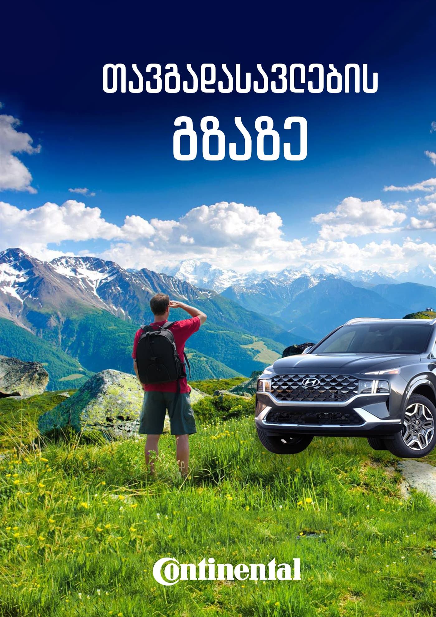
They look nice, but there’s not much to them other than a demonstration of your ability to use an image editor, such as Photoshop. Even there, there are problems. For example, the automobile in the Continental ad looks very much out of place. Not only is it inexplicably parked in a meadow on top of a mountain, but it appears to be floating above the ground since you didn’t put a shadow beneath it.
I can’t read Georgian, so I don’t know what the words say. Perhaps those words would help to make the concept more clear to me.
As you said, though, you’re a beginner, so what I’ve said shouldn’t discourage you. You’ve shown some good judgment regarding aesthetics, composition, contrast, and the other various elements of design.
I initially typed up a critique of each poster, but I don’t think that would do you any good.
Graphic design is about way more than having or knowing the right software. It’s about communicating, crafting pieces that connect with a target audience, making people respond. To do that, you need to understand the problem that needs to be solved and think in a conceptual way to solve the problem.
What you’ve posted tells me that you’ve messed around with Photoshop a bit (or whatever app you’re using), but, unfortunately, you haven’t showed us that you understand the fundamentals of what graphic design is about.
If graphic design is a viable career path where you are, I would strongly suggest you seek out a proper education.
All of this might seem a bit harsh, but it was for your own good. I hope you take it in the spirit in which it was given.
These are all inconsistent in very strange ways.
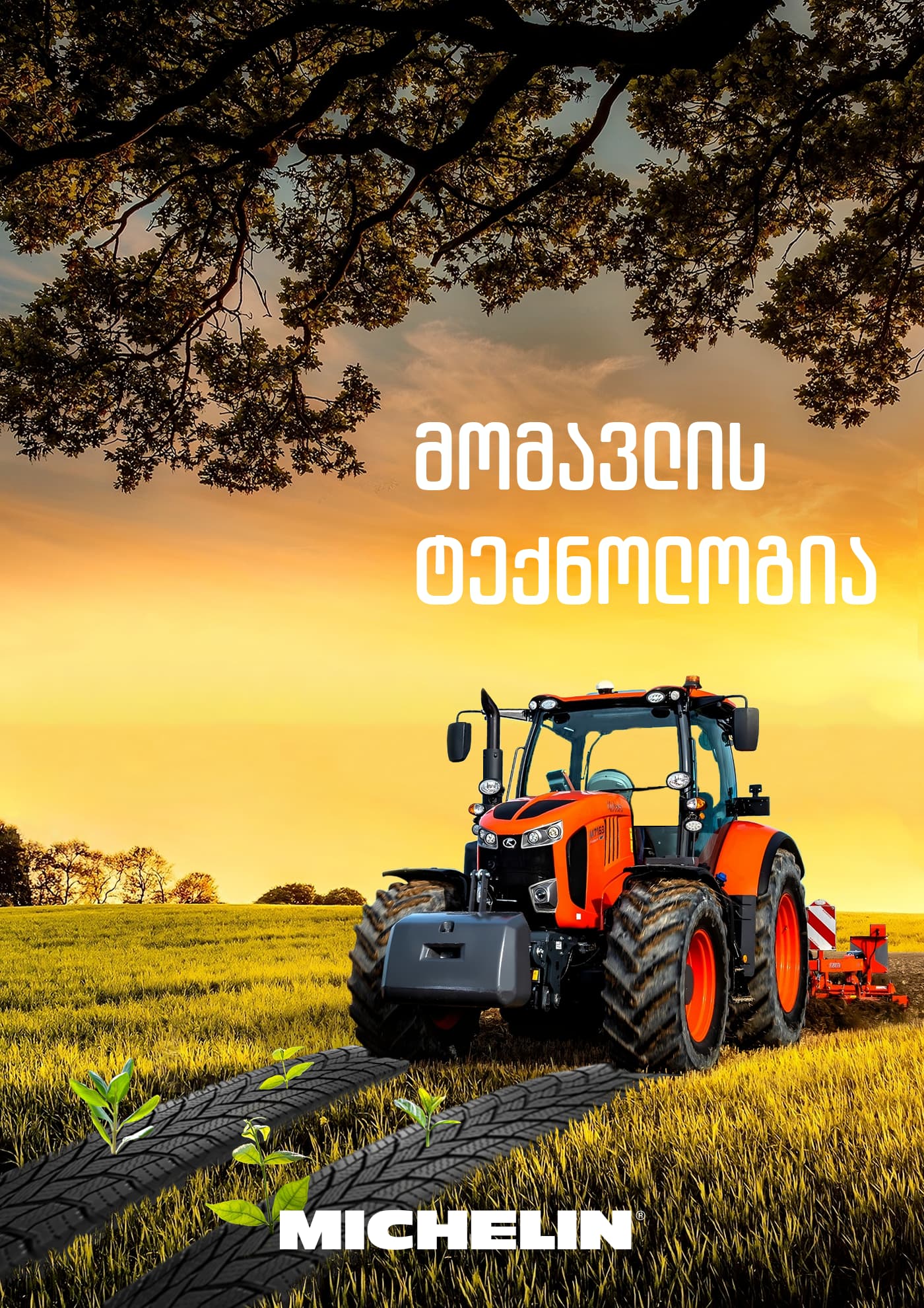
The top one the tractor is driving over tire treads and plowing them in.
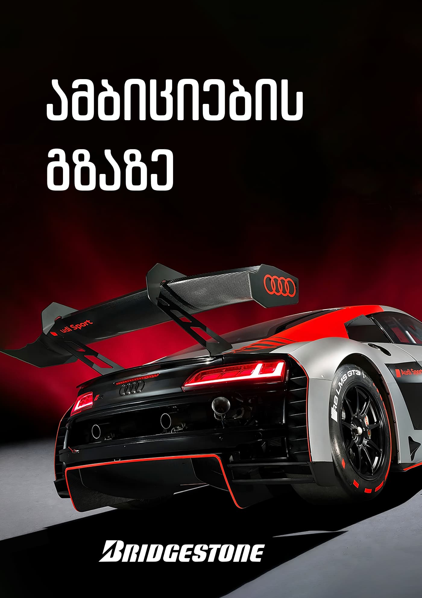
The second one down shows a lot of car but no Bridgestone tire. The R8 LMS GT3 is an Audi model, not a tire.
The third one, the car is levitating above the grass. Bad comp work there.
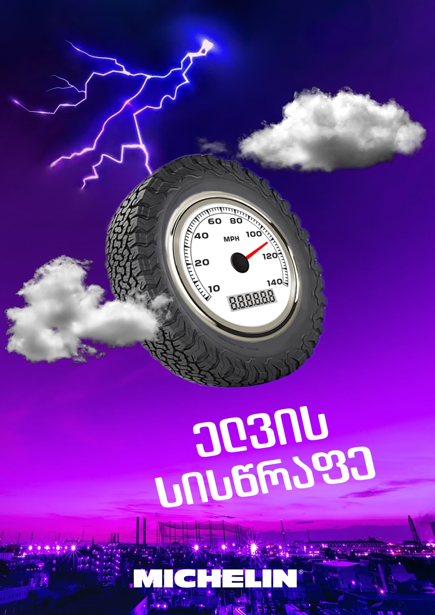
The 4th one is out of round perspective-wise, lightning would come from a cloud, that’s not a storm cloud, and why is the meter at the bottom all 8s?
Thank you so much for your feedback, I value your honesty, be as critical as you desire. Wow didn’t expect somebody to recognize the Georgian alphabet^^. you are right continental ad needs more shadows and looks a bit unrealistic like the car is flying xD, editing skills need some improvement as well, maybe I can use more smooth composition structure that’s eye-catching
Why advises are always good :D, I appreciate you taking the time to write this advice and express your point of view. but I can’t figure out exactly what elements need work…
I tried more abstract and creative approach to invoke certain emotions that fit in drivers segments fantasy and emotions that they will get after buying a product, If you take a look at georgian ads, adding a little spice of oddity is good within moderation. yes I added tires, the point was to create surrealist looks and impression that tires are of such high quality that plants grow on them and it will help you grow more crops.
the last poster is for motorcycle drivers, they value tires that last long are durable do not wear out when driving at high speed, so I tried to craft this emotion that tires will grant them speed of lighting as it’s written
There’s ‘abstract’
and ‘looks like beginner’s mistakes.’
Why go for high end and speed if the ‘abstract’ looks too comical to take seriously? Blows the whole point of the ad.
If the first ad is saying the tires will make your weeds grow better, then maybe the tractor should be aimed the other way.
If the last ad is for motorcycles, that sure aint a motorcycle tire, the perspective is still off, and if you want to imply the tires last a long time, put something over 80,000miles on the odometer (but be sure the tires actually do last that long or you set your client up for a false advertising lawsuit. At least here in the US.
I’m not anywhere that I might see a Georgian poster ad or back-cover ad for anything. If you say this is the kind of art that works for your audience, go for it.
okay I’m a beginner and there are mistakes, you got a point, I agree, there’s a lot of staff that needs improvement.
ah cultural differences..
I don’t know how to put this in words, but know I understand that culture also influences graphic design.
lawsuits.. we are not that harsh :D, we even have a saying go and sue me! ((if you disagree with somebody) it’s rare to see somebody suing someone in georgia) humor is part of our culture.