I think I’m a little rusty (like I’ve gotten more right brained or something) - so I went to a prompt generator online to try to get the juices flowing.
It said “create a logo for a hacker collective.” Awesome. I could have fun with that right? Why not. Anyway, I put more of the description in the photos below of the process I went through when coming up with the logo.
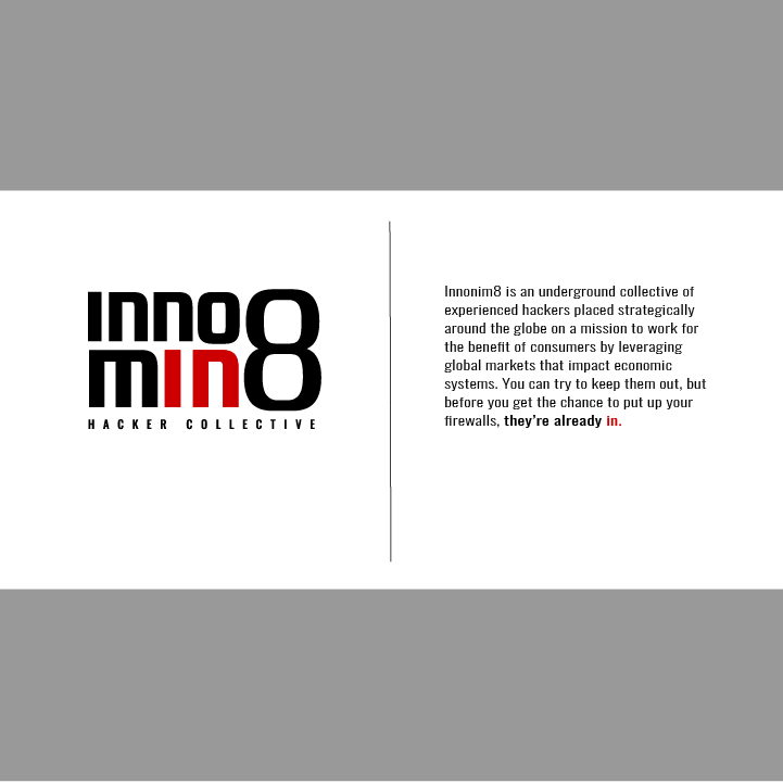
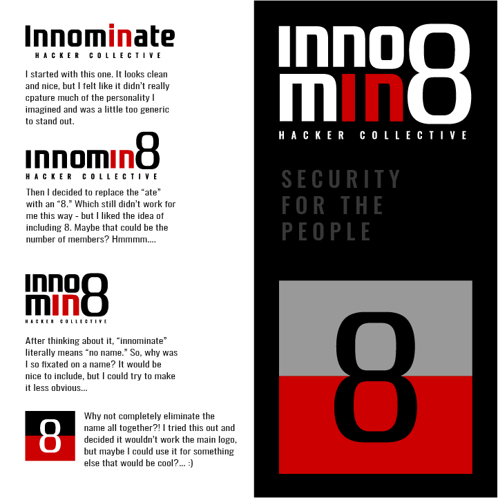
I had to think of a name myself, so I just thought of synonyms for “anonymous” and came up with innominate. It’s all completely made up, even the little back story I made (inspired by the very little I know about anonymous). I added some Walt Whitman in the copy if there are any history/poetry buffs out there. I decided to use the number 8 as a reference for how many people work in the collective - number 8 being a mystery, like Bosley on the phone for Charlies Angels.
Visually, it looks nice, but it’s illegible. I was trying to figure out how it was supposed to read and did not get innomin8 until I read your brief.
Also, and at the considerable risk of coming across like a bore or know-it-all, wasn’t “Charlie” the one on the phone in Charlie’s Angels? I never saw the movie, so it’s been since the original series was on TV when I last saw the show. Maybe I’m misremembering.
Yeah, Charlie was Bosley’s mysterious boss and the disembodied voice on the phone. I don’t want to derail the thread, so don’t even think of asking me how I know that.
I agree with Steve that everything about what you’ve done looks pretty good. The logo is unusual but unusual is fine. Besides, a group of hackers probably warrant an unusual look.
Even so, the logo isn’t especially readable — partially, I suppose, because it’s not a real word, which makes it challenging to piece together. Perhaps it’s appropriate for a “hacker collective” to use a logo that’s difficult to decipher; I assume they tend to work in the shadows, unseen, and out of sight. For that matter, maybe the entire branding is a bit too above-board and corporate-looking instead of underground and behind-the-scenes.
Getting back to aesthetic concerns, the kerning is a bit off. I would also beef up the weight of the 8. It seems to be quite a bit lighter than the other letters.
What are the success metrics for this brief?
Where would the mark be used and what it’s intended to do - be intimidating, mocking?
Who is the intended audience?
What are the personal values that motivate the hackers, are they political, financial, are they blackhat, whitehat, greyhat…, do they have a manifesto, do they do it just for fun?
Thank you Just-B! I feel like you really understood how I was approaching it. I thought it would be interesting to create a logo that is hard to decipher but makes sense to those “in-the-know” for exactly the reason you described.
As for it looking to corporate - I understand what you mean, and I’m interested in how you might approach creating a brand that looks underground and behind the scenes. Would it be more minimal? A simple illustrative logo mark that stands alone with no other context?
As for the kerning - it’s something I struggle with. I like the style of the typeface, but it was too.. what’s the word.. condensed? Tight? By default it looked like the letters were too close together to be readable so I tried to space out the letters to give it more breathing room - now I’m considering the idea that if I was unhappy with how the type laid out no matter how much I tweaked it, maybe I should have picked a different typeface.
And you are totally right. For the logo text I wanted it to be even bolder than what the typeface had to offer so I offset the path to expand the edges a bit, but I did that before including the 8 and didn’t make the same change to the 8 - good catch!
Pluto you bring up some very good points that I didn’t necessarily consider, at least not in specific ways. Partially because this was created using a prompt generator that provided very little instruction - so I had a lot of a freedom to create this to be whatever it wanted to be.
The next time I do a project like this I will remember these questions you asked to set some more guidelines and make it a less broad approach. Thank you for the feedback.
The reason is simple—the word breaks at a point that is not consistent with good grammar, breaking words down into proper syllables ie: instead of breaking like “in-nom-in-ate” it breaks as “inno-min-8.” This happens because designers get fascinated with their own design without thinking of how it communicates.
I’d stack two of the o’s to create the eight. The proportions might need a slight adjustment, but using the o would help provide visual continuity between all the shapes.
The kerning on this composition is easy — exactly the same amount of space between all the letters in the top line. The spacing needs to be slightly greater in the bottom line because the letters are larger, but I’d still make that spacing the same for all three letters.
As for the personality (underground, in the shadows, etc.), the brief doesn’t say much about that other than the group is worldwide, underground, and working for the good of consumers.
A corporate logo with hoodies and all the trappings of a corporate entity might be fine if they’re trying to promote themselves and mainstream good guys. On the other hand, they’re probably engaged in illegal activities (even if they think it’s for good), so I’m not sure they’d want a full-blown brand or have the hierarchical structure to commission one.
The mask the Annonymous group uses comes to mind, but I’m unsure of its origins. I suspect the masked developed organically instead of through a formal branding project.
What I probably wouldn’t do is head in the sci-fi, fantasy, cosplay, we’re cool direction. I’d also avoid the obvious, such as using shadowy figures. I’d keep it simple with a subtle personality that pushed it toward the personality and emotional tenor that seemed most appropriate. What that is, though, is unclear from the brief, so I suppose that’s up to you to decide.
For what it’s worth, I really like your presentation. It’s clean, simple, looks good and doesn’t go overboard.