A project I found on fakeclients. Here is the brief for anyone interested:
Good afternoon,
I am Jennifer Davies, head of the advertising committee of a large animal shelter named Safe Haven Shelter. Most of our animals are relatively older dogs, but we also give shelter to puppies, cats, and a small number of other animals. Sadly, there are currently a lot of animals that are being brought to the shelter but not a lot of adoptions. This causes our shelter to almost reach its capacity, which means we wouldn’t be able to take in any more animals. This is something we would like to prevent and therefore we are looking for someone to design us an ad for in both magazines and newspapers. The magazine ad gets to be full-page, the newspaper ad however will only get to be one-eighth of a page, which means around 5 by 3.75 inches. That means that the magazine ad can handle a lot more detail and more things on it than the other one. However, they both have to be eye-catching and very fun and happy. We want it to mention our name and website (www.safehavenshelter.com) as well as something along the lines of ‘Will you be my new family?’. It doesn’t have to be those exact words but the message has to be similar. We also want you to put some animals (mainly dogs obviously) in the ad so that the said quote makes sense. I think that is all. I look forward to your two designs and can’t wait to help our animals find a home!
Kindly,
Jennifer Davies
Anyways, I made 2 designs (as requested), 1 of a big poster and the other a newspaper thing they should be attached.
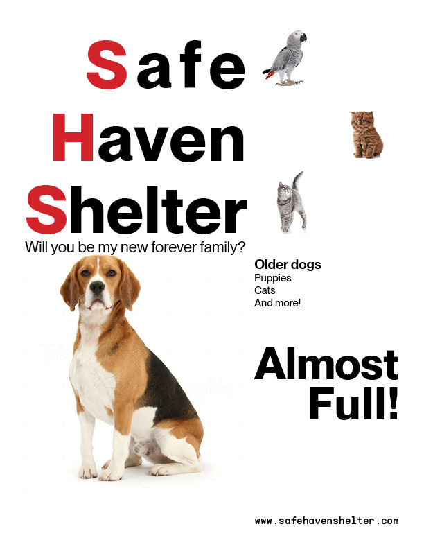
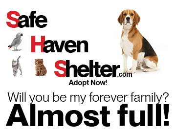
Just looking for general feedback on the posters, i was going for a more swiss design approach. As that has really been inspiring me recently