Designs for International Business Consultants

Printing won’t know this. It’s just going to create the gradient in that section.
And it will be a hot mess and varying results from print run to print run and with different printers/processes in place.

You would need to send them a proof of how it should look so they can follow that.

I don’t think your card is of the same design quality as the ones you have linked to - you have to see this too, do you not agree?

Yes, there were cheap buisness cards machines in shopping malls, my friends and I used to get business cards made up for fake funny businesses and leave them in Mcdonalds / on car windshields, or just anywhere we could - for a joke.

Adobe guidelines are only guidelines, they are not definitive to every situation.

I do agree. Just couldn’t place what went wrong. They have a better hierarchy that I believe makes the information stand out from one another better and have logos I don’t have the confidence to make. I suppose I could have changed the font color, but I couldn’t tell you how they make their text layout more efficient. I should have mentioned thank you for responding in my prior message, so thank you again for the detailed response.

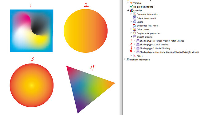
Anything that isn’t a solid color, whether process color or spot color, is a “smooth shade”. All gradients and meshes fall into this shading type in the PDF library.

Size of shaded area, colors involved, effects involved, blend modes, etc along with print technology will have a very large effect on how they work (or don’t) in practicality.

1 Like

Thank you for that explanation! I believe you’ve helped me realize what shaders are. You have indirectly answered two of my questions. I’m grateful for the guidance.

Business cards serve two main purposes: provide the recipient with contact information and create positive emotional responses consistent with an ideal first impression.

The latter of those two purposes is difficult to achieve. This is because it requires the ability to put oneself in the recipient’s position while noticing those subtle emotions that are only subconsciously perceived by the recipient. In addition, it requires the ability to design the card in a way that evokes those subtle emotions. Doing this requires experience.

Evoking the desired emotional response involves considering everything that most people overlook: the card’s texture, the card stock’s thickness, and the tactile experience of how the card feels in one’s hand. For example, is it sharp and crisp or bendy and rubbery? Will the recipient feel raised letters or an embossed logo? Will the appearance of the card change depending on the lighting or the angle from which the card is viewed?

Varnishes, foil, embossing, engraving, thermography, and various finishes can be used in creative ways to create a perfect symphony of subtle sensory experiences that add up to a positive first impression.

I haven’t even touched on your latest design yet because I don’t think you’ve even considered the depth of the problem beyond the surface appearance of the card.

Leaving those considerations aside, I have a few comments on your design.

First, your new version of the card is a vast improvement over your initial version. As you mentioned someone saying, though, it looks uninspired.

Swoosh shapes were very stylish and overused back in the '80s and '90s. Even when someone doesn’t consciously recognize it, the shapes convey a subtle feeling of something outdated. I assume you used those shapes to suggest the sea, which is understandable, given the company name. However, there’s probably a better, more contemporary way of achieving that.

Serif typography certainly has its place, but a sans-serif might work better on your card because sans-serif is more closely associated with business purposes. I don’t know why you’ve switched back and forth between caps and lowercase. I love old-style numerals, but they’re essentially lowercase figures, which look a little out of place when adjacent to uppercase letters.

If the business name includes the word Consulting, that word should be treated the same as the first two words in the name. I don’t understand why you created such a large space between the lines of type in the name and made the point size of the word Consulting smaller with tighter letter spacing. In addition, lowercase letters rarely look right when they’re spaced out, as you’ve done. Loose letter spacing on caps is common and can look pretty good, but it rarely works with lowercase (and honestly, I’m not quite sure why).

By the way, look at the cards below. They’re not all great, and I don’t know what might be most appropriate for your uncle’s business niche. However, most have a professional business look that might trigger an idea that could work for you. (Ignore the reference to PSD cards — business cards should never be built in Photoshop.)

1 Like

“Shaders” are related the CGI / computer graphics, short programs that run on the hardware to render light and color. These are not shaders.

Graphical shading (gradients in this case) are not necessarily always a bad thing to use, but potential production methods have to be carefully considered before doing so. I wouldn’t use them at all on a business card unless I was certain they would output as expected, especially not in a small space like text. A physical proof would help sort that out.

In general though, if the printer used for final production has a high enough resolution, small gradients shouldn’t be too much of a concern, as long as the difference between the colors in the gradient are great enough and the printer’s gamut is such that the gradient doesn’t get rendered poorly.

These aren’t things a print shop will share with you though. So again - physical proof beats everything.

1 Like

Another great response! Thanks.

I understand a bit more of the psychology behind my design. I needed this explanation. I have looked at many of the neat business cards that are out there, and the users here found inspirational. I would like to delve deeper into this and see what may come out the other end at a notably later date (I’m thinking a month).

I now have lots of information infer from and have a new appreciation for the complexities of fonts. I never knew how many years they took to develop until now, and will be playing around with the leaning, kerning, and tracking for dozens of hours in the foreseeable future.

Such an interesting subject. It’s a Hallmark of a thread for future reference for anyone starting out.

It might be a business card but the subconscious of the experienced designer is illustrated well here.

And I’m so glad you havent, like so many before, turned to insulting others.

It’s truly a breath of fresh air.

What I haven’t told you, perhaps subconsciously, is that you are almost there. I don’t think you’re too far off a memorable design.

Usually from business cards you’ll create letterheads, compliment slips and other stationery

Another reason a gradient is not a great idea as stationery for letterheads is usually on uncoated much lighter paper as opposed to business cards printed on heavier coated paper.

Don’t think towards how the business card will be designed think forward to all it’s applications.

1 Like

Very insightful. I’m quite curious where printers get this information. This is another great remark. I’m excited to have heard from you.

Such an interesting forum. This is by far the best I’ve gone to.

If any of you who have replied, and many others frankly, had an online course, I would pay for it hands down. I’m lucky to have people, who speak their minds freely.

Also, I’m glad to hear that you feel I am onto something with my design. :smile: I recognize this is a stark change from the first iteration.

“Printers” as in commercial printing businesses get the information because they’re doing the print work. They have the presses and the RIP software and know how to get the best out of them for a given media.

Most (probably all) of them will have an in-house prepress department that has the sole duty to check and fix incoming customer artwork. If artwork is not fixable, they’re responsible for either going to the customer directly or going to those who’s job it is to talk to the customer and inform them of the issues in the art that they’re likely to run into as a result.

I’m not sure how you’d learn most of the detailed technical stuff without working for a print shop for a while in prepress or as a press operator or both, or without having been a designer for decades, working with numerous commercial printers and their processes.

1 Like

As someone who’s just starting to learn graphic design, you shouldn’t work with clients because you might harm their business.

If your uncle uses your designs, he will look very unprofessional in the eyes of his potential clients.

The best thing you can do is to use a nice business card template.

Thank you for your concern. I did share this information with him. He told me not to worry, and he already pushed back the date he wanted them by. It’s possible I will have something in the future. Cheers!

Really that is a shame!