Designs for International Business Consultants

Hello all! Happy to make acquaintance.

THE JOB: I was designing some business cards and app icon for my uncle’s corporation. (He called the app icon a logo, but I am trying to be clear with him whether or not he wants some symbol for his trademark)

THE GOALS:

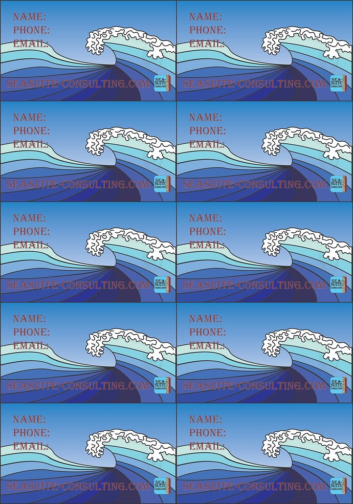
Business Cards: My impression is that this should look as professional as possible. I want it to be simple and legible of course, but specifically, I would like to give the waves in my cards a more fluid look. I’m also unsure if I should add any more details to anything other than the water. I wouldn’t want it to look busy.

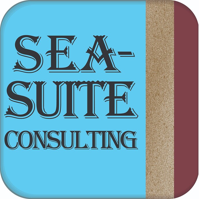
App Icon: I think I took the logo as far as I could. I would like more tips on my wordmark design, The font I used is Algerian

CIRCUMSTANCE; These designs will be used for both digital and print, so I exported these files from Illustrator in 300dpi and eye-dropped his requested colors in CMYK. I am a complete newbie, who is not getting paid for the work, and have until the 22nd to finalize my first ever designs. I wish I found a site like this when I started a few days ago. LOL

You can see everything I made the past few days in the links provided. Let me know if I misunderstood any of the guidelines

Front

Back

Logo
![Sea-Suite Consulting Logo - 1|690x690]
(upload://yI8Mvezglitt837BooBokAG8913.jpeg)

Logo Requested:

Thank you everyone! Looking forward to meeting you all, and hopefully doing more work together.
Goodness! I don’t know if it shows for you, but my app icon did not render. Here it is again.

I’m now seeing how I could space SUITE better. Could’ve sworn I gone over this a hundred times. Will keep you posted on any changes I make. Is it alright to continue posting updates down the thread?

You won’t like what I’m about to write. I’m very sorry.

Algerian is one of the most appalling typefaces ever designed. As you can tell, I dislike Algerian with a passion that borders on loathing and disgust. It’s not the right face for this (or any) job.

The abysmal typeface aside, I can barely read the name of the company on the back where it’s written out in a dark rust color over a dark blue.

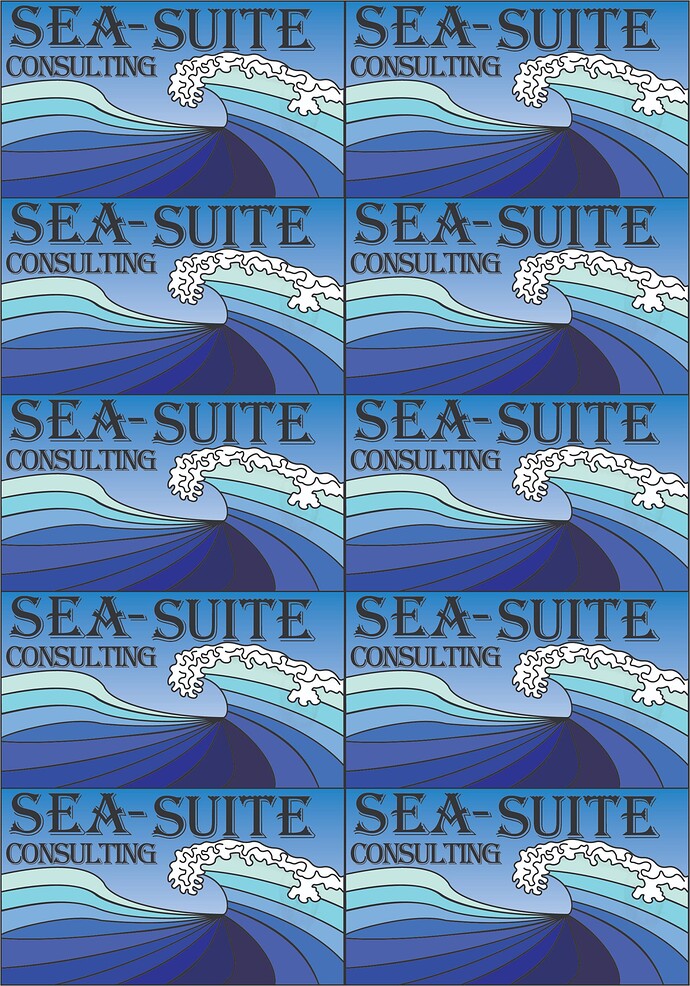
The word CONSULTING on the front is tracked way too tightly.

Why have you stacked up the cards in bunches? Are you planning to print them like this? If so, this is the wrong way to go about it for numerous reasons.

You mentioned that you want the card to be simple and legible, but you’ve done the opposite. Your card is congested and illegible.

Why have you used the same illustration on both sides of the card? For that matter, why have you covered the entire surface of the card with the illustration, then crammed everything else in to fit. The illustration looks like your version of Hokusai’s famous woodblock print. Covering a card with something this busy doesn’t work.

The logo is completely unreadable at the size you’ve used it on the card.

Speaking of the logo or app icon (whichever it is), those textures won’t work. They’ll be completely lost in a blur when printed at any size short of two or three inches wide.

You’ve told us nothing about the company, what it does, its personality, or its customers. You’ve given us no indication as to why this would be appropriate or evoke the desired emotional response from the intended audience.

You mentioned putting this together at 300 dpi (you mean ppi). This card, as you’ve designed it, should not have any ppi. It should not be raster art; it should be scalable vector art.

As I said at first, I’m very sorry, but your design is not working in any possible capacity. I’d make recommendations on how to improve what you’ve done, but it’s unsalvageable.

You mentioned this being your first design project. A business card is important since it’s purpose is to communicate contact information and leave a favorable professional impression. Your design does neither. Your uncle and his company deserve something better and more professional. You’re not ready any more than I was when designing my first college project several decades ago.

If graphic design is something you want to pursue professionally, great. However, you have much education ahead of you before you get there.

2 Likes

Lets start with 300dpi.
Why are you exporting a vector format out of Illustrator as a 300ppi raster?
Are you submitting these for printing at someplace that only takes jpgs?

Can you read the back? I can’t (well I can if I work at it) and you haven’t even put in the information yet. That info will cross the white/black part of the wave. And if the email is as long as the dot com with a name in front of it, you will run out of room.

Did you outline those letters with a very skinny stroke in an attempt to make them legible against the wave art? If you have to use outlines in that fashion, there is always something wrong with the design.

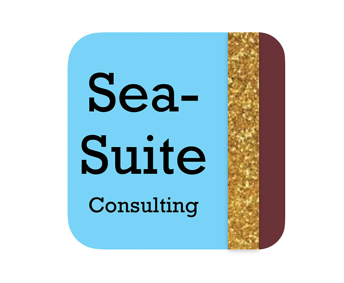
That block logo isn’t working as a logo. You really have to get rid of the gold raster image (is that sand?) You may need to enlarge it at some point to a size where it will pixelate worse than it’s showing here. Photo images in logos = always a bad idea.
Plus it’s way too small on the back of the card and lost among all the other elements.

You didn’t want it to look too busy by adding elements, yet you have at least 9 colors in there in a wave form that is already too busy. A blue to white gradient is often problematic too (the sky.) It might not print the way you intend, depending on how these are printed.

Why are they imposed? Are you printing these yourself?
The backs aren’t aligned and you have no bleed front or back. You also might want a little more safety on the front of the card. Cutting is not always accurate and only having 1/16" at the top and left side is just asking for that text to be clipped.

2 Likes

Whups, B posted same time as I did with pretty much the same observations.
I’m not as offended by the font though. :slight_smile:

There’s a drug store I drive by a couple of towns over from my hometown. They used to spell out the name of their store in big letters using Comic Sans. One day while driving through, there were sign installers out front removing the big letters. This made me happy.

The next time I drove through, I noticed that the Comic Sans had been replaced with a new storefront sign using a combination of Algerian and Papyrus. Aggggghhh! Since then, I’ve intentionally averted my eyes when driving past.

1 Like

@Just-B
Hey B!
I did some more reading on the forum here and realized I posted this way too soon. I’m both thrilled to hear from you and sorry to waste your time. I appreciate your insight. You’ve given many helpful tips on this thread on mainly others that I have started implementing in the design, but I understand that there is still much to learn.

  1. It is good to know the wave itself is too busy. I will also come up with more designs to see what I can implement on both sides.
  2. I could definitely learn about printing. I’m completely ignorant on this, and I assumed printing shops would print in a similar layout to a home printer, but PrintDriver gives me the impression it would work differently.
  3. I would also love some commentary of the technique on my “art” if you have more to add on that.
  4. I thought the same about the app icon. He does, however, call that his logo. He thought it would be simpler to make them the same thing, but they do serve different functional purposes, and I mentioned that in my last email.
  5. If I’m going to push any of these cards forward for production, I will try to make it properly scalable. I’ve heard for printing that CMYK and 300 PPI is necessary, so I tried to mention I had done so. From what I read in other threads, this sort of thing should be self-apparent.
  6. I don’t have contact information yet. I should’ve put in a probable stand-in.

I was especially excited to find such detailed responses here. I’ve gotten to touch on bleeding, kerning, and grids. I would appreciate any other broad categories I can google. I would love to know what emotion means in relation to design, but I imagine it involves me learning much more of the history and trends that you had mentioned are essential in some other threads. I would also like to know any online courses you find valuable. I am willing to pay for the education, but college wouldn’t be realistic.

Here is some more information. First thing I did when I found this site was read the guidelines and made a post. Was completely unprepared for the expertise that I would find here. :open_mouth:

The company is a international business consultancy aimed at small and medium sized industries across the Pacific. I’ve tried to get more details about the type of consultancy it is, but he only mentioned an emphasis on marketing. (Yikes on my part) From examples of business cards I have seen online, do not show this sort of art and strange layout in either case. There is many great tips here that I couldn’t find on my own. It’s hard breaking into a new vernacular. Thank you again and wishing you have a great night!

I put it in as a JPEG, because that was one of the few file types I could paste into this text box, and it didn’t allow for hyperlinks. I did see how someone got around that in another thread, so I will try placing a / in front next time.

  1. That text length was such an obvious thing! Thank you for brining that to my attention.
  2. That’s a very good tip about the font. I did add the outline to make it more legible. I will remember that wisdom.
  3. I didn’t realize that photos were a bad practice. It was a photo of glitter, because I couldn’t find a texture that would look like the one he implemented in his.
  4. You’ve got a really good eye. Fortunately I already knew about aligning before coming here. Unfortunately, I still managed to miss that detail. I know now this won’t go anywhere, but I like how much better properly aligning it made it look.
  5. I didn’t realize that about gradients either. What reasons would it not work as intended? I can’t find an answer to this yet.
  6. You could probably gather I know next to nothing about printing. I was basing the layout for that exact purpose, cause I couldn’t imagine any other way of getting it done. I did get to learn that bleed happens to be a few designers’ pet peeves around here.

Thank you for the kindly advice. Same goes for you as did B, I would appreciate any tips or recommendations for online education that you have. Also, wishing you a great weekend.

You did not waste my time, but I’m very happy you weren’t insulted or too put off by my comments. Graphic design is difficult. There’s much more to it than many people realize. I’ve been at it for decades, and I’m still learning.

Read the following about bleeds.

Also do a few Google searches on the subject because different sources explain it in different ways.

In addition, PrintDriver used the term “imposed” or imposition. Imposition is when the printer arranges what’s to be printed on one or multiple sheets of paper, so that it can be trimmed or, in the case of multi-page documents, folded up and trimmed so that everything is in the right order. It’s almost always best to let the printer determine the imposition since the imposition is dependent upon several variables. In other words, unless the printer tells you otherwise, it’s best to send them only one copy of the card (with the bleed that you’ll read about), then let them impose it in whatever way works best for them.

I’m not quite sure what you mean by technique. You have some illustration talent, if that’s what you’re asking. What software did you use?

You’re correct. They need to look similar, but as you observed, an app icon needs to serve a very specific function that is similar to but not synonymous with a corporate logo.

Two very different imaging technologies are used in graphic design: raster and vector. As with bleeds, it’s important that you understand the terms. Here’s a link, but again, do a Google search on the terms to understand them.

A business card, like the one you’ve designed, would best be made as a vector file. 300 pixels per inch (ppi) is great for printing a photograph, but commercial printing uses a much higher resolution (around ten times that high) to make sure the edges of typography and other solid lines and edges do not print with jaggy edges. Scalable vector artwork is always better when it’s practical to use it. However, it’s not possible with photos or scanned artwork or when an organic look is necessary. In other words, raster and vector each have their place, but on your card, vector would be best. However, vector illustration or layout software is necessary. What software do you have access to?

1 Like

No worries! I’ve gotten the impression you’re one of the sweetest users on here. Besides, the first thing I’ve heard about graphical design is how essential negative feedback is in particular. I was desperate to find some backbone, and I think I got the best source I could ask for. Also, I’m looking forward to do some reading. I am really grateful for yours or anyone else’s time.

I use Adobe Creative Cloud. I’ve historically been a free alternative for my family’s wants. As a consequence, I am much much better with photography and videography (Lightroom and Premiere). I also am an amateur web designer, and have used Dreamweaver to a smaller extent.

I already know my go to blogs and channels on YouTube for such topics, but I’ve only ever played around in Illustrator and Photoshop. I was going to show my Uncle some of my previous work, but I never really bothered to save any of it. I just came up with some samples on the fly, and he seems cooperative so far. No doubt, your impressions will be brought up, so he can think critically about what this means for his business.

I don’t know your age or what your plans are, but if you intend to work professionally in the field, whether it’s print design, web design, video, illustration, or another type of creative design endeavor, a 4-year degree is your best option for learning.

If you go that route, be prepared for intense scrutiny and constructive criticism. It hurts at first (at least it did with me), but you’ll soon discover that the best, most effective, and most efficient kind of learning requires a mind shift that appreciates and absorbs the points of view from one’s peers. When your work is pinned up on the wall next to everyone else’s and gets a thumbs down from almost everyone in the class, you’ll work your butt off trying to improve and prevent that from happening the next time. From what you’ve written so far, I think you’ve got that part of the process already nailed down pretty well.

I’m 21. I was about to enlist in the Air Force, but got stuck when my great grandmother got diagnosed with Alzheimer’s. She needed quite a bit of assistance, but now we understand she needs supervision. It’s become my full-time unpaid internship in exchange for a place to stay. I was a pet stylist, but it just wasn’t meant to be. There just wasn’t enough industrious individuals to help pave a way for becoming a credentialed professional in Arizona. Spent a year and a half and paid tens of thousands in education and equipment to find a dead end without apprenticeship. It did however give me pretty thick skin and a deep desire to find rigorously accredited individuals. I’m just trying to make the most of my time, but entrepreneurship has always appealed to me.

One more thing. The site you mentioned, https://pavilion.dinfos.edu, is a great source of information. Are there any other encyclopedic sites that you know of? I also have hundreds of hours on Udemy for my aspirations, so I am serious about putting in the time.

Round 2!

I made a much plainer design that accounted for bleed, layout, color, and legibility. Would be happy to hear about my use of grids and color harmony in particular. I made adjustments for my gradients using this reference, but there are some tidbits that I don’t understand quite yet. Mainly the point below, and how to calculate luminosity. Also this.

Blockquote * Use a blend that changes at least 50% between two or more process-color components.
–Adobe

Sea-Suite Consulting 2.3
Heads up, I was told this design is uninspired, but that is a step up already!
Edit: Incorrect Address.

I think you’ll get more responses if you paste a jpeg here instead of making people click a link to open it. I’ve taken the liberty of doing that. I hope you don’t mind.

Not at all! Thank you.

Why such a disconnect between Sea-Suite and Consulting - they have the same ‘branding’ but look disconnected.

This somebody important is very important, consulting above and below their name, there can be no mistake!
Still using Fax? Like the design of the card, the Fax Machine is in a timewarp with the design.

Why is the address in capitals? Why old style numerals for the numbers, they are all disjointed - maybe the look of them reminds people of the ‘sea’.

So many errors on the card.
Gradients on text
Gradients on background (different processes are going to make the cards all different when printed in different printers and different print processes)
Serif font on small text is going to be problematic for legibility.
All caps text.

It truly looks like it came out of a business card machine that you’d see in a Mall in the early 90s.

It couldn’t be any less modern.

1 Like

How does this identity hold up to other companies in the consulting game? I’d suggest you survey the branding of some of the larger consulting firms. While your uncle may not directly compete with them, he at least operates in the same space. Look at Bain & Company, Deloitte, PWC, and Booz Allen Hamilton to start with.

1 Like

I should definitely read a typographic textbook. I read some other posts in the crit pit, and this is where I have the biggest disconnect. This would explain why I have inappropriate spacing and use odd formatting (my sources are USPS and Microsoft).

You may be surprised to learn that there is only gradient in the background. The colored text is just a mesh cut with a clipping mask.

I tried to follow the guidelines Adobe provides for printing gradients, but I could see how it may not work in my best interest. One of my graphic designing inspirations (certainly had no influence on this card), Kurzgesagt, does not use gradients in their posters. They mention how they have members on their team with a background in printing, and this could be their influence. I will have to find a book for addressing these printing technicalities.

I wasn’t alive in the 90s so I will have to take your word that there were business card machines. I do believe the look is quite dated anyways. He mentioned he wanted a card like these ones in a later email.

That is a great suggestion! I have been looking up “business cards” of every kind at this point, but I ought to have looked for specific samples. This does give me very different results.