Hello! I am designing a scientific data visualisation application (native desktop application). I am aiming for it to be a bit more “neat, modern, minimalist” though, but this is where I am now.
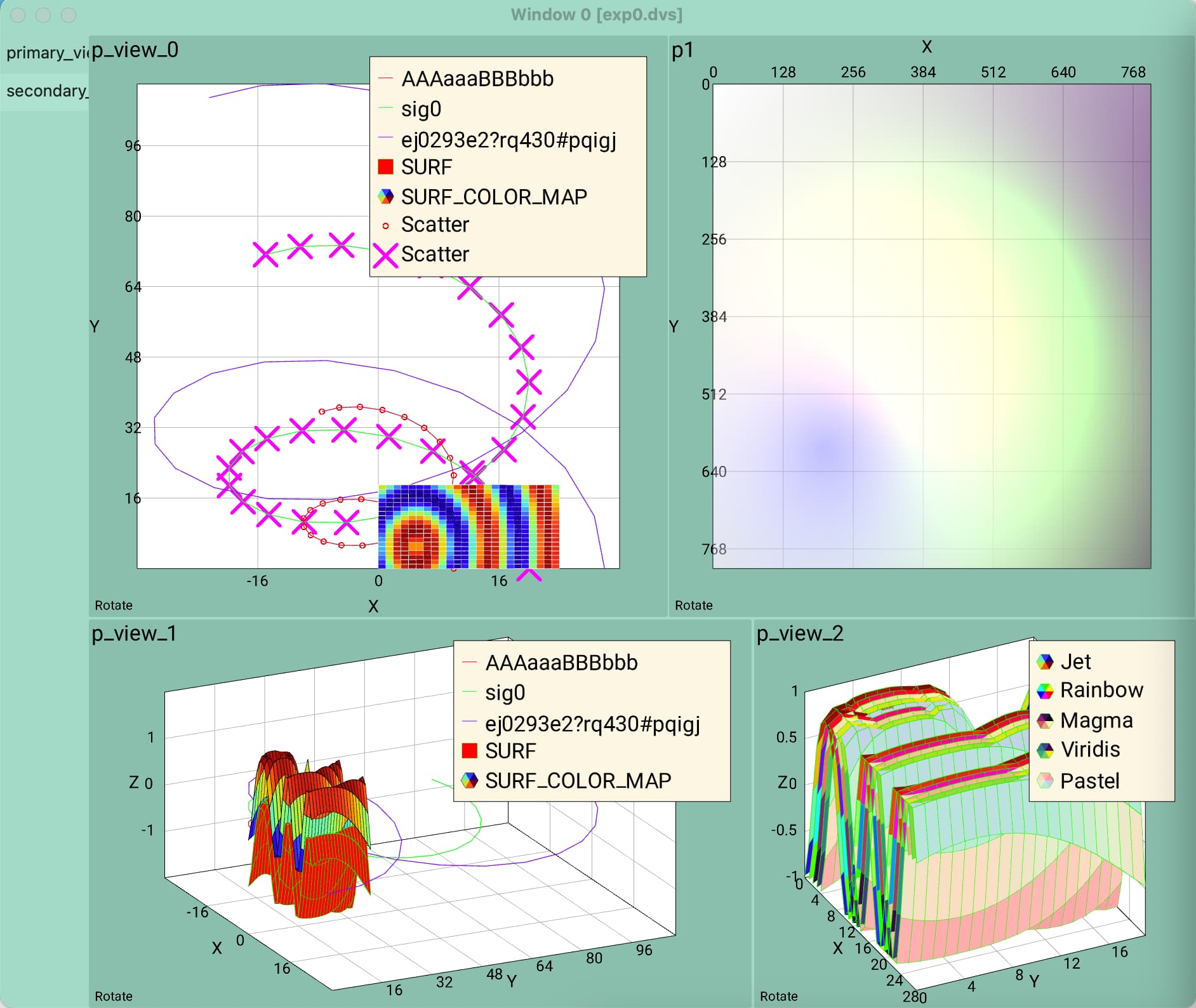
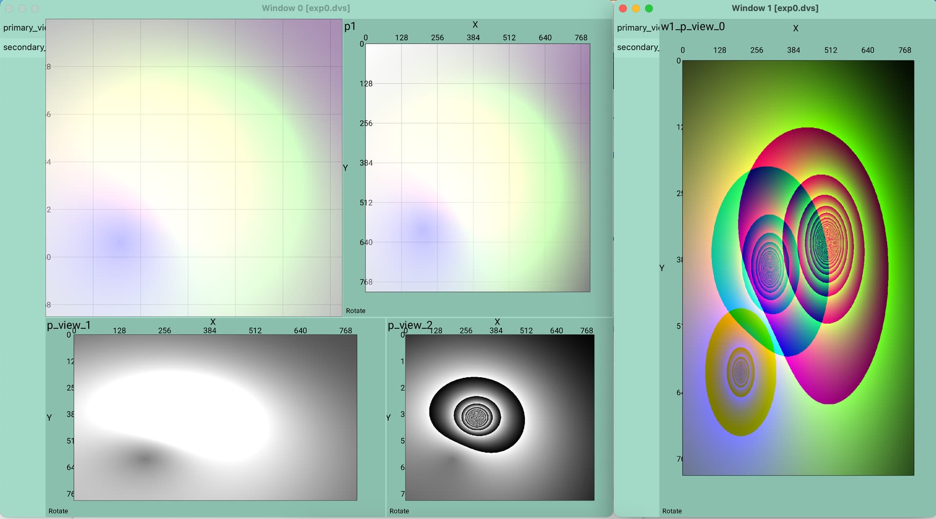
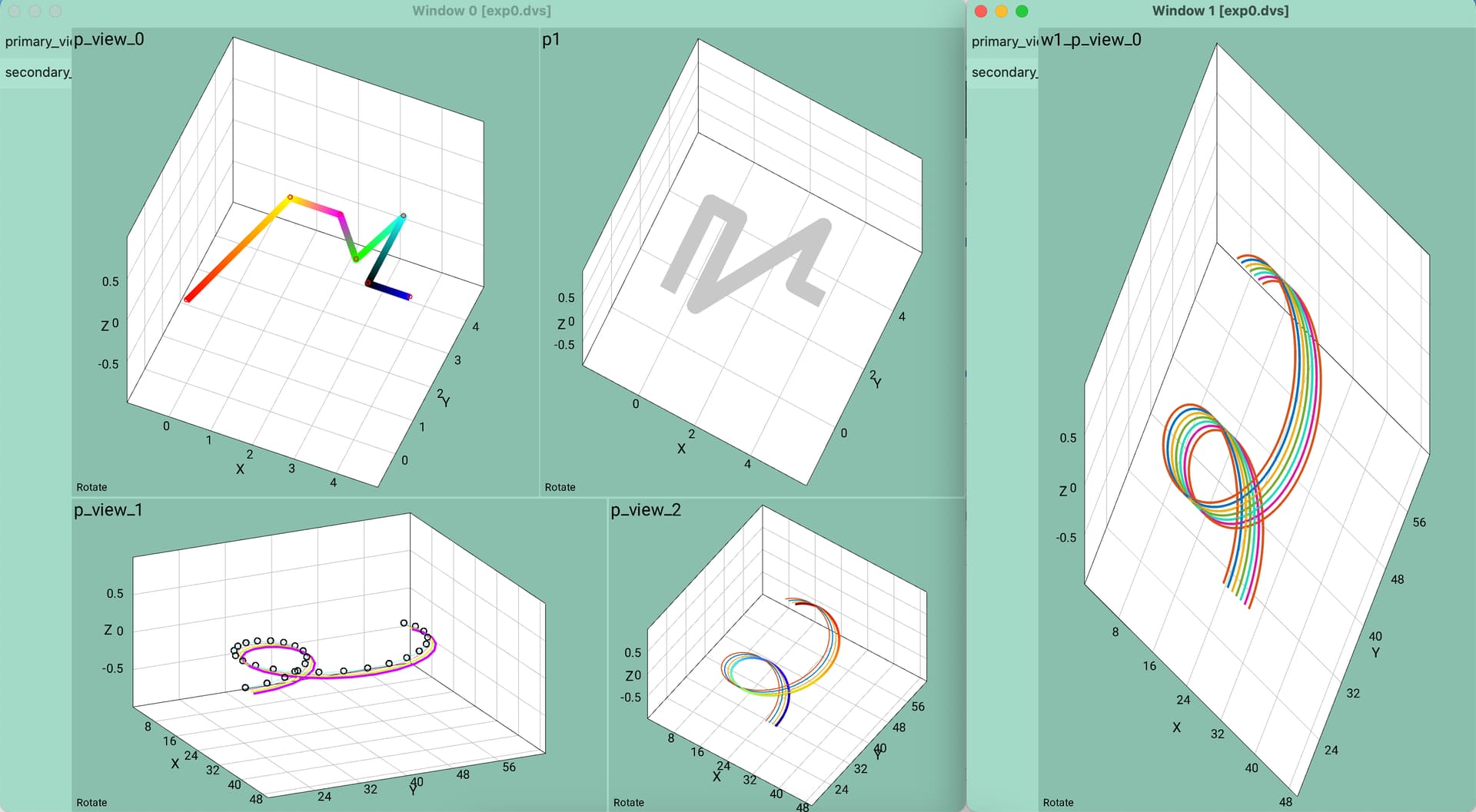
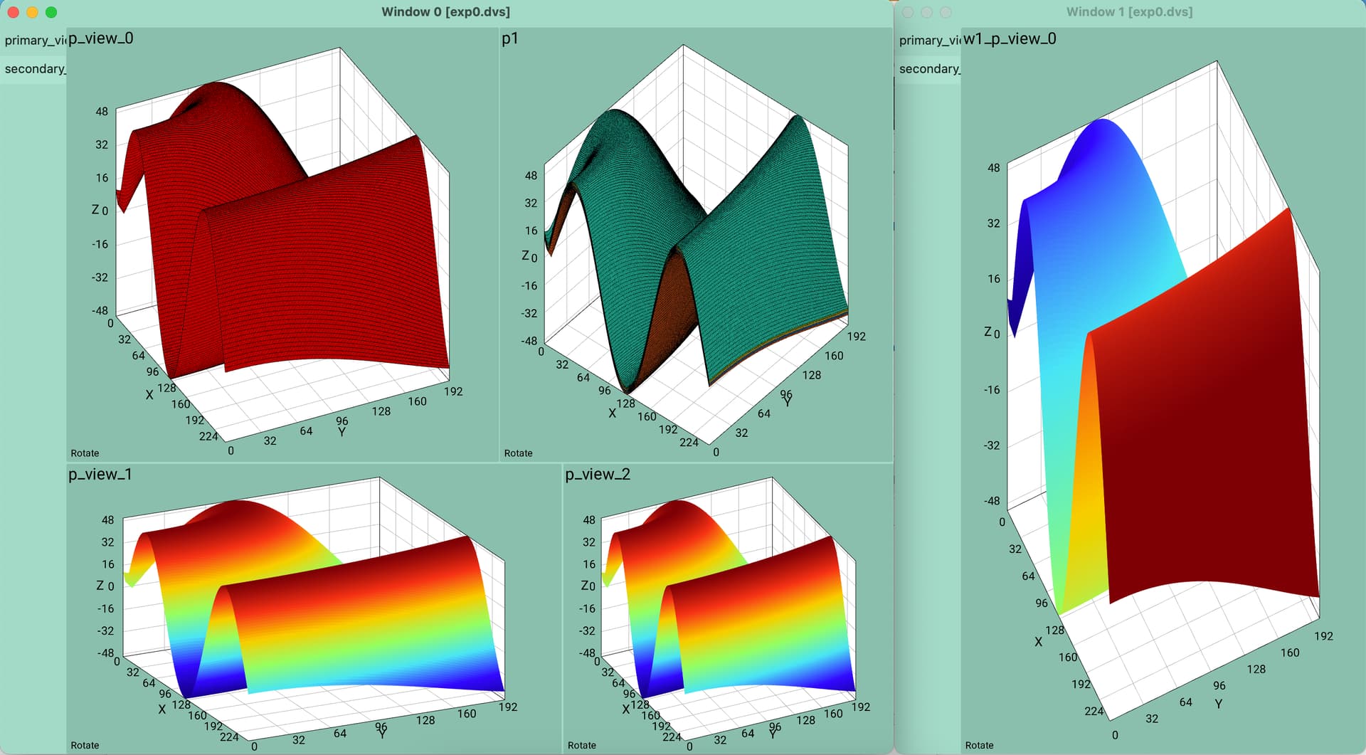
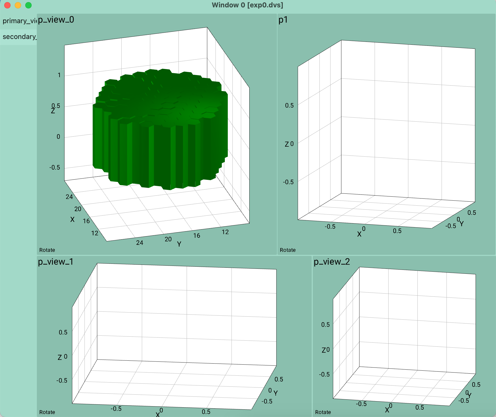
The application will consist of multiple windows, and each window will have tab buttons on the left side, and in each tab there will be a bunch of “views” (basically each rectangle that has a white box with lines and axes is a “view”). The views can be moved and resized by the user. The views have rounded corners, which I kind of like as a design feature (though not very visible in the images).
Any thoughts on how it could be improved? How could it be made “less boring” like data visualisation tools usually are? The visualised data style/look cannot change though, as that is provided by the user. So only the “view” rectangle, the white “walls”, the axes lines and the numbers can change.
This is a bit awkward.
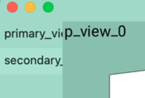
Are the dark green areas floating windows? Are they the movable and resizeable views you mentioned? Can the yellow boxes be repositioned so that they’re not overlapping the visualizations beneath them?
Speaking of green, I wouldn’t use a colorful background. A more neutral background (as in shades of grey) would probably work better.
I find these kinds of user interfaces difficult to design. I have a client that creates 3d simulation software for the automotive industry. They sometimes asked me to make suggestions on their user interface. I’ve found anything more than tweaking things here and there all but impossible without taking a deep dive into the user experience (UX), as @Joe suggested. Unfortunately, this means working side-by-side as a team member with the programmers during the development stage.
Hmm yeah maybe a UX person is the way to go… Thanks for the feedback!