Not knowing the language, I just see shapes. Sorry, I can’t help you or provide any kind of comments.
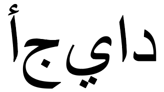
its only a stylized way of typing “أجياد” does that help?
All languages have their own nuances and taboos. I would tread carefully (unless, of course, you understand the language and culture well). I have to disqualify myself.
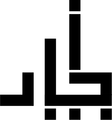
Okay. I see a locomotive heading right, with square wheels.
lol interesting.
Like Eriskay, I’m completely unqualified to give an opinion on a geometric interpretation of Arabic letters. I’ve always greatly admired the elegance and beauty of Arabic script, but it’s a something of a mystery to me.
I have no idea how this…
turns into that.
I can make out some of the respective letters that seem to be out of order, but that’s about it. I have no idea what it’s for or how readable it might be. Very sorry.
Arabic reads from right to left. But i really appreciate your replies guys ! shows how genuine and positive this forum is!
That’s one thing I did know about Arabic, but it’s also what puzzled me a little bit. Your version seems to have reversed to some extent the left-to-right order or at least jumbled the letters around.
I’m genuinely curious. Can you explain what you’ve done a little more. What is it for and what does it say? Is it a word mark logo? Is it common for Arabic to be written in a geometric style instead of the fluid script that comes to mind when I think of Arabic? My ignorance on this is deafening.
You and me both.
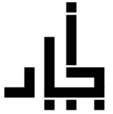
the first letter is “أ” closest in meaning to “A” ,decided to make it the header so i put it on top.then used some simple composition tricks while maintaining eye path of the letters making sure the letter “ج” in the name to be read second (its easier for native Arabs to read it from first sight),and so on,you might already know that in Arabic when you are writing/typing the letters convert ,and may change shapes completely , just like attached hand writing in french and english .the Word “AJIAD” “أجياد” means long beautiful roots/necks.
This might make more sense in comparison ;
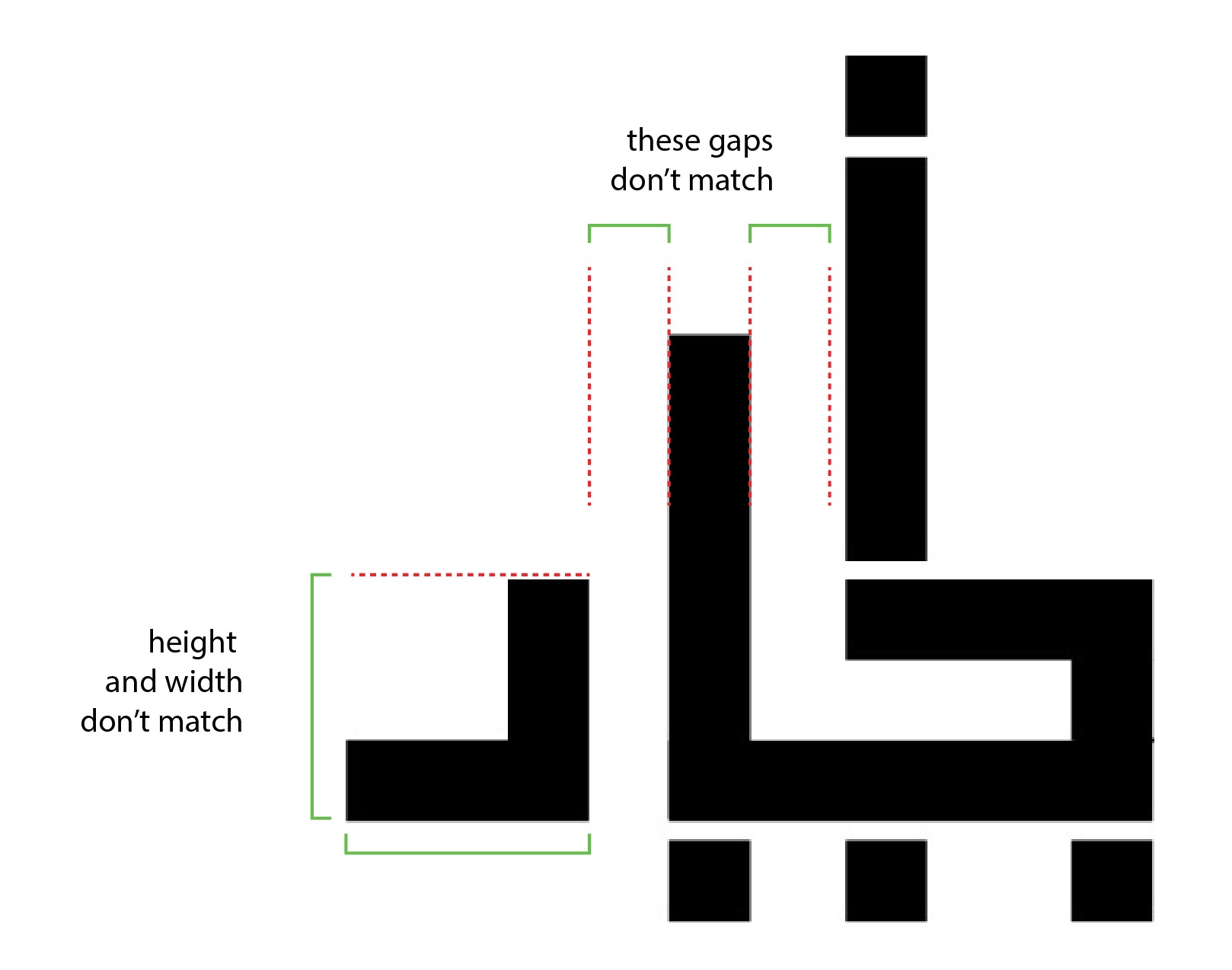
As with everyone else, not knowing Arabic makes it hard to provide solid advice. The only things I noticed were some discrepancies in sizes of gaps and such, which may be intentional. I will say, I like having some rounded edges as your last example shows, but that is only because I’m looking at it from a pure shape based look, not as lettering. Perhaps the blockiness you used is similar to the difference between serif and san serif roman lettering fonts.
I will say that I do get the sense of an angular, high rise structure, which if the hotel is tall and angular, it may help in conveying that.
All in all, I wish I could offer a better critique.
Oh great thank you! indeed the blockiness was pure personal decision making ,however there are blocky fonts out there similar i dont think it is similar to serif and san serif i mean it can be blocky but doesnt have to be san serif or serif whatsoever.i went for simplicity,the gaps imbalances were not intentional.This is great critic actually.