Next, I’m after some constructive feedback on my fairly basic WordPress website. I knocked this together relatively quickly just to have a presence for my clients to see I’m legit. However, I’m now at the stage where really I need to give it a bit more personality and unique style.
Before I engage my designer to work some magic I’d really like some ideas on what works and what doesn’t, and how people see the style as matched to the logo/brand.
I’m a bit of a fan of bright colours, especially pink, but does this fit the brand? Does the homepage image work or do I need to commission something a bit more bold, or possibly even forego a photo all together?
Maybe I’m a bit of a weirdo (which wouldn’t be outside the realm of possibility !), but there feels like there’s a bit of a disconnect between your logo and business name and what it is you do and how the rest of your site is presented.
Am totally down for a business name being somewhat abstract, but when I was accessing your website, my first thought was that I had misread your post and that it was a dog grooming business - how did you arrive at that name (it’s also pretty long!)?
That aside, your logo being a thin lined and illustrative seems inconsistent with the bold clean-lined style of the rest of your website. I think you should pick one style or the other or at least have some crossover somewhere so your logo doesn’t feel like it’s out of place.
Would also recommend faster hosting too mate!
Hope that helps !
Regarding the site itself, it’s hard to say how effective I think it would be without knowing what type of clients are you looking to attract?
Thanks. All of that makes sense. I did think the bold black and pink was kind of at odds with the logo which I had a friend draw for me!
The name is just something silly I came up with which stuck and generally people seem to like it and remember it. I am now thinking perhaps I should look at having the rest of the site designed to fit with the logo style.
Frustrated at the hosting speed as I’m paying good money to have it super fast so I think I need a word with Hostinger!
I’d agree that the logo style and the site treatment are at odds, but frankly, making the site look more llike the logo will just make for a sloppy looking site. The logo design is … lazy, and itself lacking in impact. It has no anchor; no focal point. The dog and table are built of clean lines and the type of scribbled-looking lines, yet they are all of similar light weight, so it’s “mono-toned,” weak, and utterly forgettable, despite the unusual name. I’d say stronger branding is in order before building anything around it.
I agree with everything already written, so I won’t repeat it.
You said you’re a fan of pink, which is fine. However, it’s also the color most likely to evoke the most extreme love-hate reaction.
The site has a solid, professional look, but the black, white, and pink color scheme isn’t especially dynamic. It also comes across as an off-the-shelf WordPress theme. Then again, perhaps that’s what you meant by a need to give it more personality and style, which I agree would be helpful.
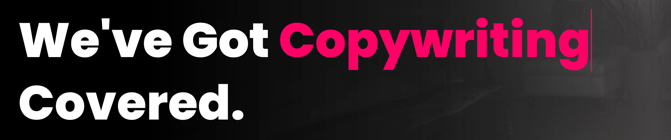
You probably ought to put in a proper apostrophe on a big headline — especially one advertising copywriting.
It’s a nit-pick, perhaps, but I’d also suggest ditching either the periods or the Title Case on all those page headings—use one or the other, not both.
It is an off the shelf template. I did the bare minimum to get the site live whilst I was setting up but I’m now keen to have something a bit more thought about