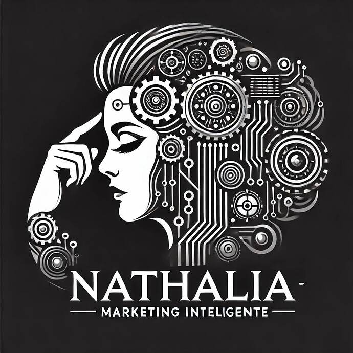
How about this image for the concept ‘’ Intelligent marketing’’ ?
Whoa, there is way too much going on there for a logo. There is nothing you can do that will save this. Go back to the drawing board and simplify, simplify, simplify.
It’s an excellent illustration that could be used in conjunction with the brand, but using it as a logo is a recipe for problems due to the reproduction limitations imposed by the complexity. For example, it will turn into a blur at small sizes.
Great poster.
Feels a bit like AI due to the non-vector qualities of the tech part.
Not suitable for logo use, imho, for the reasons given by the others.
Since you posted this in the student forum, I am going to help you out with a brainstorming exercise. The first part is this: make a list of 10-15 items that symbolize intelligence (e.g. an owl, a brain, etc.) and make a list of 10-15 items that symbolize marketing (e.g. a dart in a bullseye, a speech bubble, etc.). They don’t have to be great. That’s not the point. The point is to get you thinking. Post your list here.
As a concept, it’s not bad…
It’s very ‘analog’ and not sure how that plays in a ‘digital’ world.
Gears/circuits done a million times and the silhouette of a woman’s profile is an overused metaphor for intelligence and technology, not really sure I’d tie it in with Marketing, without the tagline.
Colour scheme is bold and professional, which gives it simplicity and focus.
The typography could be better, the tagline could use a lighter or sans-serif font to create a stronger hierarchy and improve readability.
It’s too intricate, which makes it difficult to reproduce/recognise in small sizes, such as on business cards or digital icons. Simplifying the details and improving on the theme (to take it into the digital era) would enhance versatility.
You will need a simplified version of the logo with minimal details for smaller applications, such as a favicon or watermark.
Might be worth studying effective simple logo designs
That’s a great illustration that could potentially work well as part of the overall brand identity system. Of course, it’s way to detailed to work as a logo.
Since the design should appeal to companies, I wouldn’t use black and would use different typography. As it’s now, the design looks like a music album cover image rather than something targeted at business owners and marketing departments.
Here are some great branding portfolio you should study:
Cyrano 2.ooo:
![]()
I’m with @Joe it smacks of being AI-generated. Could be a nice illustration if drawn properly. As it stands, it’s very sloppy looking. As a logo, as others have said, not the way to go.
I hadn’t noticed that at first, but yes, the imprecision of the gears, circuits, and other gizmos looks AI-generated instead of properly drawn. I’m getting tired of AI images.
What I’d love to do is cut a vector version of that in sign vinyl at blade-sign size, hand it to the designer and say, “YOU weed it.”
![]()
While it appeals to my steampunk tendencies, overall it’s too much. Maybe cut the gears to be 1/3 on the head and simplify everything.
And AI sucks for this kind of thing.
OMG the weeding would be horrendous!
And the tiny vinyl areas wouldn’t even stick to the liner!
Lol…
the logo might be too complicated.
Too complicated for me, but I’m a minimalist so forgive me
The design was looking good good efforts put by the logo designer and its very creative but this is design bro this is not a logo a logo is a identity of a brand or store which looks simple and attractive example like apple and nike the logo was very simple but its attract the people and that is a type of logo and its design
Boy, the first timers love to comment on this thread. The previous four comments have all been first time posters.
I’d make sure the logo still works in black and white, since digital stuff isn’t always shown in full color. Also, try it really small—like favicon size—to test clarity.
You absolutely nailed. Probably bot finding and posting to build up rep on forum then post spam links.
Suggest mods @Just-B @RedKittieKat etc might lock this one.
Funny though.


