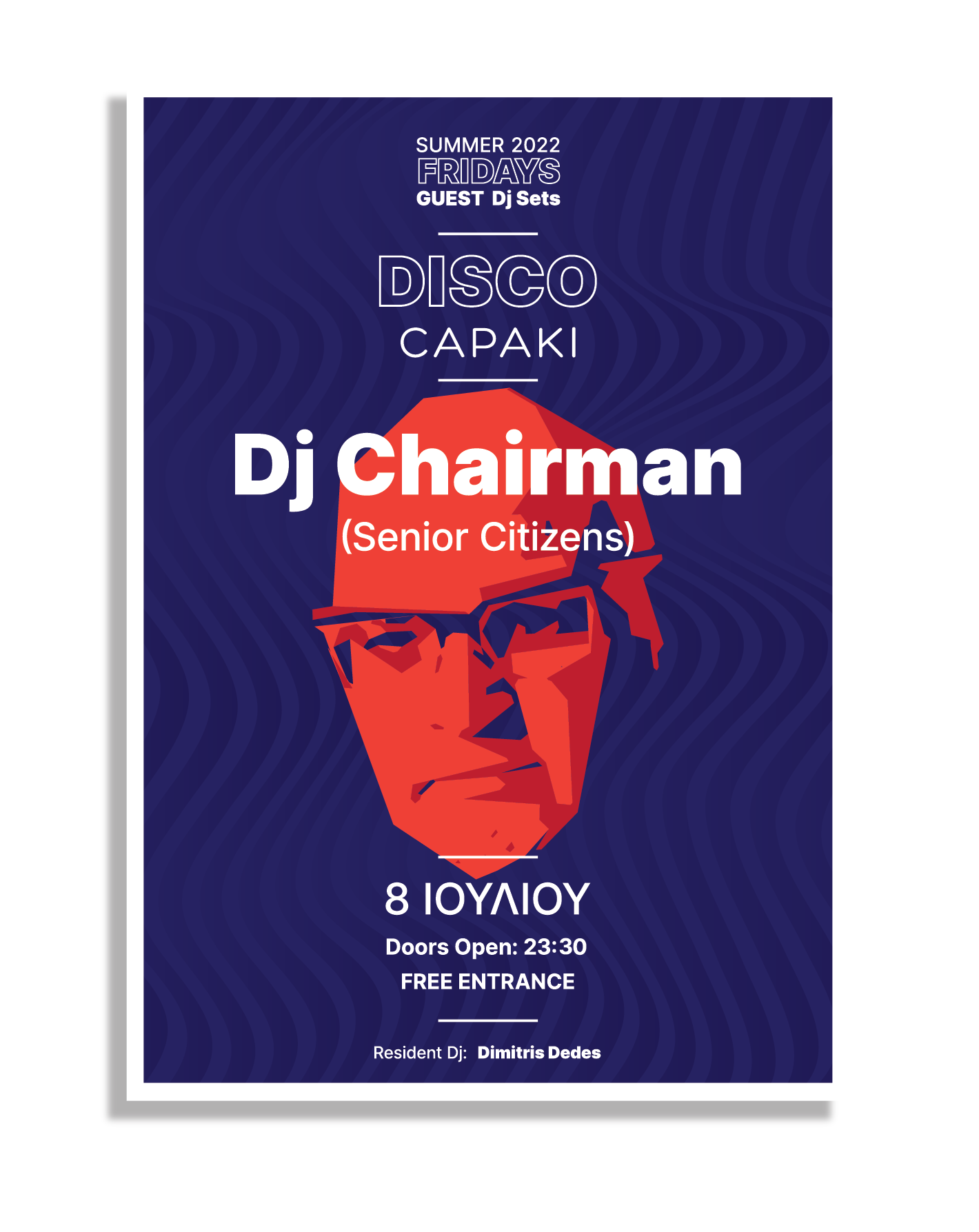
Continuing the Dj Poster assignment, This is the poster i made for the first event.
Any recommendations?
Do you thing " Disco Capaki " and “Summer 22 FRIDAYS Dj Sets” should exhange places?
The poster is mostly for web use (there will be 2-3 print copies only to be posted inside the disco in A3)
1 Like
So you’re sticking with the same mistake as previous ‘Dj’?
Where is it on? What’s the location?
Who do you contact for more information?
Why is the date in a different language and the rest in English?
Why are there two DJs? And why is one less important than the other?
Thank you for your reply smurf2!
- Client wants Dj with lowercase “j”

- There will be no more info on the poster because it will be posted mostly on social (Client’s demand).
- It’s a Disco Located in Greece, the text/info is provided by the client and he wants it “as it is”
- The main Event is “Dj Chairman” that’s the reason for the poster.
- The resident Dj is the permanent Dj of the Disco (I think he is the owner of the Disco) and he ask me to add him with “small letters somewhere”
Hey Stefanos1984, I’m not a graphical designer so take my comment in that context.
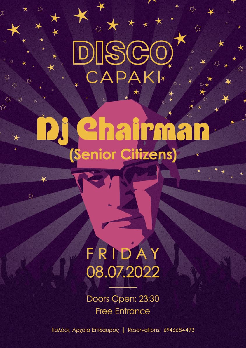
I liked your initial design, the face looks interesting and it pops. The poster is quite hip.
Your latest design has less of this contrast in color, it’s more bland. I know where my eyes would fall if they would hang side by side. Not the biggest fan of the stars and crowd image, this feels a bit cheezy. Perhaps this version fits better with the genre though.
The artist font you chose does fit nicely with the event theme.
I’m not sure what a “senior citizens” disco is — playing disco hits from the 1970s, perhaps.
If so, the glitter and funky typeface are appropriate. Of course, the typeface has more of a '60s look, and the disco genre was more of a late '70s thing. And tossing in Futura (a typeface with a 1930s Art Deco look) is incongruent by several decades. Then again, precise historical accuracy probably isn’t the goal, so you can probably ignore these geeky concerns.
I like the general look and like it a lot better than the first version.
I’m less enthusiastic about the illustration of the ominous, disembodied head. It visually dominates the entire composition. I suppose if it’s an illustration of DJ Chairman and if he’s the attraction, that presence is appropriate.
Aside from that, the thing that concerns me about the head is the drawing itself. What’s going on with the left side of his skull? It’s just sort of not there — like a chocolate Easter Egg bunny that’s hollow on the inside.
In addition, the vector-drawn, planar look of the head is clearly not a '70s disco look. Instead, the style of the time was a bit more swirly and less rigid. Again, though, I might be going off on things that aren’t especially relevant, which speaks to my criticisms about minor issues without any significant concerns. In other words, I like what you’ve done.
Thank you for your answer!
No! I like this meticulous criticism.
That’s why I post my work here.
Well to answer some of your questions:
The Disco is called “Disco Capaki”
The main event is Dj Chairman who has a “crew” called “senior citizens”
The music he plays is disco /funk /soul from 70’s 80’s.
Indeed the head is an illustration of Dj Chairman’s head.
As for Futura (it’s not Futura to be precise, it’s Century Gothic) maybe my choice was not that good, I wanted to play it safe ![]()
I don’t like the stars to be hoest, but client wanted to add something to “sparkle”.
I mistook the words “Senior Citizens” in parenthesis as a way of saying, “This is an event primarily aimed at older people.” I wonder if others will interpret it the same way. You wouldn’t want 20- and 30-year-olds staying away due to them assuming the event was intended for their grandparents.
I’ve never been able to tell Futura apart from Century Gothic, so my mistake. Even so, they both have an Art Deco look, but only someone like me would notice that sort of thing. Both typefaces are used often enough that I doubt anyone would see either as anything other than contemporary.
I’m really curious about something, though. Why are all these posters written in English instead of Greek? Are the posters intended for tourist locations or is English so common in Greece that the target audience would just see it as a normal thing?
Well, it is more “trendy” and “in” to write in English here in Greece, especially for music/technology and other topics, because it is an international language.
It is pretty normal for music posters except for greek songs/music.
2 Likes