Do you have any feedback for this logo?
too many small skinny details.
1 Like
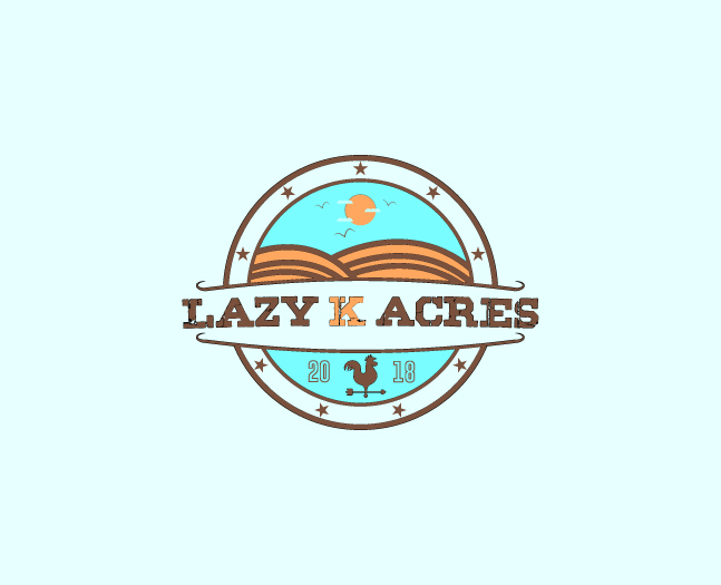
What PD said. above is at 33% size birds and cloud are gone …K is practically unreadable, lines in hill gone, weathervane is unrecognizable. There’s also some odd balance issues, like why the weathervane is off centered. The odd spacing above and below “lazy k acres” The fact that there are 4 or 5 colors. Kerning is off, why does the S look squished? Why do the lines of the “banner” for lazy k acres both curve upward at the ends? What are the weird stripes in the K for. Way too illustrated, IMO. It needs to be simplified down to its core.
2 Likes