I need a second set of eyes on my brand’s consistency. Is there a clear tone for this brand? Does it show in all of these designs? If not, which ones does it not? How would you define the style?
If the style is not consistent, which images do you feel are the best quality? (This will help me guide myself on my brand)
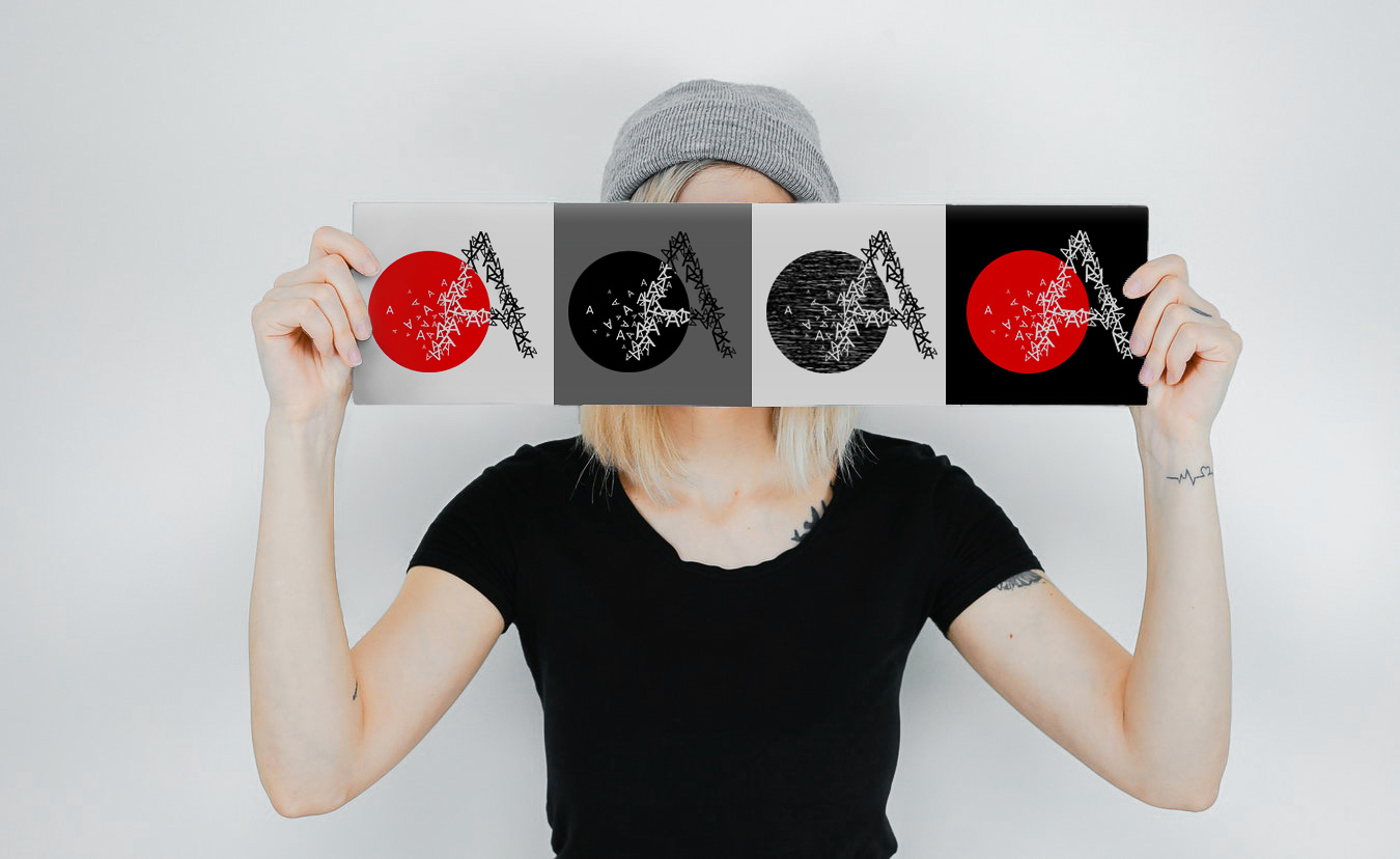
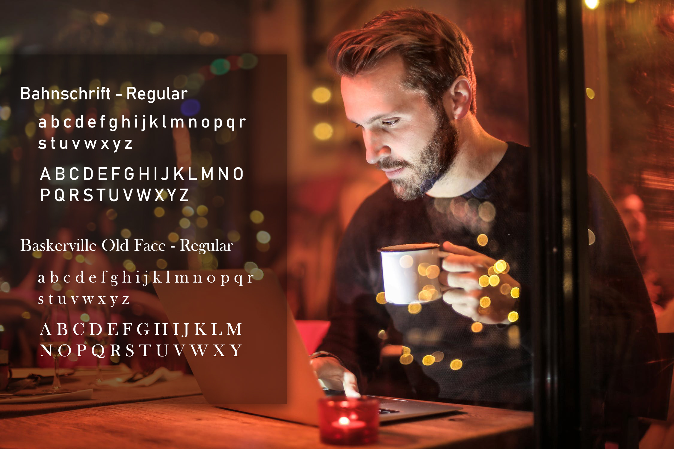
Your work is stylish, rich, a bit abstract, prone to using blacks, whites and reds, and simultaneously having an interesting mixture of tension and friendliness. There are also consistent typographic themes running throughout. It’s really very sensitive and beautiful work.
I do, however, think you’ve focused almost exclusively on aesthetics while seemingly having downplayed or, at least, not making obvious the purpose or function of your work. If its purpose is style and beauty, fine. If they’re self-marketing pieces, I’m unsure potential clients or employers will see past that to a strategy that could be adapted to successfully meet their advertising and marketing needs. And when it comes right down to it, that’s every client’s first concern.
How to define it other than that, I don’t know. Does all your work look like it belongs together? Not necessarily, but it all has your fingerprints on it.
As a designer, though, why do you feel it’s important to develop a consistent style and deliberately cultivate a personal brand? Most every good designer evolves a certain look, but it’s not usually so deliberate and calculated. It’s just the natural consequence of the same person doing the work.
I suppose it depends on your objectives, though. If you’re trying to establish a niche that appeals to certain clients wanting that certain kind of look, great. Most designers, however, can’t be that picky and need to adapt their style to match whatever is most appropriate for the paying client or employer.
If I had one suggestion, it would be to concentrate a bit more on how your work and your style are relevant to your potential client’s needs. What’s in it for them?
Wow, thank you so much for a thoughtful and thorough response. This gave me a lot of food for thought and I will produce some graphics that focus more on me being a graphic designer. Honestly I just graduated from college about 4 months ago and my school focused more on UX/UI design and programming, but I like marketing design more, so I have been doing a lot of self teaching. My brand displays have been predominantly mirrored after work I’ve seen on Behance, as that is where I have been concentrating my work while reprogramming my portfolio website.
Again, I really appreciate you taking the time to provide such intricate feedback and will definitely be thoughtful about it when I am producing graphics for my brand. Thank you!
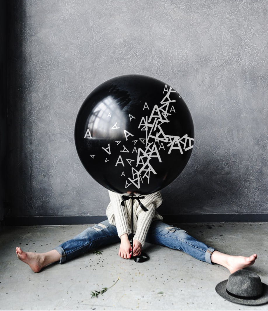
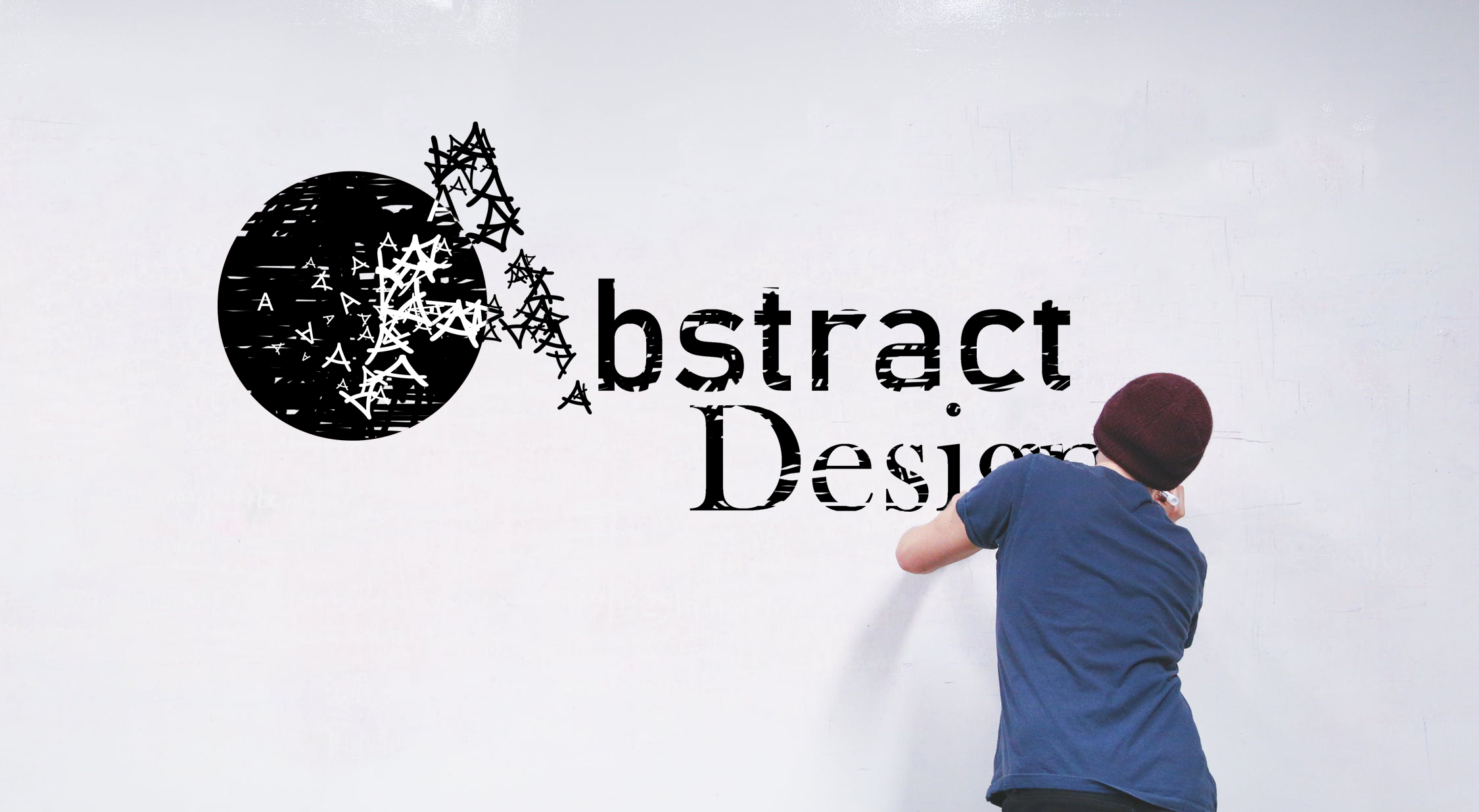
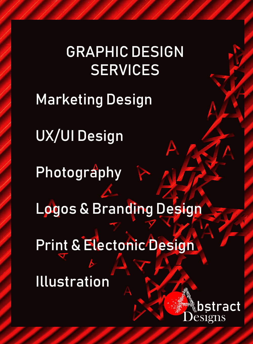
I’m having a hard time deciding if I like the compilation of “A’s” logo.
My gut wants to tell me that it’s just too busy. And I can’t stop thinking about the issues you’ll face in printing the piece at a small size. Take a business card for example, unless the backside of the card sports the logo as large as possible, I can’t see this being used in a single sided card while sharing real-estate with the typesetting of your contact info. And if printed on a mid-to-low volume digital press at that size, i doubt you’ll make out much out the compilation.
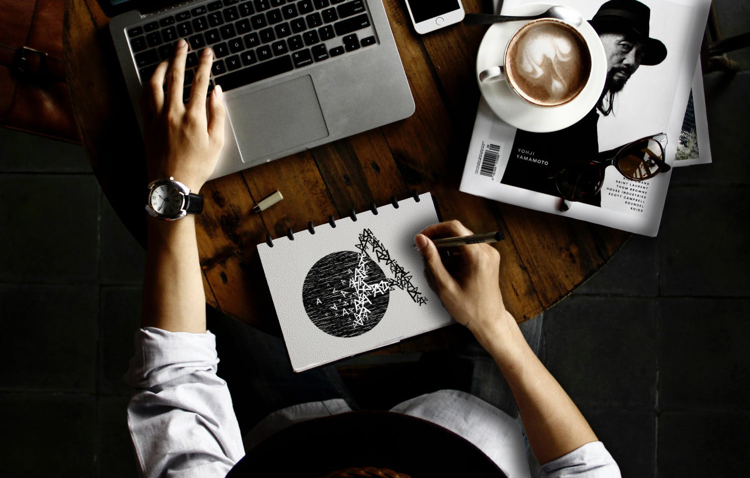
That aside, you did I fine job of imposing the branding into the photography. I like it.
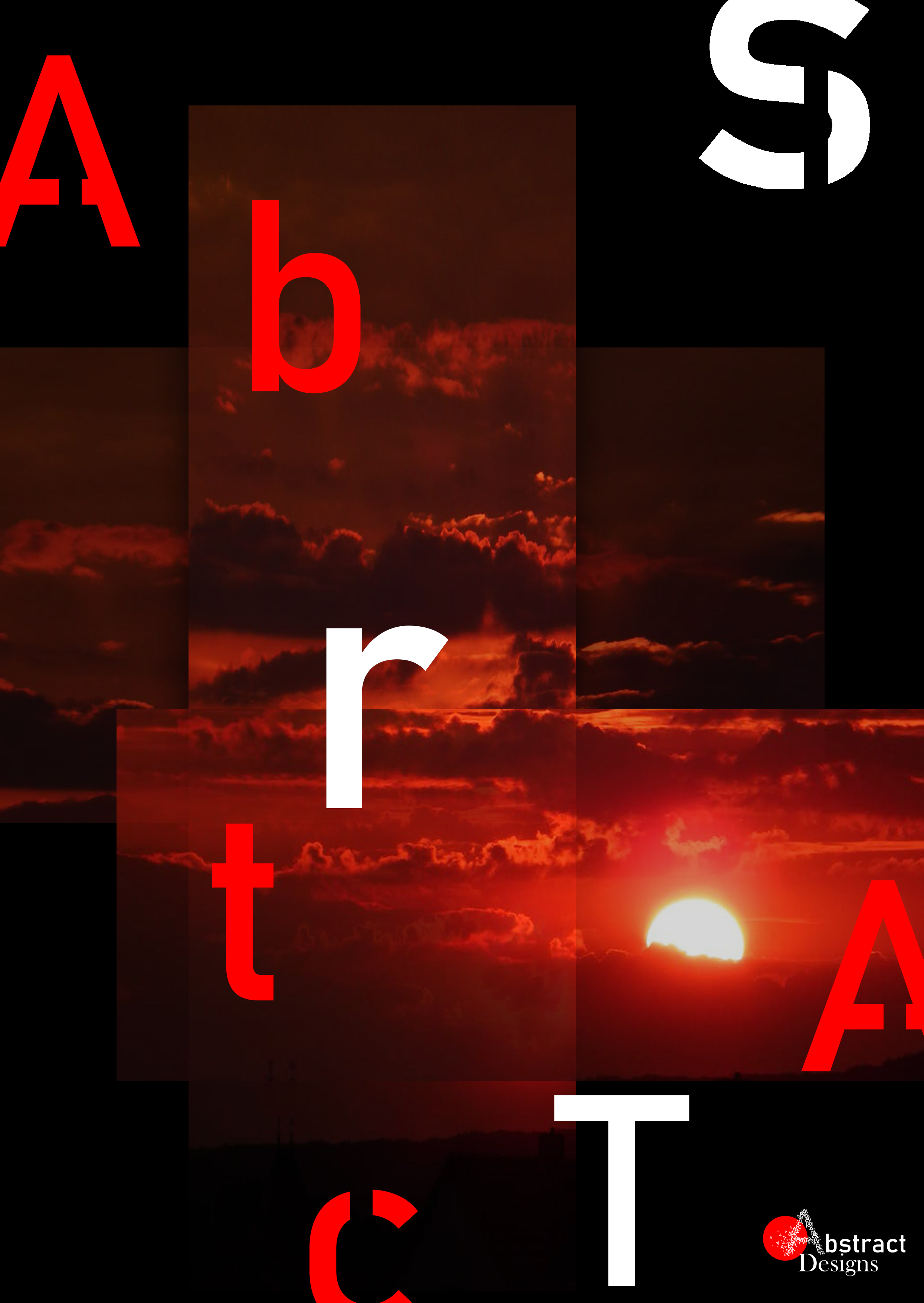
The piece on your graphic design services seems out of place me. The border seems a bit amateur-ish to me. and I don’t like the rippling gradient effect.
Also ‘electronic’ has typo. ‘logos’ doesn’t need to be plural.
I would like to see more of your work though. More ‘day-to-day’ type design work.