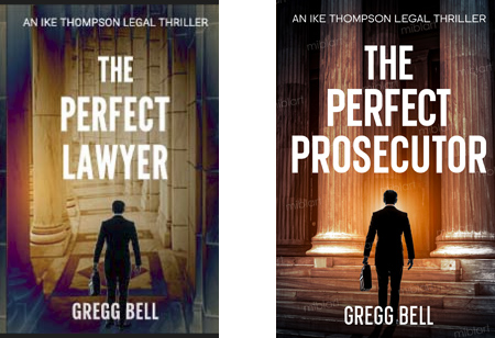
Hi. It’s an ebook cover. Meant mostly for sale digitally, although there will be a paperback as well. The audience is legal thriller readers, and for now the book will be exclusively on Amazon.I have no experience as a designer but i was able to do this cover (with a lot of your help).
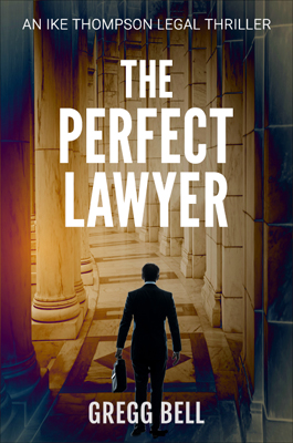
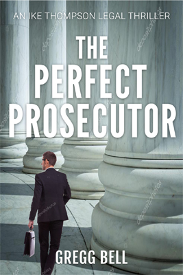
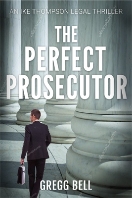
Now I’ve written the sequel and have been working with a cover designer. I felt the font size would need to be adjusted (I did the below image on the left) and the typefaces don’t match, but in general do you think the cover on the right (The Perfect Prosecutor) has potential as a sequel cover? Any suggestions are welcome. Thanks.
I agree. looking at the images without context, seemed as if you were trying to decide on the title, rather than create a sequel. Maybe keep the same lighting but use another angle or image altogether.
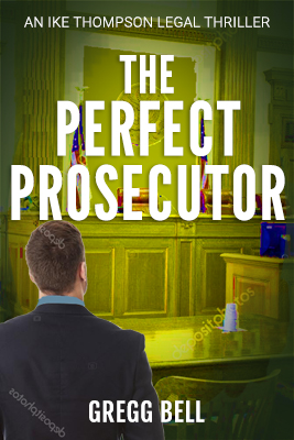
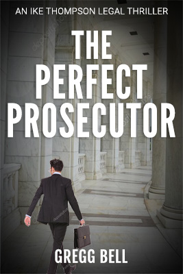
I’m still at it. I know that these covers are super rough. I just put them together in hopes of finding a concept that works. I reduced the font size on the cover for The Perfect Lawyer so it matches the font size of the sequel, The Perfect Prosecutor, in hopes of developing some branding mojo. Also I went with different coloring schemes in wanting the covers to be similar but not too similar. Any feedback is welcome. Thanks.
This is the current cover:
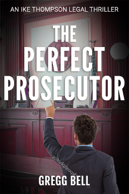
A couple more. I felt these just went more with the first cover. I know they need help. I was going to lower the figure but I flattened the image, to match up the text with the cover for The Perfect Lawyer, and forgot to undo it. So any feedback if I’m just catching more of a branding connection with the cover for The Perfect Lawyer. Also if it would help if I made the pillars etc the same brown/beige tones as in The Perfect Lawyer? Thanks.
Got another possible sequel cover to my legal thriller The Perfect Lawyer. The sequel cover is The Perfect Prosecutor. Any feedback will be appreciated. Thanks.