Just need some help centering this design on this apparel.
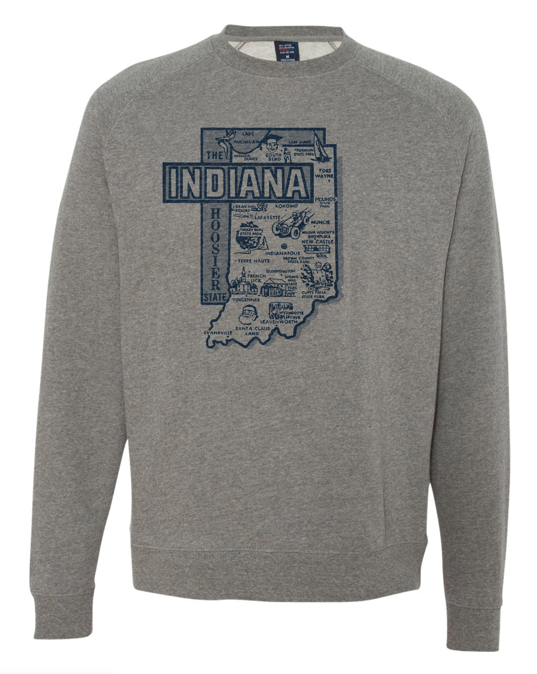
Definitely seems off centered. Even with INDIANA hanging to the side, I’d focus more on centering the generally rectangular shape of the state to the middle of the shirt.
2 Likes
Sometimes visually centred and mathematically centred are two different things.
2 Likes
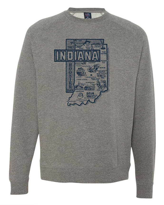
Craig’s looks centered.
Another thing throwing it off a bit is that the shirt wasn’t laid out and photographed symmetrically. It’s just enough off to make the neck appear positioned to the right just a little, which means anything centered beneath is will appear a little off too.
Thanks for the replies folks.
“2 fingers from the neck” is a rule of thumb we used in the silk screen industry
the image needs to be a finger higher.
and place a image of Pepmol-bismal or any antiacid were Urbam Champaign is located because that area got me sick on 2 occasions.