Not sure if this sort of post is allowed in the crit pit or not…
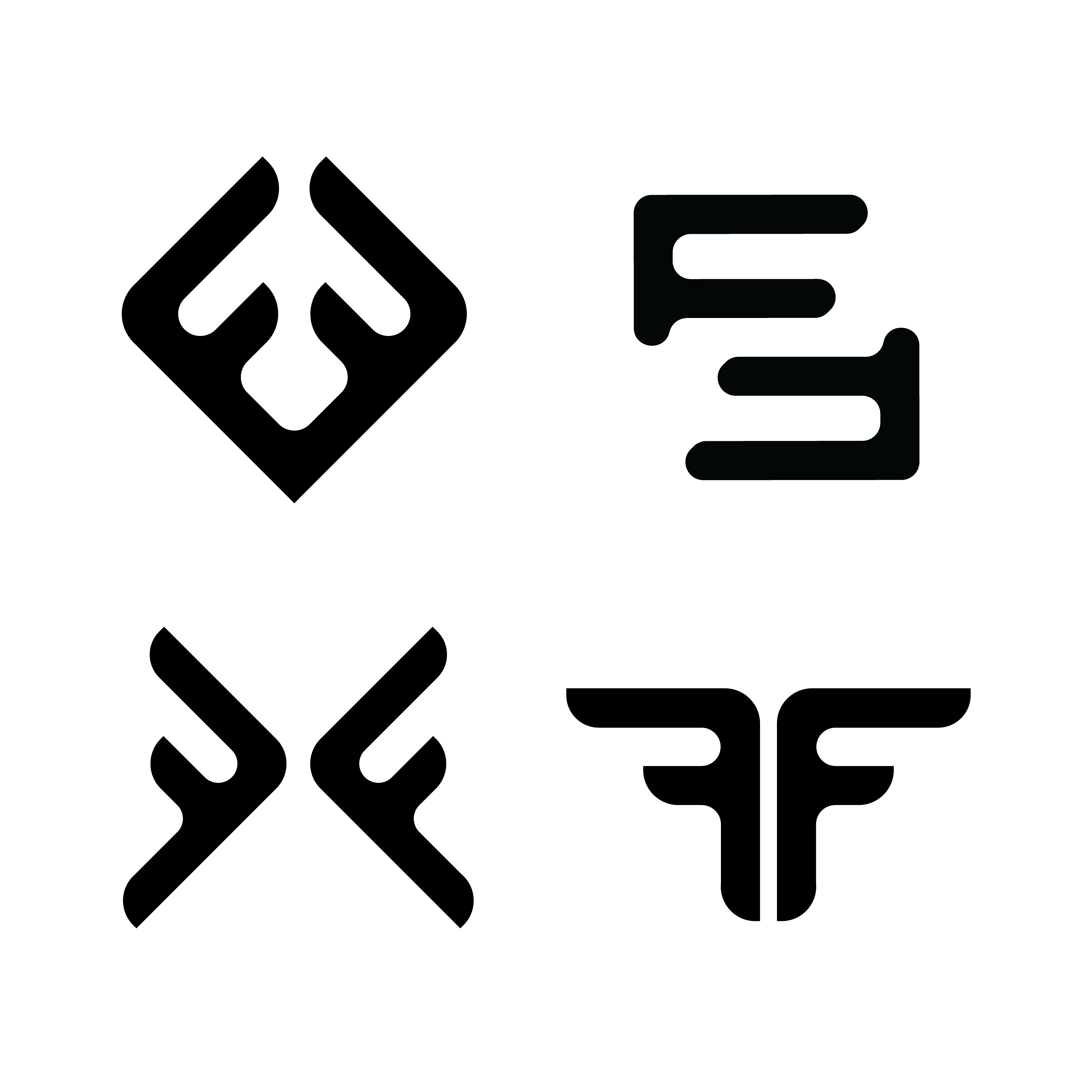
I’m working on a logo mark for a personal trainer who would also like to start an apparel line in the future. His company name is Fiorentino Fitness. His current logo is a double F mark, but it’s super boring.
Any favorites out of the following marks I’ve drafted?
These obviously aren’t finals, just trying to decide which direction to take.
The bottom four look familiar, but I can’t remember where I’ve seen them before.
The first one and the fourth one at the top look the most like an actual logo to me. I would throw out the second and third at the top. With the first one I am afraid that some people will be drawn to the negative space rather than the mark itself, which probably isn’t what you’re intending to do.
I like the curved combined with the point aesthetic you’ve got going on with some of these logos. That reminds me of a blade and I guess can be somewhat related to fitness/toughness.
1st 4, Down-Right, I like it the most, it’s like coming out as wings or like an animal with horns, which pretty much suggest “strong” for fitness, you know.
If he’s wanting to start an apparel line, it really needs to be distinctive so it won’t appear that his mark (which is super important if you’re competing with Nike or Under Armor) has been copied or has great familiarity. (Not saying you copied this, just saying an apparel mark really needs to stand out.)
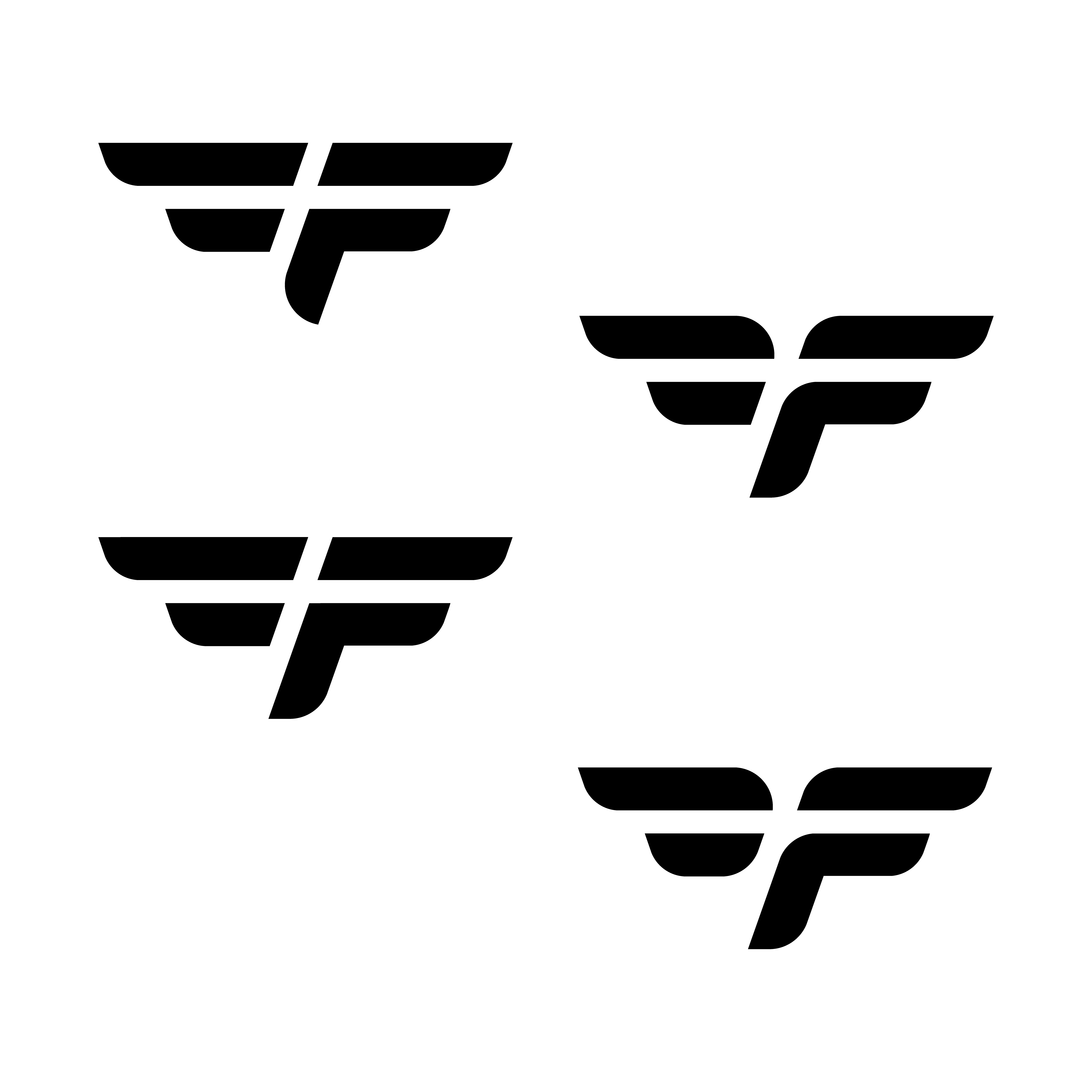
Yo I love the bottom four. They really do it for me. If you could contact me at desmanray@yahoo it would be much appreciated. I’m interested in that logo