Wow. And I thought MA was bad. LOL.
I just assumed on the format I guess because I made a lot of those ‘inserts’ thingies during my very first internship a long time ago. They were for some drink mix company that doesn’t exist anymore.
You have the first legally licensed distillery in Utah located in Park City.
High West sells some darn good bourbon whiskey (so I’m told. I don’t like liquor that strong.) They serve on the premises.
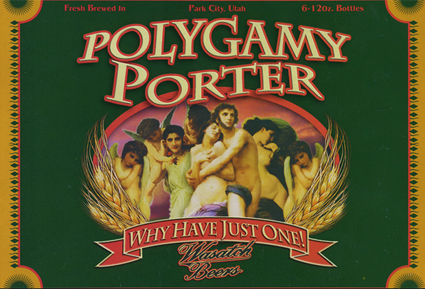
We also have some really good micro-breweries here that make some very good beer — Polygamy Porter, made by Wasatch Brewing being one of my favorites.
There’s a distinct cultural divide here in Utah between observing Mormons (who, more or less, run the state) and liberal non-Mormons or non-practicing Mormons that dominate places like Salt Lake City and Park City. The anomalous distillery and good micro breweries are sort of a product of that divide.
I live right on the edge of Salt Lake City, with Park City being just up the canyon. This positions me squarely in the more liberal, mostly non-Mormon enclave of the state. If I moved to the south end of the valley, it would seem the cultural equivalent of moving to a foreign country. I’m exaggerating slightly, but not much.
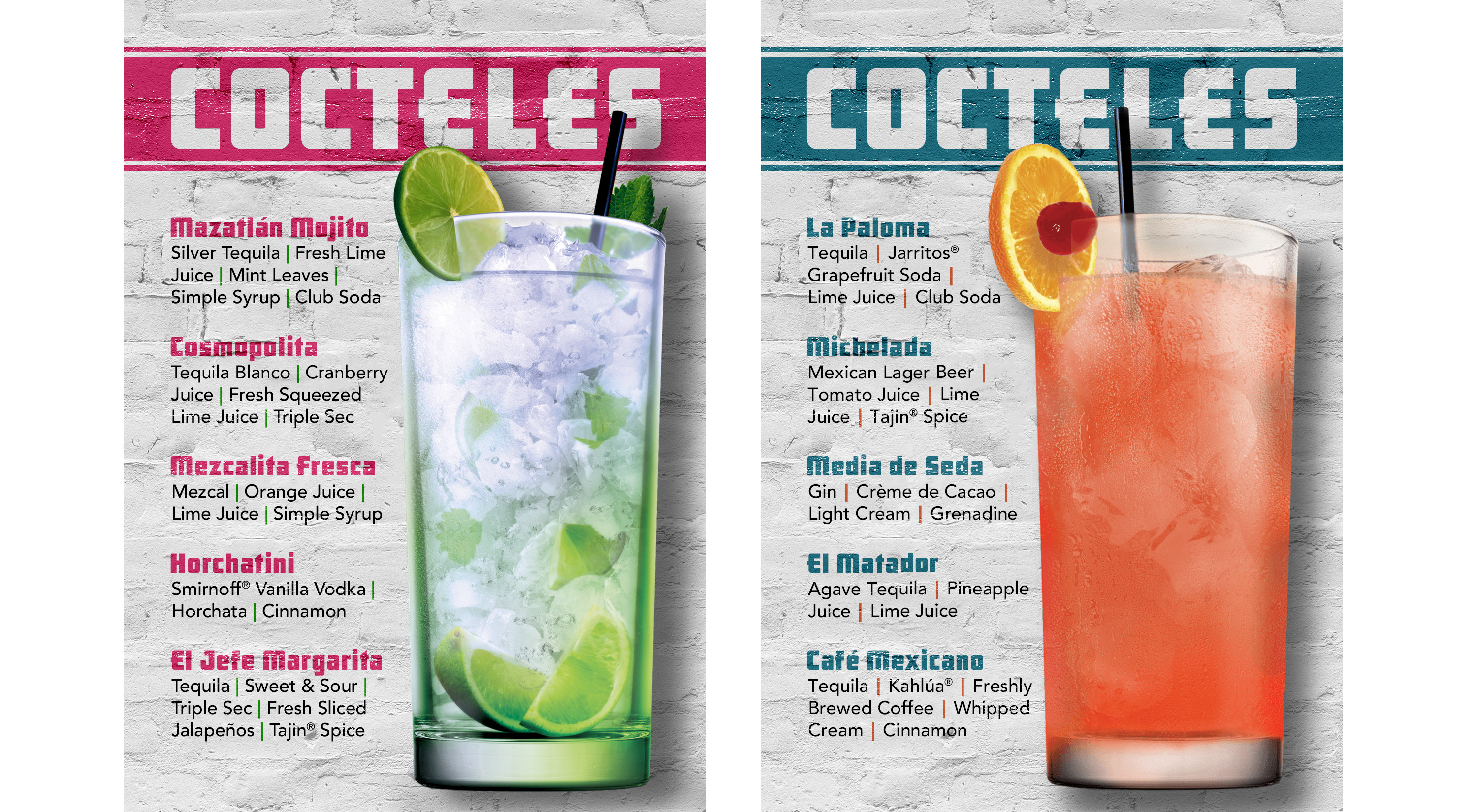
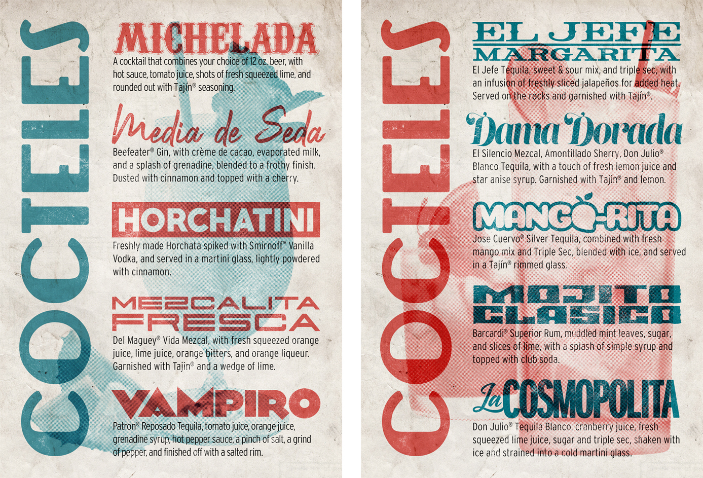
No ones had a chance to order a “Mazatlan Mojito” yet.
The client has put the drink menus on the back burner, which gave me more time to tweak the design.
I was going for the typography and advertising you see painted on walls in Mexico, but I felt the lettering was still a little too crude and rough. I wanted just a hint of elegance. Not to mention, I feel like the heading and drink names just looked “typed” over the background despite the blending.
Here’s the changes I’ve made:
@creativeboost
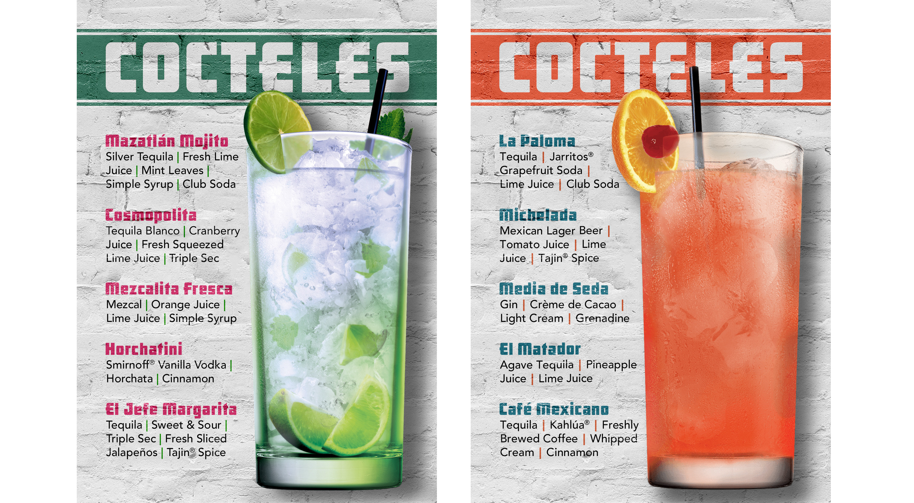
Thank you! This is with the green title, and headings in red. I’ll try to go back to the previous design and apply that same recommendation and see how that looks as well.
@MrDangem
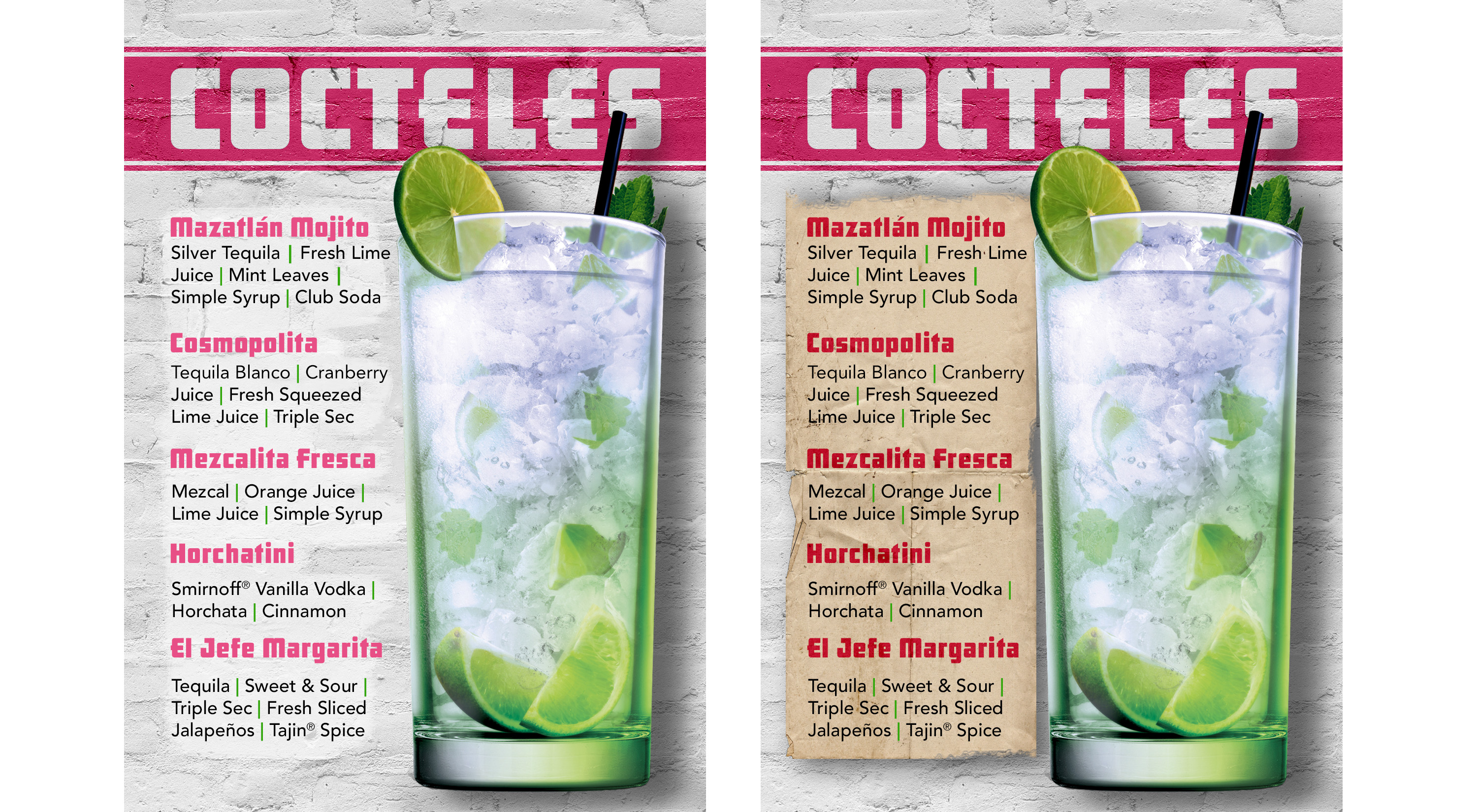
I’ve gotten some constructive criticism here, and also from the print shop we’re getting these done from, that the text gets a little lost. In the meantime I’ve made the font slightly bolder (Avenir Medium), and enlarged it from 7.5 to 9. I also experimented with your suggestion to add something behind it. I don’t know if this is what you had in mind, but this is all I could come up with. I’ll keep playing with it though.
In regards to Utah, I heard they had some alcohol restrictions, but I didn’t know how seriously they took it!
And I’m looking at the text, and the font still looks too fine. Maybe another font that allows slighter bolder variations. Futura has more options that way, so maybe I’ll give that one a try.
Personally, I don’t think Futura has the right look. It’s too Art Deco for something that needs to have more of a Mexican look. Besides, it just has all those big, roundish letters that make for uneven-looking text. I think what you have already works quite well.
I probably wouldn’t include those backgrounds behind the text on your last set, though. They’re not really needed, add extra complexity and come across as attempts at a workaround solution to the problem that isn’t really there anyway. If anything, I might just lighten the background area a bit, but do so in a way that doesn’t look so obvious.
Thanks, I guess I’ll stick with that font.
I agree that the Futura is very conspicuous for the reasons you mentioned. I’ve just got into the habit of using it lately because it’s the only decent-sized font family I have next to Helevetica. Everything else I have is from DaFont and the plain-looking san serifs usually only come with 3 font variations at best.
I wasn’t happy with the original grey background, as I felt it was a little depressing. I also wasn’t comfortable with using an obviously faux texture like brick on a flat surface. I was trying to emulate the style of painted lettering on walls you see in Mexico but it just felt weird to do that on such a small surface.
There’s a lot here that I like. It really has lots of personality, and if that personality matches the personality of the bar/restaurant, I think you have a winner. I’m a little unsure of the background images and how they impair the legibility of the text, but if the restaurant has that kind of layered, slightly chaotic, gritty personality, it might very well be just right.
I agree. This is great, but the drink images are affecting the legibility. Consider making them a bit more transparent or removing them completely. Great work with the drink name typography!
@Just-B @SurfPark
Thank you both. It means a lot.
When I finally came up with this design I was so happy. Then I noticed the legibility issue with the red drink background and I was like, “Noooo! WHY!???Do I have to really rethink this whole thing yet again???”
Surprisingly, when printed out the legibility isn’t an issue with the text descriptions, but on screen it looks bad.
It was a pain in the ass to come up with a unique identity for each drink name AND have them all match up width-wise. Ugh.