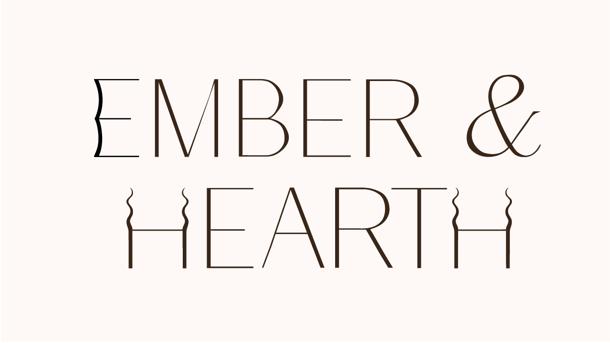
I’m a beginner and I made a logo for a fake company called Ember & Hearth. It is a premium luxury minimalistic candle company that specilizes in candles that make you feel cozy. They are minimalistic scents and pride themselves in being eco-friendly, high quality ingredients and ethical practices. Audience is adults aged 25-45 who appreciate luxury home goods and have an affinity for eco-friendly products. They seek high-quality items that enhance their living spaces and prioritize wellness, self-care, and sustainability. Please critique my logo. Thank you!
I did also create a lettermark/favicon so it can work for smaller sizes such as social media icon.
I like the font you chose; it has an upscale feel. But I think the overall execution is lacking. I’m not sure why the E in EMBER is bowed in like that, the ampersand seems a little disconnected in this layout, and the Hs remind me of antelope horns. Spend some more time in development and show us 10 different options. Refinement and culling are huge parts of logo design.
I didn’t even notice the horns before. The E is bowed to look like sleepy eyes. Thank you for your critique.

