This is a quick project that needed a quick turn around. I like the idea, the execution could be cleaner.
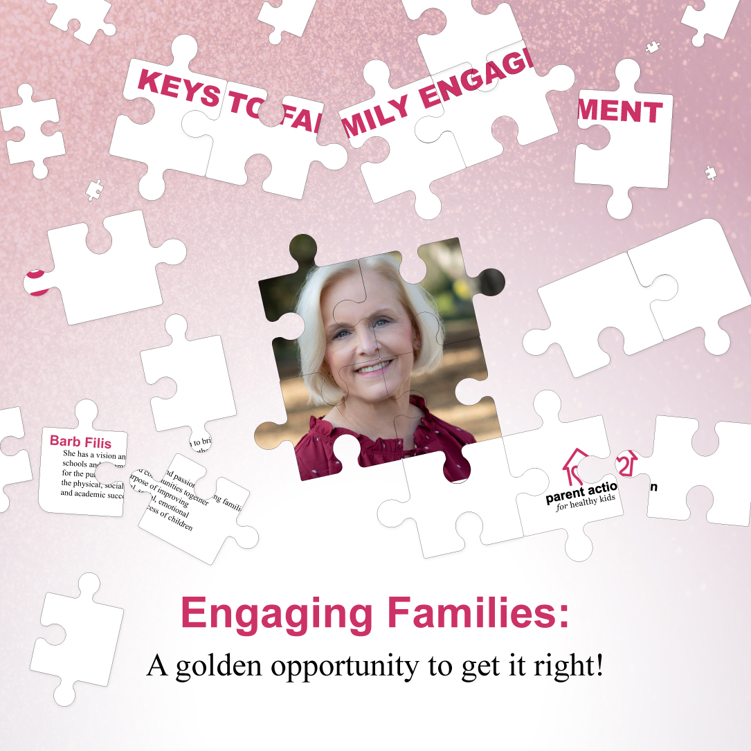
I definitely did something slightly different with the type. The idea behind it is that this lady is a motivational speaker.
My explanation to her was: "These may be a little ambitious. The idea behind it, is the people you are building connections with are putting together ‘a puzzle’ which is their path to learning and engaging with educators and parents. Their thought process is represented by the puzzle pieces and those pieces that are more attached are the ideas and messages you present them through parent action coming together and ‘clicking’. "
I think the jigsaw puzzle concept is great. It’s clever and fits the subject matter.
I likely wouldn’t break up the headline or, especially, the logo and bio. Instead, I might be more inclined to treat the layout as an actual jigsaw puzzle where most of the critical elements of the puzzle layout had been assembled but with pieces here and there around the edges not yet in place. I might change the background to resemble a table top. I’d also reconsider the use of magenta as the primary color. I’d definitely remove the tiny, miniature puzzle pieces.
Your two headlines both say either “Engaging” or Engagment". If it were me, I’d make one of the headlines clearly dominant. I might also change one of the Engage words to something else that might better connect it to the puzzle motif. There’s an opportunity here for some clever text, and I think more text is needed to explain what is being promoted, why its being promoted, why it should be of interest to the target audience, and what the call to action might be.
I tried the table top, and it just didnt look right which i though was odd. So i figured I would ditch the realism attempt and just have fun with it, hence the smaller puzzle pieces.
I am afraid I am going to risk annoying both you and Just-B here, but for me, the whole jigsaw puzzle is a real non-starter. It tops the charts for most over-used visual cliché. I agree that in this case it is at least relevant (but that’s why it’s a cliché; it’s relevant to a thousand things), but it just comes across as hackneyed and tired, I’m afraid,
It is such a hugely over-used visual metaphor. Because it is such easy go-to for anything involved with ‘fixing problems’, many many others before you have done just that.
Visual clichés can be useful sometimes for getting an idea across quickly, but it is always better to turn them on their head a little if you are going to use them. If you do, use them sparingly. The last thing you want people to read from this, subliminally, is that the service is tired, obvious, predictable, dated.
You need to engage with people on a much more emotional level, rather than in a one-size-fits-all way.
The recipients are people with anything from family issues to family trauma and almost certainly with some level of distress, looking for support. You need to engage with them at that emotional level, rather than in some abstract way. They need to feel that this person/service will understand, be empathetic, etc, etc. You need to foster a sense that here they will find the help they need, whilst being sensitive to their vulnerabilities.
My suggestion would be dig a little deeper. This smacks of stopping at your first idea.
Hope this helps.
I agree the idea could work and that the execution is the main problem.
Disjointed content doesn’t work too well.
And the one puzzle piece at the bottom of the photo is one of those, “that doesn’t go there even though it fits” kind of things.
Lately I’ve come to associate puzzle pieces with Autism Awareness,mostly through their ribbon campaign. That association may be regionally based though. Don’t know.
It is too hard to read. I should be able to read the copy and understand the content immediately, and the graphics support that content in a secondary role. I’ve seen some more artistic designers go this route, but I question the effectiveness. Ask yourself how willing your audience is to spend time and decode the message.
Some things to fix immediately:
- Don’t break up organization logo. This implies the organization is fractured.
- Don’t break up speaker’s bio. This implies the person isn’t legit.
- Don’t break up an important headline (which is marked as important since it is top center).
- Give me a call to action. How do I register for this event? Is it free?
Some things I’d suggest:
- Have a background that contrasts more with the puzzle pieces.
- Use a central image of a family, since it supports the topic more than the author’s photo.
- Move the author photo and bio to a different location. The author may be enough to attract attendees if this is only meant to for industry professionals, but if this is a public event, consider using stock photos of families and children to catch the eye.
- If that organization “Parent Action for Health Kids” adds authority to the topic, you’ll need to better showcase this endorsement.
- The puzzle motif is interfering with your message. Step back and include all the copy you need for this piece without the puzzle. Slowly add them back in where possible.
1 Like
I’m not a fan to be honest.
As many have mentioned, the text / logo should not be broken up as it makes it really hard to read. I’d also recommend checking out some different fonts as you’ve pointed out.
Conceptually using a jigsaw puzzle seems logical to demonstrate the point, however I don’t think it works in most cases and the pieces just end up looking flat and lifeless, which detract away from the design overall.
I too would also like to see a call to action / phone number / website / date otherwise my eye isn’t being drawn anywhere and I don’t know what I’m meant to do with it.