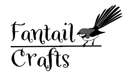
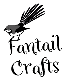
Hey Guys - I’m working on a logo for a small independant crafter. She’s doing a bunch of stuff, so has gone with a local bird (the Fantail) as her craft name, rather than anything specific on what she produces. She’s also keen on a particular font, which I’ve used.
I’ve come up with some ideas, but would really appreciate your thoughts on what I’ve done so far.
Do any of them work any better than the others? Am I going in the right direction with the bird?
The bird is way too big in the last one. It should probably be simplified/stylized more, and I think that it would work well somehow sitting on the lettershapes.
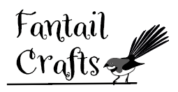
I think you have a nice first attempt here, but it needs some work.
To my eye, the illustration style you used for the bird doesn’t mesh with the style of the font. The font is playful, and the bird is clip-arty looking. Spend some time working on the bird and try to draw it in a way that’s not so literal so it will work better with the type.
Spend a little more time on the type, too, particularly the aft in Crafts. Try to get the af and ft to blend better. This will likely involve customizing the letters so that they don’t bump into each other or so that they’re tied together in a more organic way. The dot on the i is to close to the tail on the lower case l. Bring it down closer to the main body of the i. Watch your kerning – especially in the ra in Crafts.
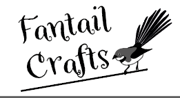
The more I think about it, try a silhouette of the bird – that might look pretty nice with the font.
I like the feel of the top left composition, but it all needs refinement. If you’re going to stick with that font, tighten up the Fa pair, and fix the placement of the a in Crafts, because it’s breaking the shape of the word in an unpleasing way.
In addition to from Steve’s good advice about the stylistic mismatch, I’d say the bird’s shape is unflatteringly bulbous. I realize there are real birds with similar proportions, but the “fantail” is supposed to be the star here, and it’s weak compared to the heavy anchor of the bird’s girth. Give the poor fellow a neck. In fact, next to tail feathers, the curvatures of a bird’s head and neck are often their most distinctive features. And the tail needs work too; it should start a bit lower and farther aft, with more density near the nexus. Right now those feathers just look like a lineup of quick calligraphic strokes, rather than the vital aerodynamic steering mechanism they are for real.
Dammit - I spent ages on that bird.. LOL! But I hear what you’re saying @HotButton - tbh the tail was the last thing I did and I was flagging a bit. I do need to make it more of a feature. I like what you’re saying @Steve_O about the mismatch between font and bird. I’m wondering if I do convince the client to change the font.
I was hoping to have a font she could use with or without the bird, but maybe I need to abandon that in order to tighten up the kerning / placement. I’ll have a play with that first.
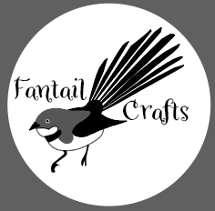
@praxis I did have one version where I had the bird on the letters, but the only one I felt could support him was the F which meant he was a bit unbalanced! But as a concept I think it works well. I guess that’s where I was going with the first image.
Heh, if it’s any consolation, I’d say you got his posture right. Authentic, but not static…looks like he’s about to do something, and that kinetic energy is a good thing.
I would say the client doesn’t know much about great looking type if she wants that font.
Seeing as you are the designer, id probably recommends she ditch that font and style. If shes really keen on that crazy, goofy, ‘every fun thing at Michaels or Hobby Lobby’ kinda look. I’d definitely try to find another font. Especially one that complements what you’re going for in the bird.
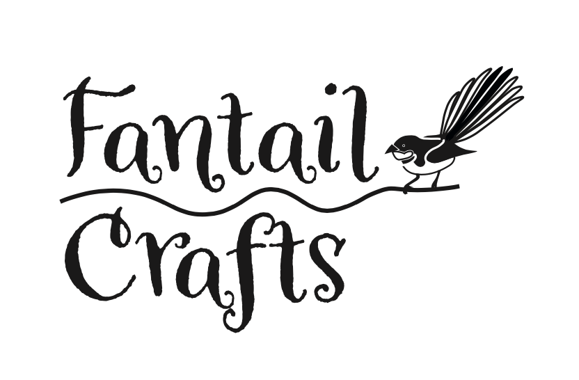
So we’ve come up with the following - using the font she liked but properly spaced. The bird in black and white with the tail a little better rendered. I’ve sent it across to her, but I thought you may want to see the final product. I’m not 100% happy, but she’s pretty chuffed..
Thanks for posting a follow up. Many times, this group takes the time to make thoughtful comments and the poster disappears or doesn’t post follow up work. You made number of improvements over your original iterations. Glad to hear the client was happy.