Hello everyone
Being a 2nd year graphic design student, I figured that designing a business card to network, by having something to hand out to potential clients would be greatly beneficial for kick starting my career.
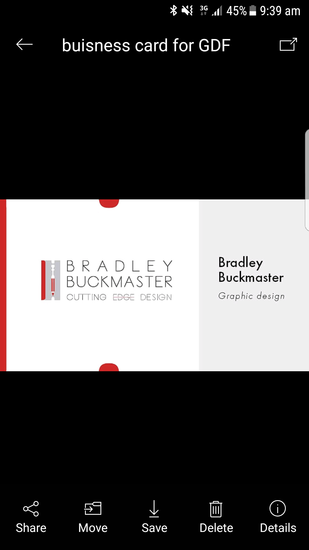
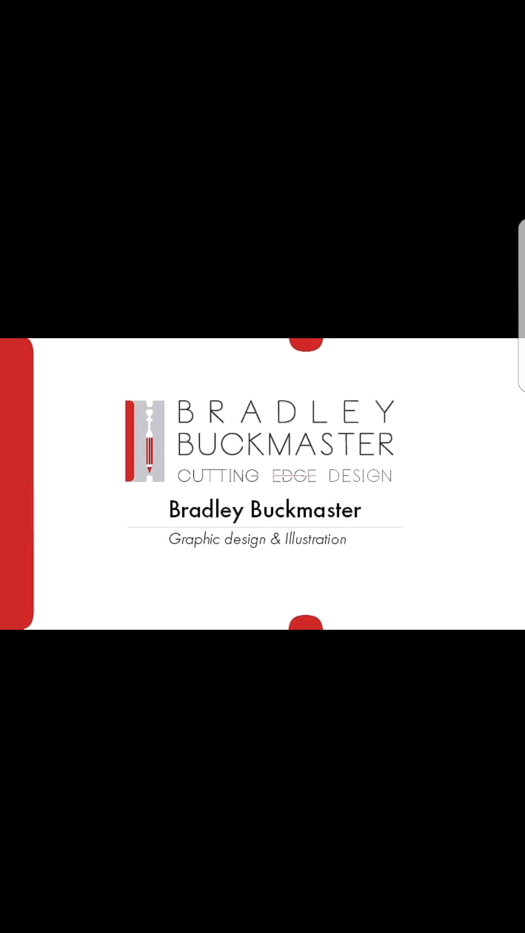
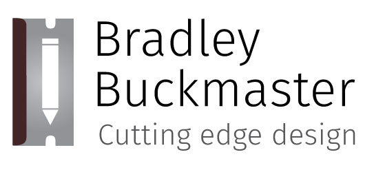
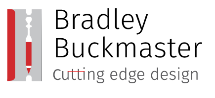
So I come here in search of advice. I have two concepts as shown. Please take note this is not the final design, as my contact information is not yet present on the back of card. In both designs, I used the suttle circislr shapes from the top and bottom of the razor in my logo to draw the viewers eyes towards the centre of the card.
For the first two buisness card, My contact numbers and address was going to be directly below my name, and of the second card, that info on the back of the card.
Before I say anything, I like the general look, but I also see several picky little issues.
Thin stripes that bleed on the edges of printed materials are subject to trim problems. If the card isn’t trimmed exactly right, the stripes can get thicker, thinner or appear to be noticeably crooked.
I probably wouldn’t be inclined to space out your first name like you’ve done just for the sake of justifying it with your last name. It’s pushing the limits of it looking natural.
The typeface you’ve chosen for your name is a little clunky. I’d be inclined to stick with the Futura you’ve used elsewhere.
Why is there a thin red line in the word EDGE? (You won’t always be there to answer that question when people wonder about it.)
The kerning on your name and tagline needs quite a bit of work.
The round shapes at the top and bottom of the card probably ought to be round, otherwise they draw attention to their failure to be so.
The little pencil in the razor blade is an interesting idea, but it’s so small that I’m unsure if it will be legible once it’s printed. The thin lines in the pencil could easily fill in from dot gain.
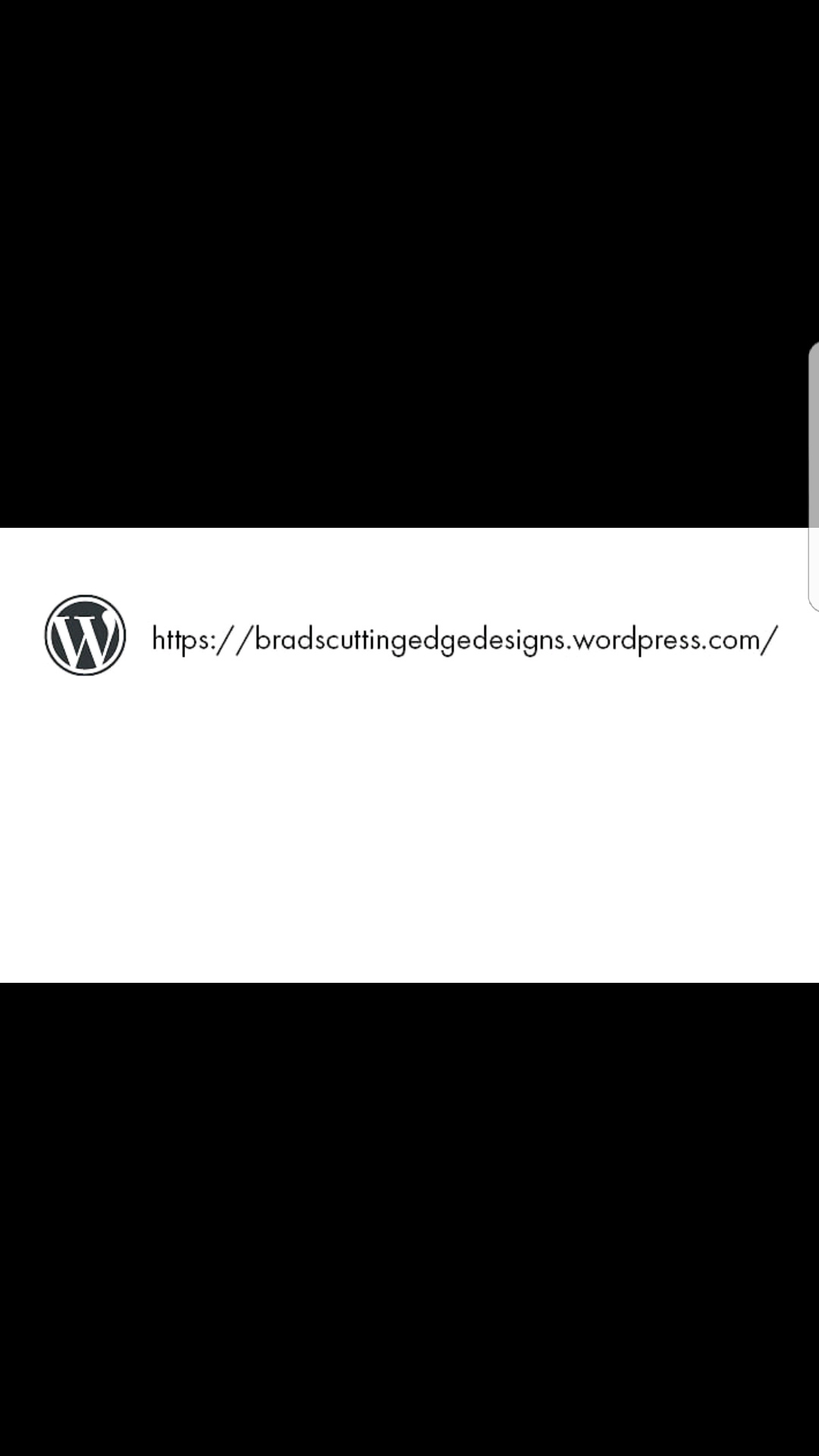
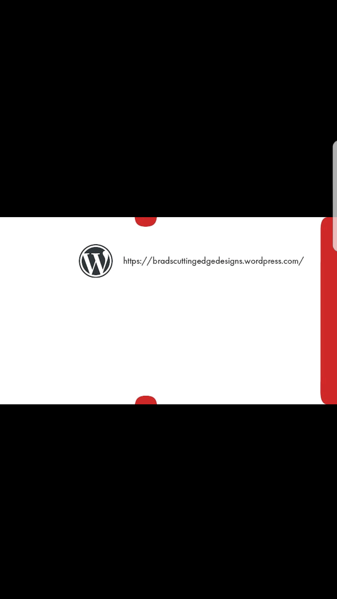
Why are you using the Wordpress logo on the back of your card? I see no reason to draw attention to the company hosting your website.
I’d kern the space between the two slashes in https://
Finally, I’m not so sure the razor analogy works when applied to the entire card. The red accents on the edges look nice, but to me, they don’t immediately strike me as features from a razor blade.
Thin red cut marks and blood on a razor…
Bleeding edge designer?
Work on getting the knowledge you need to offer your future clients a product that will enhance their bottom line. Until you know how to do that, a business card is a little bit like putting the cart before the horse.
I would advise that you get a .com address or at the very least a free customized bitly address.
As the others have said, remove the Wordpress logo from your card.
I wouldn’t include your home/physical address but definitely your phone number and email.
Is Cutting Edge Design your business name? Just for fun for reals? Have you or will you register the name? I just want to know how tied to the name you are before commenting on it and the design. Blood and razor blades aren’t exactly what clients are looking for especially for a young, inexperienced designer.
‘Cutting edge design’ is the tagline I was intending to keep, despite me not registering the name yet. My logo has been chopped and changed quite a number of times, as the original logo before this one was created for my exhibition last year. That particular tagline appealed to me because I wanted something a little less generic, if that makes sense? As I have’t done any real life client work, my logo hasn’t been spread around the industry as of yet. My whole concept of having the razor blade as the graphic is based around the tagline, as a razor blade is object typically associated with a cutting action.
It’s interesting how the red’s interpreted as blood, and the reason I placed the red in the logo was to try and represent my creativity that is produced in my work.
The red colour the razor is suppose to try represent creativity, as the colour of the razor is quite neutral. I also wanted to create some contrast
Also, just to make sure I understand what ypure saying in the last paragraph, you’re saying I should be aiming to obtain the knowledge to make my logo & business card give my future clients the confidence that I will deliver a product that enhances there bottom line
Since you’re still a student, my suggestion is that you wait and design your logo closer to graduation.
Because (1) you’ll be bringing more design skills to it and (2) hopefully you’ll have learned to consider your target audience when making graphic decisions.
I have taken into consideration your feedback and came up with these potential final logos. After undertaking some testing in the form of surveys for each logo, one consistent answer amongst the three was that the red created the connection blood, and not all the answers when they were asked what profession these logos are related to was graphic design/design. After analyzing these surveys, I basically increased the size of the pencil to have the object relating to design easier to read, as well as dulled down the tone of the red from that shared with blood, but still having the trait of creativity expressed in my logo. The first two have taken into the feedback from the survey, and the last logo (which I know now has problems with it) is one of the three I placed into the survey.
Do you reckon that I am still completely missing the mark or is it a improvement from my previous post?
To tell you the truth, I’m just not a big fan of using a razor blade. They’re dangerous, slice things open and make people bleed. There’s a slight recoil factor that might just be me, but I doubt I’m all that unique in that respect — especially when you combine blood red with the blade.
If you do stick with this direction, that little red slice forming the crossbars on the double t is a picky little detail that just draws attention to itself. I’d definitely remove it. Possibly not a big factor, but how will you create a version of any of these in just black (no grays).
I’ll also suggest tightening up the tracking on your name. Loose tracking on lowercase rarely works.
I agree with this, and believe that most people would viscerally react similarly. Unless, the target market was blade manufacturers, knives, machetes, chain saws, etc.
I realize you’re still a student, but maintain you should consider the target market for any graphic design project.
It’s more important to design for them, than to design to express yourself. I hope your program will emphasize this, because not all of them do.
Oh, I dunno, I know my share of “bleeding edge” designers (which is a step beyond “cutting edge”) for whom a razor logo would be quite apropos and in “show business” it might even be considered cool.
It isn’t so much the razor, as what you do with it in the logo.
This one is fairly static and boring and not dangerous at all. Certainly doesn’t imply cutting anything.
I would ditch the idea of “cutting edge” and just create a calling card for yourself. I don’t believe that a second-year student with no experience is going to be cutting edge, and before I even get to see your work, I’ve raised the bar that you must meet in order to impress me. I literally thought to myself, “You’re cutting edge? Let’s see…”.
That being said, here’s some critiques on your original design.
Unless you’re working with multiple people under your brand, I don’t need to see your name twice on a business card.
I agree with what everybody said about a razor blade not being the way to go. However, if you were to ignore all that advice…
2a: I would at least rotate the border elements of the card. When I look at the icon you created, the cutting edge of the razor is on the long edge of the rectangle, but your card puts it on the short edge. This is a missed opportunity to at least mimic the proportions of a razor blade.
2b: You could go the extra mile and actually cut out the nibs and further make your card resemble a razor blade.
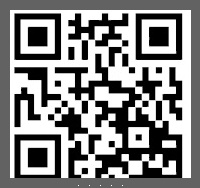
You should separate the designs from each-other so that you can tell what they would look like one side at a time, I like the idea behind it, but the word press logo dosen’t do it much justice for the design. I like the idea that another user had of using a qr code, it would make your card stand out more to others making them curious of what you have to offer.
Hi guys
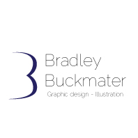
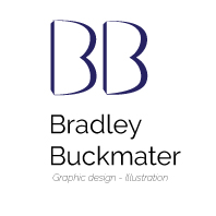
This will hopefully be my last post regarding seeking feedback for the personal logo I’m designing. So taking into consideration this overwhelming advice of the razor blade icon perhaps not being suitable to the clients needs, I have ditched the razor blade and changed my tag line to a more standard description. I have three concepts (colour choice is not decided yet) that I would really appreciate peoples opinion on so I can get it finished sooner than later.
The concept behind the first logo takes advantage of my first & last name starting with the same letters, and this is done by creating two B’s in one. (The first B is created via negative space, and the stroke creates the second B).
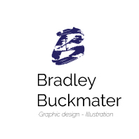
The concept behind the second logo is similar to the first one, however there are two separate shapes to represent the two B’s, with a added shape behind each letter to bring it forward off the background.
The second concept is very similar to the first one, however the trait of creativity was sort of lost in my opinion with the uniform lines in the first logo. Wanting to create that connection to art and design, I placed paint stokes on the inside B to break up the static nature of the logo
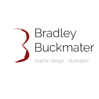
You probably don’t want to hear this, but the first thing I see in your new logos are a butt and breast. the red one especially looks like a top view of a breast with bra. As for the last one, when you reduce the size of it, it may get a little muddy and hard to read.. definitely the “Graphic design - Illustration” portion will be impossible to read for all 4 designs.