I am an architectural draftsperson by trade, but have started making a logo for my own side business and would be keen for some feedback. The business name is Oloid Studio, and the oloid shape is incorporated into the logo.
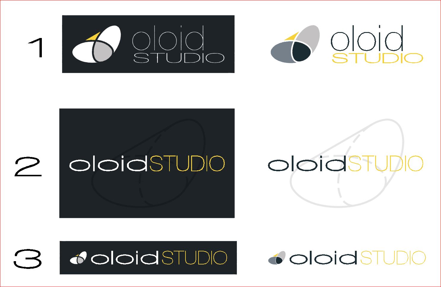
A few different concepts below, with the inverse logo side by side.
Hey. I feel that in the first logo, the black is kind of overpowering everything considering that the text is really thin. The one with the white bg is good. I think my favourite one is the second one with the white bg.
The typography is working. There isn’t enough contrast. Studio is very geometric, whereas the Oloid looks just off. I understand you’re probably trying to match the type to the oloid shape, the idea is there. its just not functional
Thanks for the feedback Poojana, I agree the dark background is tricky with the thin font, it used to be a lighter grey/blue, might need to revert back to something like that and see if it helps. I do love a thin crisp font, but it does make it tricky to balance.
Thanks Billy, i’m not happy with the font for Oloid, looks too squashed, not intentionally trying to match the shape either. I swapped the fonts around from the original logo (top one on the image) but something isn’t quite right. Appreciate your comments.
The top right and bottom right have the most promise.
BUT,
Being an architectural draftsman, how would you install lighting into those skinny-stroked letters should the client (you) want to backlight, rear light or halo light those letters?
The logo would also have to get VERY large in order to dimensionally cut or fabricate those skinny letterforms.
Word of warning on skinny letters. They are a trend. Trends… End.
Thanks PrintDriver, my problem is I am actually working on my logo in AutoCAD for now as it is more familiar to me than anything else, and I am zoomed in too close, so the small font isn’t an issue when I am working on it I need to get my font onto some protein shakes and beef it up a bit.
Be careful about “beefing up” a typeface that is designed to be skinny. Adding stroke weights or offset paths may very well destroy the aesthetics of the skinny version (such as they are.)
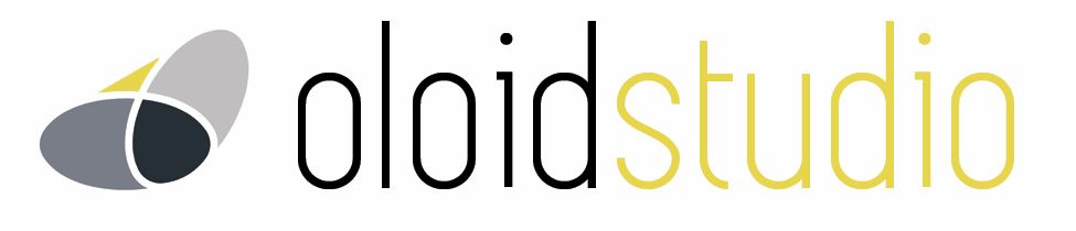
Really appreciate all the feedback everyone. My second attempt, cleaning up the font and making all lower case. I feel this is heading in a clearer direction now. But still don’t hold back on the critique.
One concern I have is the reference to an esoteric geometric shape. The logo only makes complete sense if one knows what an oloid is, which I’m guessing is a small minority of people aside from draftspersons, like yourself, and mathematicians (although I could be wrong about that). If this logo was for your drafting business, it would have more logical and pertinent underpinnings, but for a side business more aimed at graphic design, the tie-in gets a bit more strained.
I’m not saying this is necessarily bad. Sometimes it’s a very cool thing to have a hidden meaning in a logo that surprises people once they see it or it’s explained to them. What I’m really saying is to be aware that most people will simply see an unusual shape and make judgments about the logo based upon the aesthetic qualities of the unusual shape, for better or worse, without ever knowing there’s more to it than that.
Thanks Just-B, really appreciate your thoughts. I agree it’s a ‘little’ vague, but that’s the way I want it in a way. I am running a side business doing drafting work, but I also didn’t want my business name or logo to restrict me to only my drafting work. Given that it is a side business, I could make it into whatever I wanted.
Unusual things create interest, and it gives me the opportunity to be seen as not just another self-employed draftsperson, otherwise “MS Drafting & Design” would have been a better fit