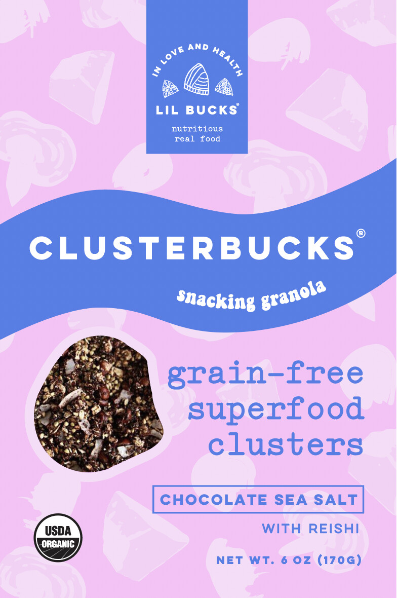
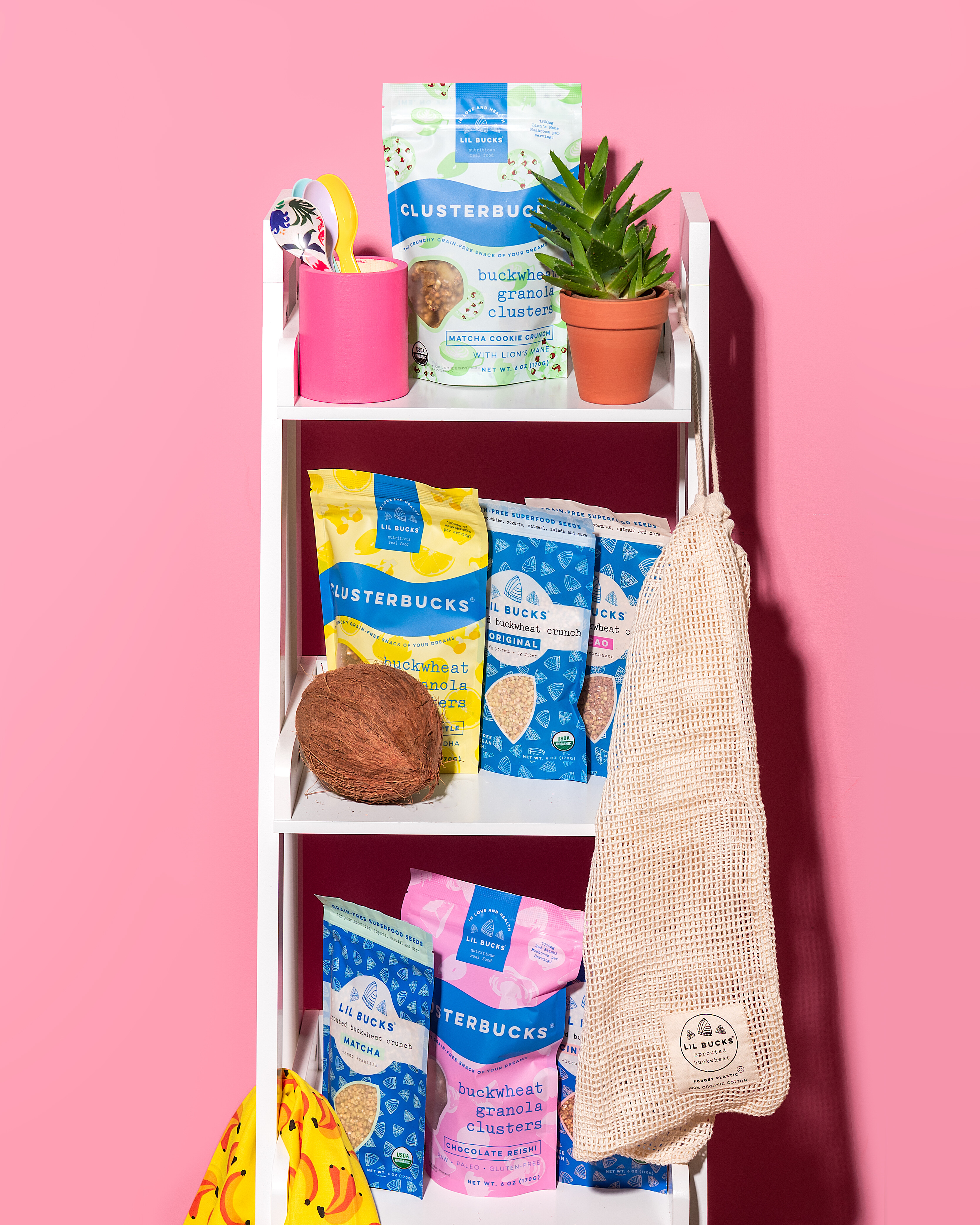
Hi everyone, I’m excited to share my packaging with you… I own this superfood brand and design the packaging in-house. I was a digital designer before starting this business, so I never claimed to be a packaging designer and have a lot to learn. This is our “Clusterbucks” snacking granola product, it’s currently on the market at places like Whole Foods. I am cleaning up the packaging to prepare for a launch into places like Target where the mass market consumer is less forgiving. Our ideal target audience is women 24-45 interested in tasty on the go healthy-ish food. Urban/suburban educated consumer, intrigued by the latest trends but not one to pave the way.
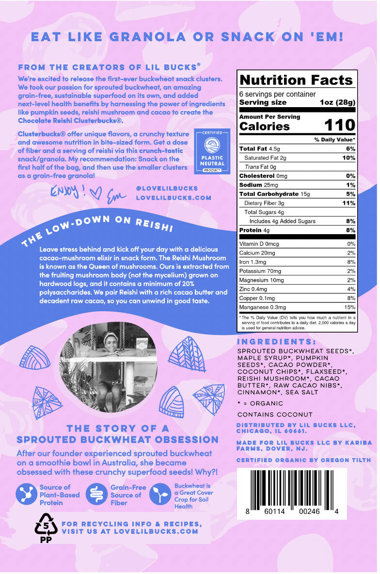
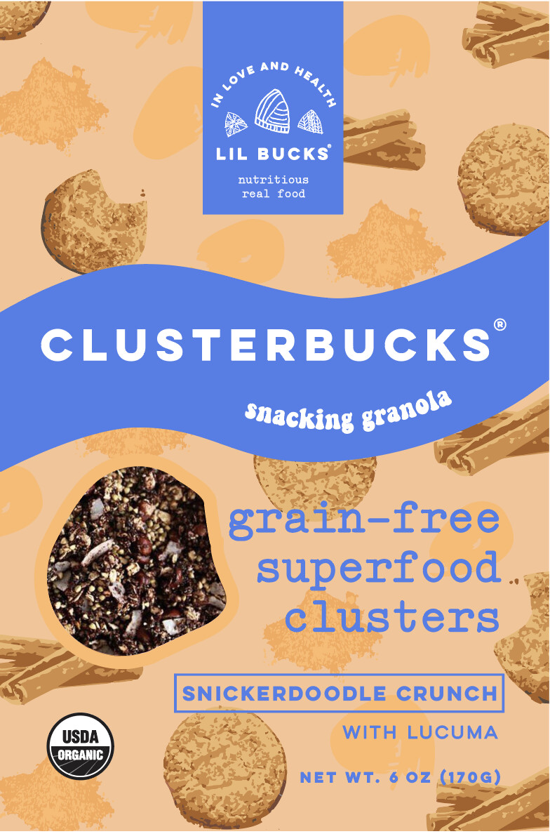
One of the things I struggle with is messaging hierarchy, especially on the back… way too much content… and can’t decide on the font for “snacking granola”. I am open to changing things up substantially in terms of word layout but want the concept of the fun bright package with the motifs and the blue wave to stay the same because we already have made a mark with that packaging in stores and online (see pics below of current flavors). We are launching a new flavor too–Snickerdoodle–only telling y’all that here… and I am struggling on the coloring for it too.
Open to any feedback or ideas, good and bad, and also if you have any messaging hierarchy suggestions or ideas to get rid of stuff / add something in, I am so open! Thank you!
I can’t say I’m a fan of the pink and blue. It’s decidedly unappetizing, queasy, and synthetic-looking — at least to me.
In my opinion, there’s too much clutter. You’ve even acknowledged that’s the case on the back. If it were me, I’d reduce the number of typefaces to give it a little more consistency. Are you sure all that information is needed on the back? There are little do-dads that seem to serve no particular purpose. I’d eliminate as much as possible while making the type choices more consistent in style, weight, point size, leading, flush left. I wouldn’t use a bold face for text. I’d also try to arrange everything into a consistent grid — especially in lining up the edges. There’s a mystery character after the word Why? I’d also make sure to use real apostrophe marks instead of the straight-up-and-down variety.
Despite all that, I’m liking the general look. It’s fun, informal, and eye-catching.
So helpful, thank you for this. Yeah I think I have too many elements to have the fun motif background AND all that info. I’ll try to majorly cut down on the content on the back and amount of typefaces I use. Agree that is probably adding to the chaos with the amount of types/weight etc. I was thinking even on the back of eliminating the large amount of text and just doing iconography of key product callouts like the back of Wildway Granola.
We do like fun, informal and eye-catching… that’s on brand… so at least I’m onto that.
Just B covered pretty much anything I could name after a quick once over, so all I’m able to add are some specifics.
The pink and blue is a cute, fun color combination and I understand why you would go with it, but those tones are broadcasting cotton candy, which is probably not what you want on a healthy snack.
And with the clutter/hierarchy on the back, one thing that might be worth trying is matching the curve of your “low down on reishi” wave text with the body below it, or finding some other way to make a better relationship between that curve. The wave is cute, but the box below it kind of jarrs against it.It’s dependent on other factors - like how much of that text you decide to keep - but I think it’s worth a shot seeing if you can do something to relate that curve to that text.
I don’t mind the pink and blue. It looks nice to me.
One has all the same transparent ingredient and the other shows ingredients with some ingredients standing out more. Might be inconsistent in branding. So the reshi mushrooms should be standing out on my the pink blue bag.
The barcode is off center and this could cause scanning issues as there needs to be a safe zone.
Your packaging says snacking granola in different fonts but didn’t appear on the 3d mockups.
Chocolate sea salt is a flavor I can imagine.
Snicker doodles crunch is not .
You might need a nut warning allergy. I don’t see any warning about it contains nuts.