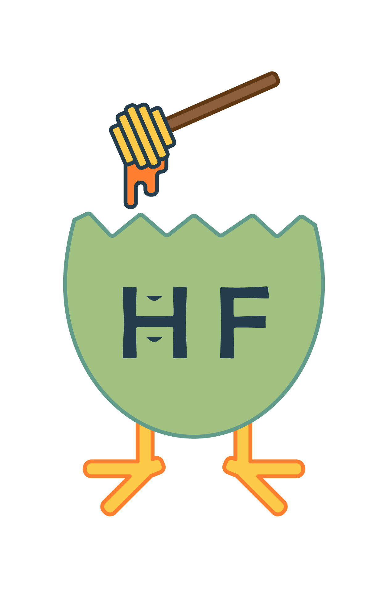
Hi, attached is my first attempt at a logo for a “H*** Farms” (name hidden for privacy reasons). We are a local urban farm and will be making/selling chicken eggs and honey. This logo would be used for egg cartons, honey bottles, and merch. The little shapes inside of the “H” are a reference to the handles on a standard type of wooden honeybee hive, called a “Langstroth” hive. The general idea was to combine beekeeping with chicken eggs in a somewhat whimsical/ironic logo and to play on the similarity of the capital letter “H” with the standard type of beehive bodies.
I have never made a logo before, so feel free to be brutally honest!
Since you are giving permission to be brutally honest, I would say it absolutely shows that you’ve never made a logo before. While this might sound self-serving, I would strongly suggest working with a qualified professional. While I can appreciate you trying to work in the bee hive handle, logo design and branding is about so much more than clip art — and this appears to be little more than a mashup of clip art.
Ha! I appreciate the honesty. While I call it a farm, it’s really something we are doing as a hobby out of our house. It will almost certainly be a money-loser at the end of the day, and most ‘customers’ will be neighbors/friends/family, so there isn’t really any budget or need to hire a professional.
I personally wanted to use the design process as a way to learn graphic/logo design myself, so would greatly appreciate any recommendations for learning resources. This was the first time I ever used Illustrator or attempted to make any logo or design (and I did make this myself, it isn’t clip art that I pulled), so I figured it would be pretty terrible to start.
@Steve_O Hit things on the head, albeit pretty bluntly. The main mistake many novices make with creating a logo is they feel that the logo needs to be a mini illustration of all the things a company does. But that is not the purpose of a logo. Think about larger companies like Nike, they don’t show shoes, clothing, people exercising, etc. HP and Apple don’t show computers, tablets and electronics, etc.
Now those are larger companies, but even a smaller company the logo should be indicative of the brand which is more than just visuals. It’s how you want people to feel about your business or company.
Hiring a professional is great advice, but if you decide to keep pushing forward, at the least scour the internet for similar small farms/businesses and figure out what works and what doesn’t. Generally simplify (generally, but some more “home made” brands do get by with smaller illustrations.) And, if you do scour the web, don’t copy existing logos and I’d strongly discourage purchasing stock logos (since you’re essentially buying a logo that anyone else can also buy and use and then you have a logo that is not specifically “yours”.)
Also, keep in mind that logos need to work fairly small.
I completely agree with Steve and Craig, so I won’t repeat what they’ve written. I’m curious about the little triangles in the H. What are those about?
The colors are not very appealing, and there are at least 7 of them, which could create costly issues on press depending on how your printing these.
What will happen to the colors if they are printed on gray egg cartons? Unless you are thinking of a sticker of some kind? Most of the home-based egg sellers around me use uh…recycled…egg containers, for better or worse. And they don’t even change the label - or the expiration date.
See my original post. They are in reference to wooden handles used on the traditional form of beehive (Langstroth). When combined with the H, the idea was that they look like a typical beehive.
I agree that there are too many colors. I used Illustrator. As I mentioned elsewhere, it was the first time I had ever used it or attempted any sort of logo design.
No worries! The gist is that I’m working on a logo for our little urban “farm”. We’re going to have some chicken eggs and honey and wanted a sort of fun logo to brand them with. I doubt we will have many paying customers, it’s more of a hobby.
Thanks for the constructive feedback! I get that my first attempt is bad, but I’m looking to learn at the end of the day. It’s also for our little hobby farm, not really a “business” in the true sense of the word.
In addition to what others have said, the best logos focus on a single idea instead of a hodge-podge of different things. Cleverness is OK, but it isn’t an essential ingredient. When cleverness is used, the cleverness is almost always restricted to a single and memorable idea. Simplicity and memorability are probably the main things to be concerned about. As the saying goes, “less is more.”
As an aside, down the street and around the corner from us on a busy road, there’s a guy who recently set up a table on a little piece of unoccupied land. He has a big handmade sign that says “Eggs and Honey.” The table is covered with jars of honey and baskets that I assume hold eggs. I haven’t stopped yet, but I’m very tempted. I also belong to some community Facebook groups, where lots of people post about eggs they have for sale. I haven’t seen any with logos, though, so you’re a step ahead of them.
@abelha I will say, good on you for using Illustrator. But, as you have probably discovered, Illustrator has quite a big learning curve. I also will say that I wouldn’t say the logo is bad, it’s just the sort of approach that someone that is more of a novice or beginner would do.
And I use business loosely. To me a business is any group or individual providing a good or service at a cost. Not necessarily a “business” that is incorporated or has multiple employees.
And, it could start as a hobby, but if it grows, it could be a more traditional business.
Best of luck, and if you do decide to do more research on smaller farm logos, sketch some ideas out (on actual paper, with pencil, pen, sharpie, crayon, whatever) and post back with some ideas.
Thanks! Really appreciate the constructive feedback. I’ll keep iterating and simplifying while I try and learn more about design fundamentals and the software.
Not sure we’ll ever really charge for our products (or if so, not much), so the goal is to come up with something that’s sort of tongue-in-cheek implying that we’re a business and something that looks good on egg cartons, honey bottles, and tshirts/hats. The only impression I’d want to leave on others would be to maybe encourage more people to use what land they do have to make their own food.
I too am totally confused about the H with triangles. It would not communicate with the average consumer. Also, a green egg? You’ve done a good job, but never forget that logos must communicate to be successful. I wish you the best of success with this project.