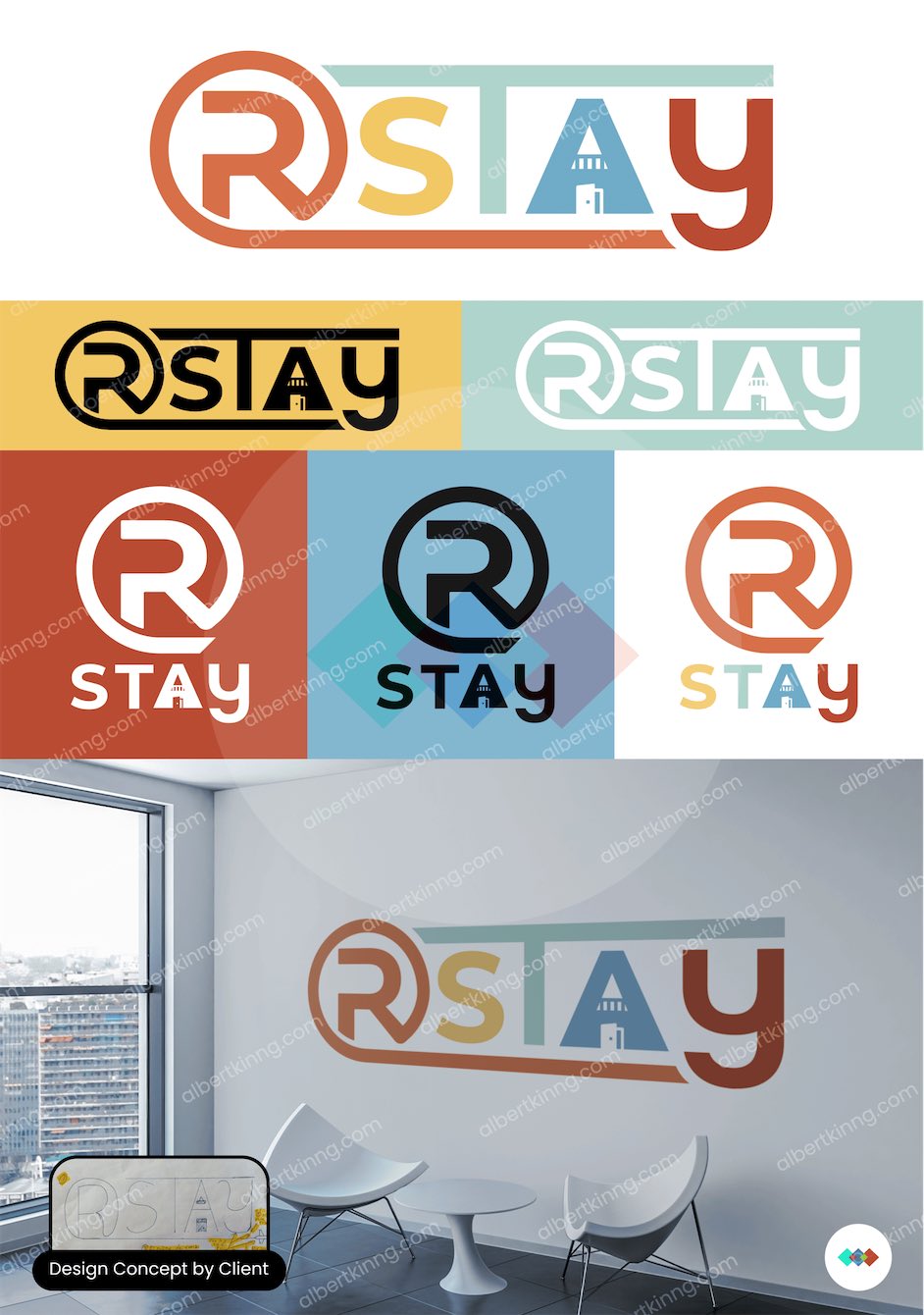
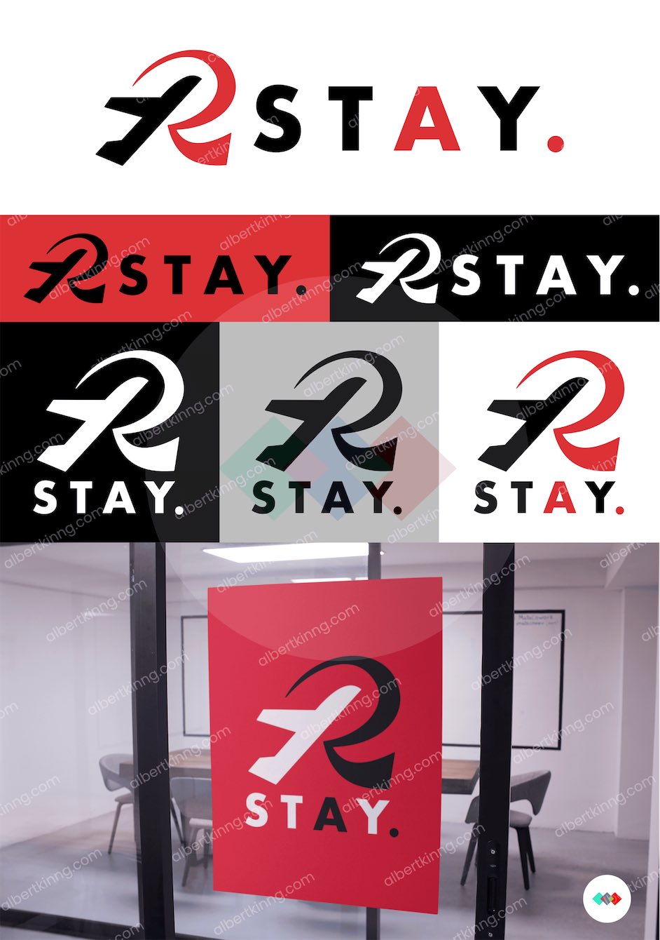
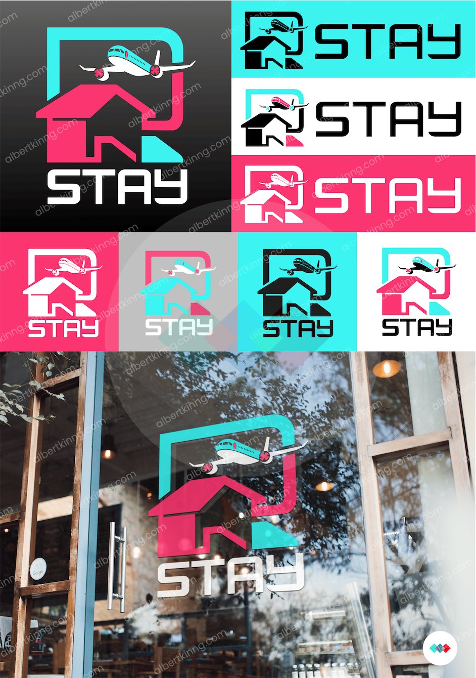
Hi, this is my first time here! I’m working on a logo and wordmark for a business that aims to offer all-inclusive online packages combining flights and accommodations at an affordable price. The client has shared a design concept and requested two additional ideas from me. Which option do you believe aligns best with this business vision?
First option: too much going on, in my opinion.
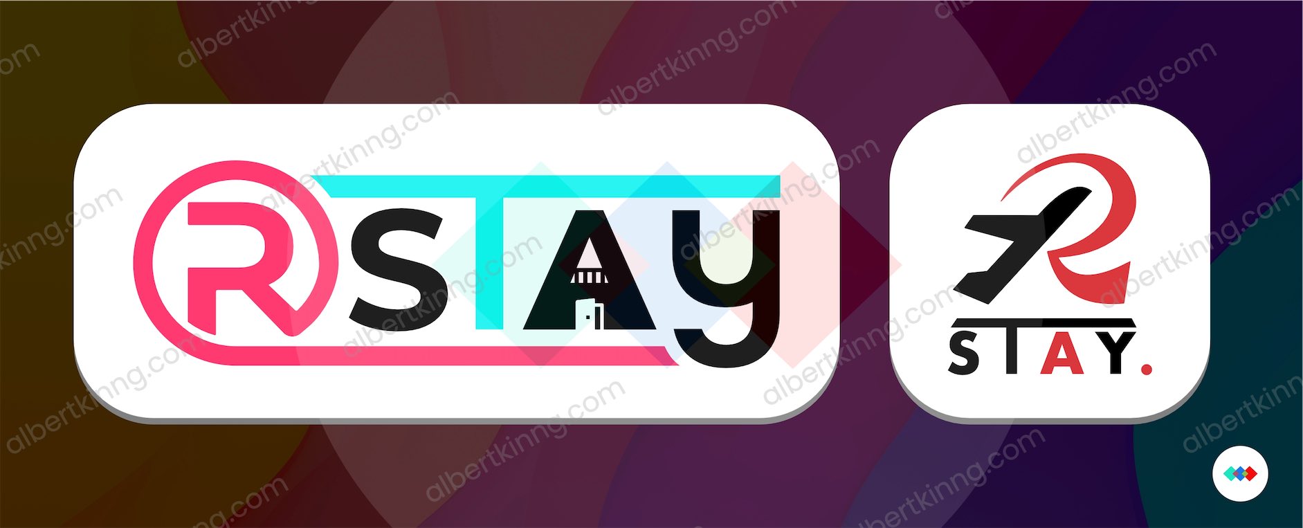
Second option: the plane looks like clip art.
Third option: too much going on. There could be some negative connotations with that logo, too. Is the plane flying into the house? Will the accommodations be noisy because they are in an airport flight path? Also, if I didn’t know it was supposed to read “r stay,” I would not have read it that way.
I think you need to go back to the drawing board on these. Sorry.
Did you actually design the Etsy logo?
Thanks for the feedback! I agree the first design is quite busy, but that one was created following my client’s specifications. I assembled it according to their vision, and it might be the one they choose. For the second option, while the airplane could be mistaken for clip art, I can assure you it’s not. I’m particularly hopeful about this one, and if selected, I’ll refine the plane’s aesthetics before finalizing. The third design combines an R, house, and plane, which I now realize makes it too complex. I don’t expect it to advance to the next round. Yes, I was part of the team working on that corporate identity, focusing on the iconography library and illustrations. While I worked on refining the logo, I didn’t redesign it or create it from scratch. The original logo was created by Scott Ostler, a great designer I admire.
The design has some appeal, but it’s busy, playful, and childlike. Are those qualities appropriate for this company? Do they want their visual branding to look like something from a nursery school playroom? I suspect not.
There might be ways to tighten and simplify the concept into something more appropriate.
As to the existing design, I had to study the A to notice the counter represented a door and a window. At first and second glance, I thought it was a rocket. In addition, the typography of the logytype is a bit clunky.
1 Like
More like a beer under the shower to me.
1 Like
I’m on the same page as you—it doesn’t work for me either. I’ll submit it as is, so they can see exactly what they requested. That way, I can step in later and suggest alternative ideas if needed. Let’s see how it goes, and I’ll keep sharing updates on this project. I really appreciate the feedback and transparency this platform provides.
Now I can’t unsee it. ![]()
Update:
The client has chosen their favorite design! They’d like to explore two variations:
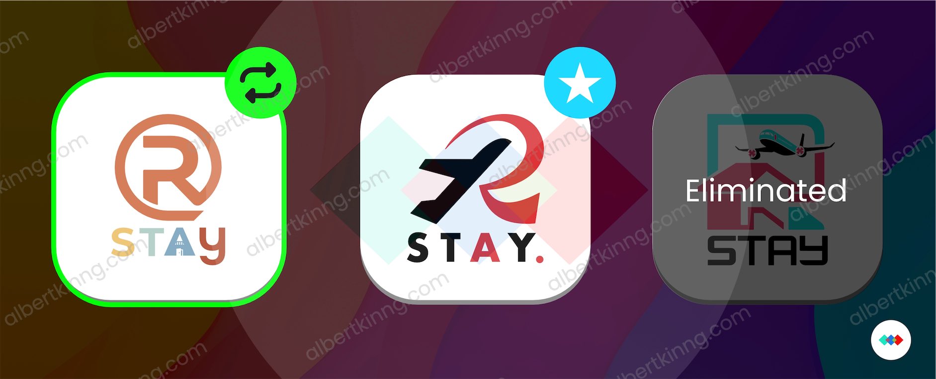
- Their designed version using the color palette from the eliminated option
- Their favorite design with a modified ‘T’ that extends across all letters, similar to their original concept
What are your thoughts on these adjustments?
1 Like