Hi All, wanting some feedback on this fictional brand I created to sort of stretch my creative muscles. I typically work on hospitality and restaurants on the daily and wanted to navigate away from that. This is my foundation however I feel it is lacking something. Maybe the integration of the textures/patterns into more of the collateral or the tone of voice more so speaking to the branding itself, perhaps I’m just being overly self-critical. Any feedback would be helpful. Thanks!
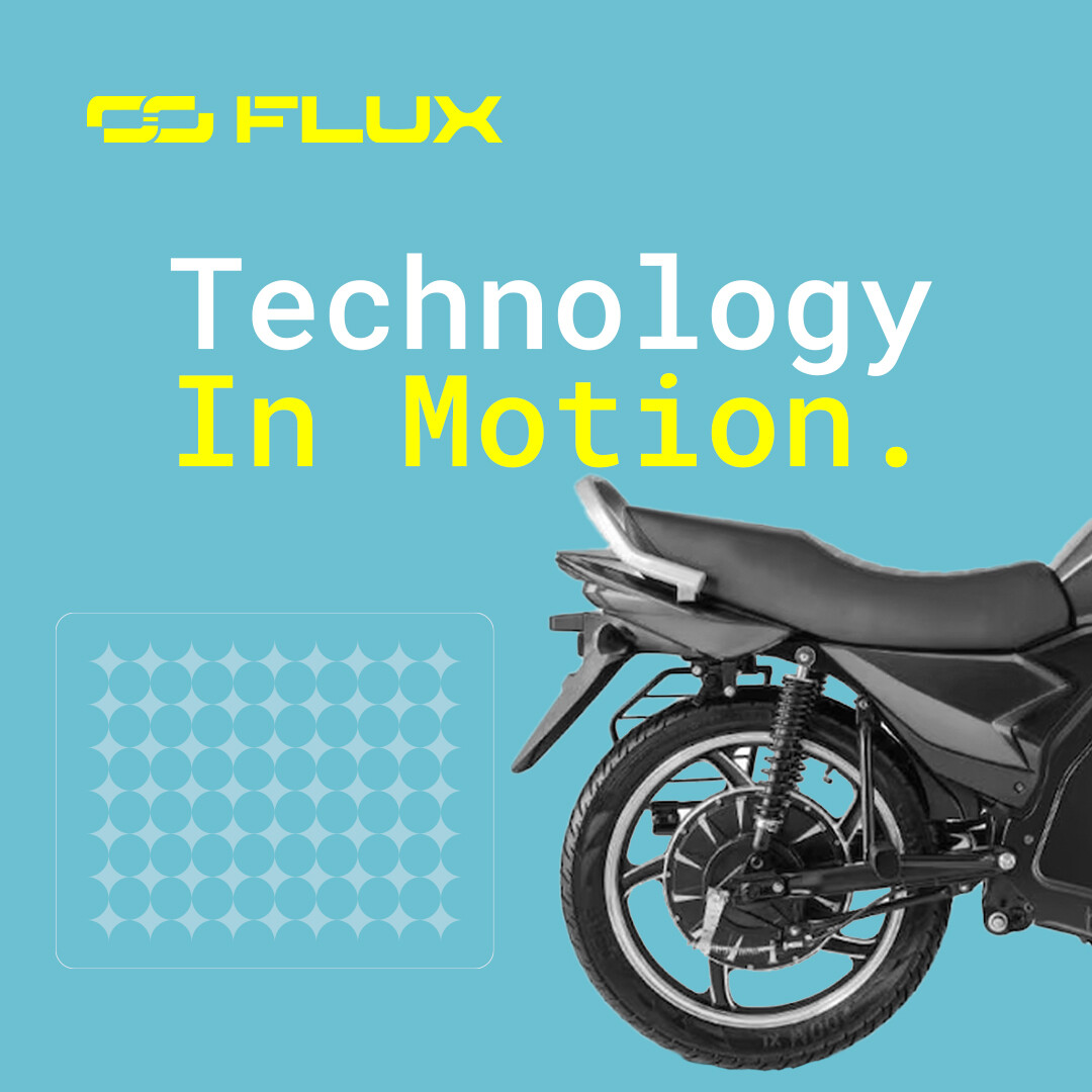
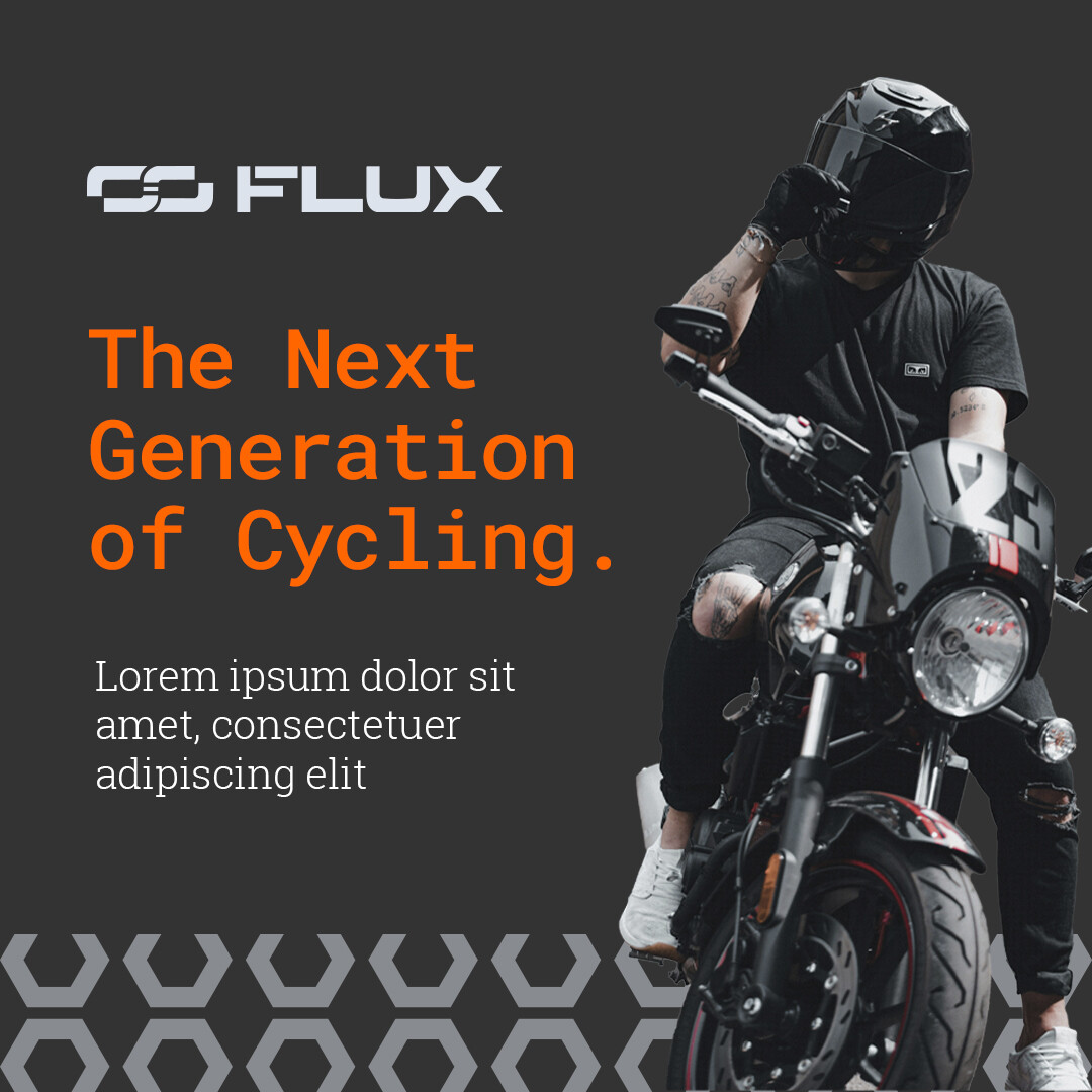

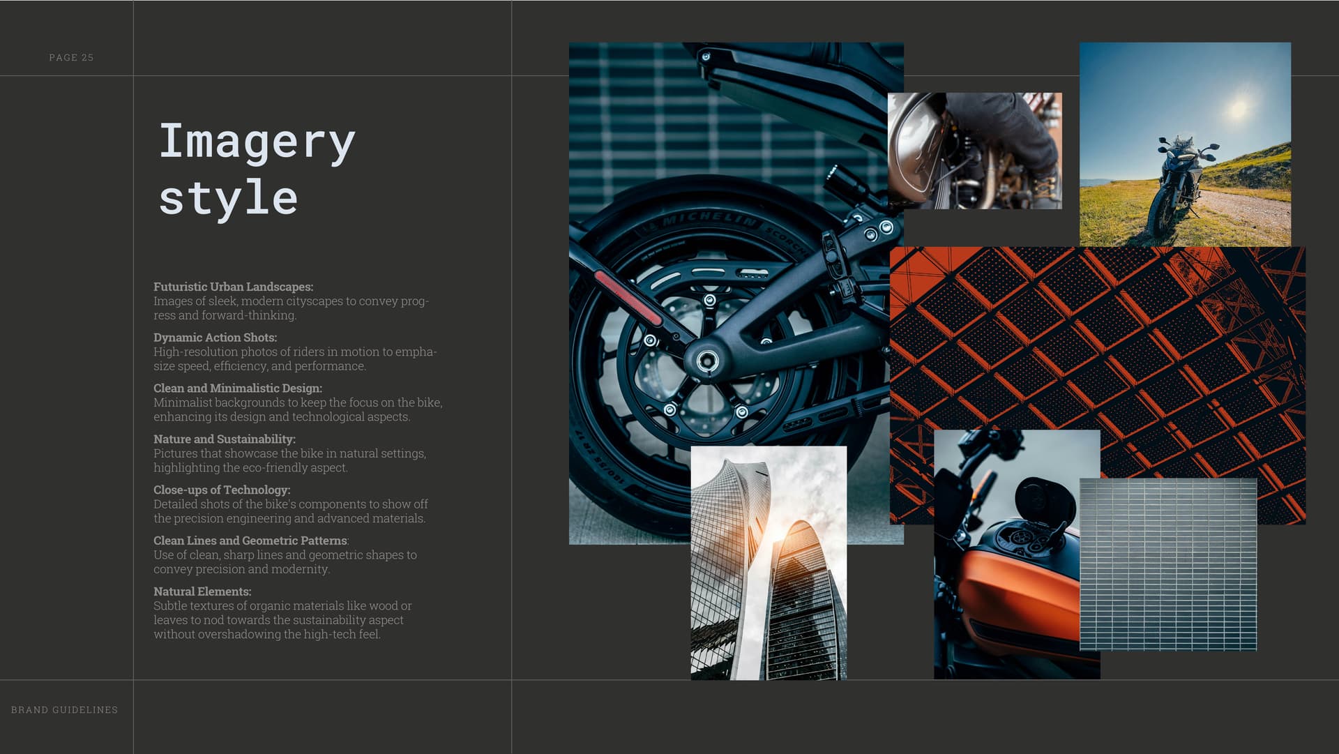
I’m assuming these are just mockups to establish a general style, since the second and third images don’t seem to serve any particular advertising purpose.
Of course, you know this, but your photos aren’t of electric bikes; they’re motorcycles.
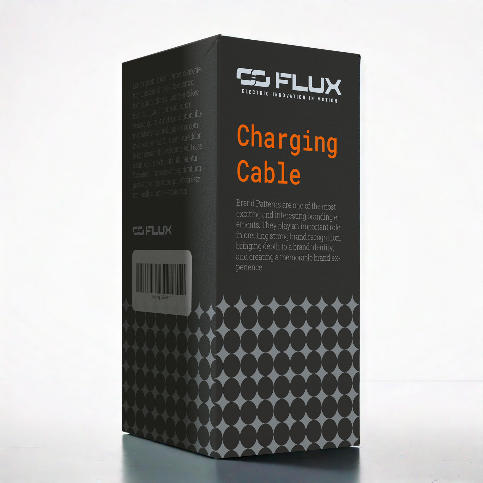
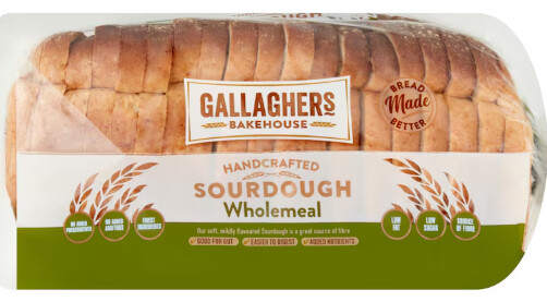
I wouldn’t use a monospaced font. They’re great for coding because all the characters line up vertically, but for anything else, they don’t typically work. The exception being if the desired look is supposed to be grungy, but since that look isn’t consistent with the rest of your examples, I’m guessing that’s not the case.
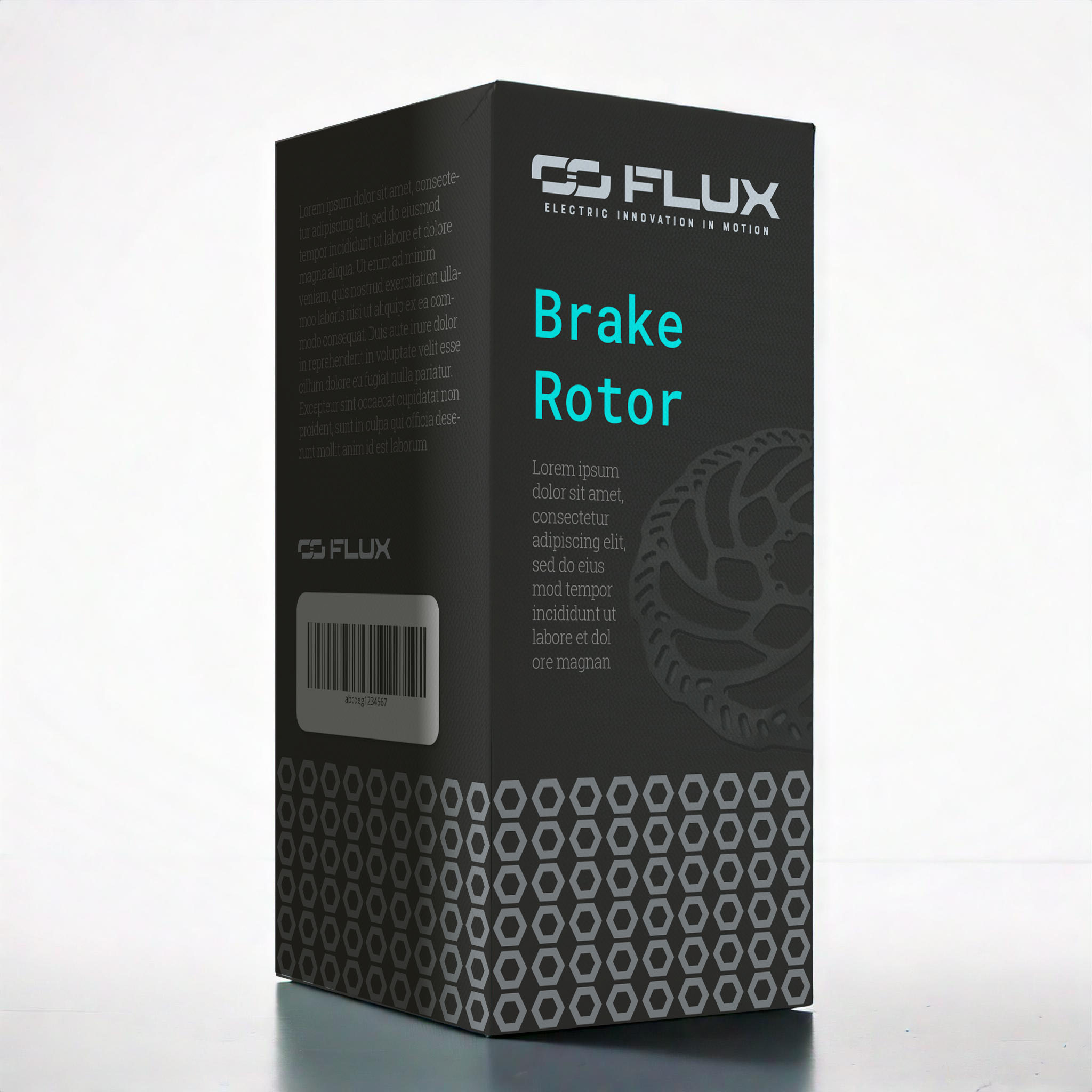
A rotor would have a hard time fitting into a tall, rectangular box, but you know that, too.
I like the patterns around the bottom of the package, but I don’t think the placement of the pattern in the turquoise example is consistent with the others.
I like the color schemes and the various subtleties, such as the thin lines.
In advertising, people really like to see the object being advertised — especially when the product’s style is one of the selling points. If it were me, I would avoid partial views in favor of photos that really show off the bike.
The turquoise image has some compositional problems. For instance, you’ve centered the flush-left type into the layout (which is a bit odd) to help fill in the big empty spot at the top right.
I think these show promise, despite what I’m seeing as needing a bit of fine-tuning.
2 Likes
Hi, I agree with Just-B about the typeface. Perhaps you used a monospace font to align with the “technological” nature of the brand. Monospace can work in some cases, but for this one, I’d try a clean, modern sans serif like Helvetica. If you’re looking for a free alternative, Manrope is your best bet.
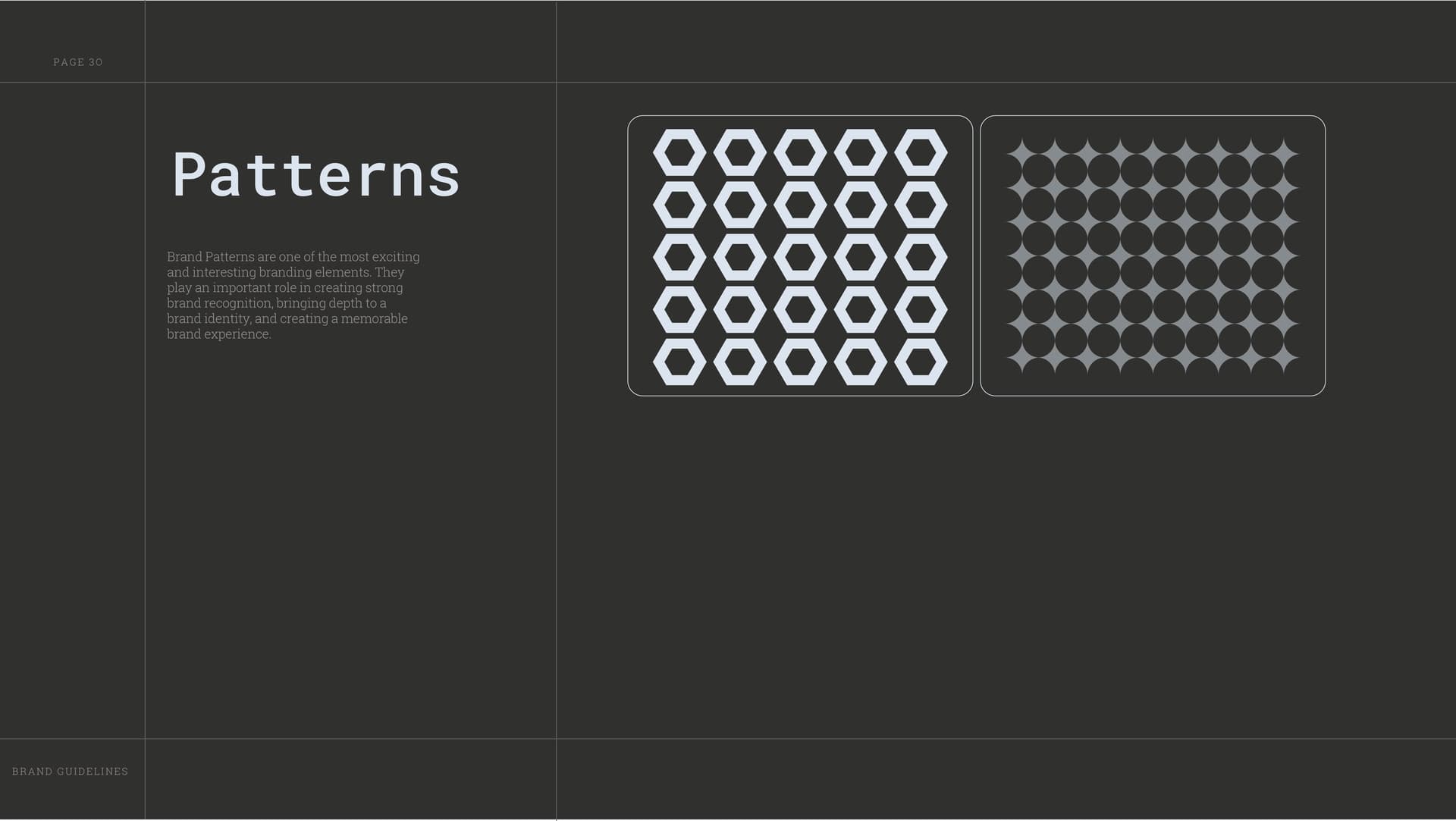
As for the pattern, I understand that a brand can sometimes have more than one pattern, and you may want to apply different ones across products to show distinction. In my opinion, this kind of approach tends to feel more intentional when there are at least three patterns (and so 3 products) to establish a clear system. They should also feel balanced. For example, the hex one has a higher-contrast color, so you might want to tone it down a bit.
Regarding the horizontal spacing for the hex pattern, I noticed you (perhaps?) matched it to the vertical spacing for mathematical consistency. But the horizontal spacing involves angled lines meeting angled lines, and those angles flare outward, making the space look wider even if the measurement matches the vertical spacing. Reducing the horizontal spacing would help the pattern feel more visually balanced.
Everything else looks great — the color, the logo especially. You did a great job.
1 Like
I agree with both previous comments regarding what they said so I won’t say the same things again. I want to focus on the patterns you created. I agree with icehall that a thrid pattern would help create a strong cohesive trio. I’m not sure if you already planned something like this, but a clear ruleset on which pattern is used for what product/project will be important to make them feel intentional rather than just something that looks cool.
And this may just be a personal preference but my suggestion for the hexagon/bolt pattern is to try and interlock them and create a sort of honeycomb. Even though they are all perfectly aligned, the empty space creates, almost a sort of optical illusion making it look like they are not spaced evenly.
Other than that, great job !!
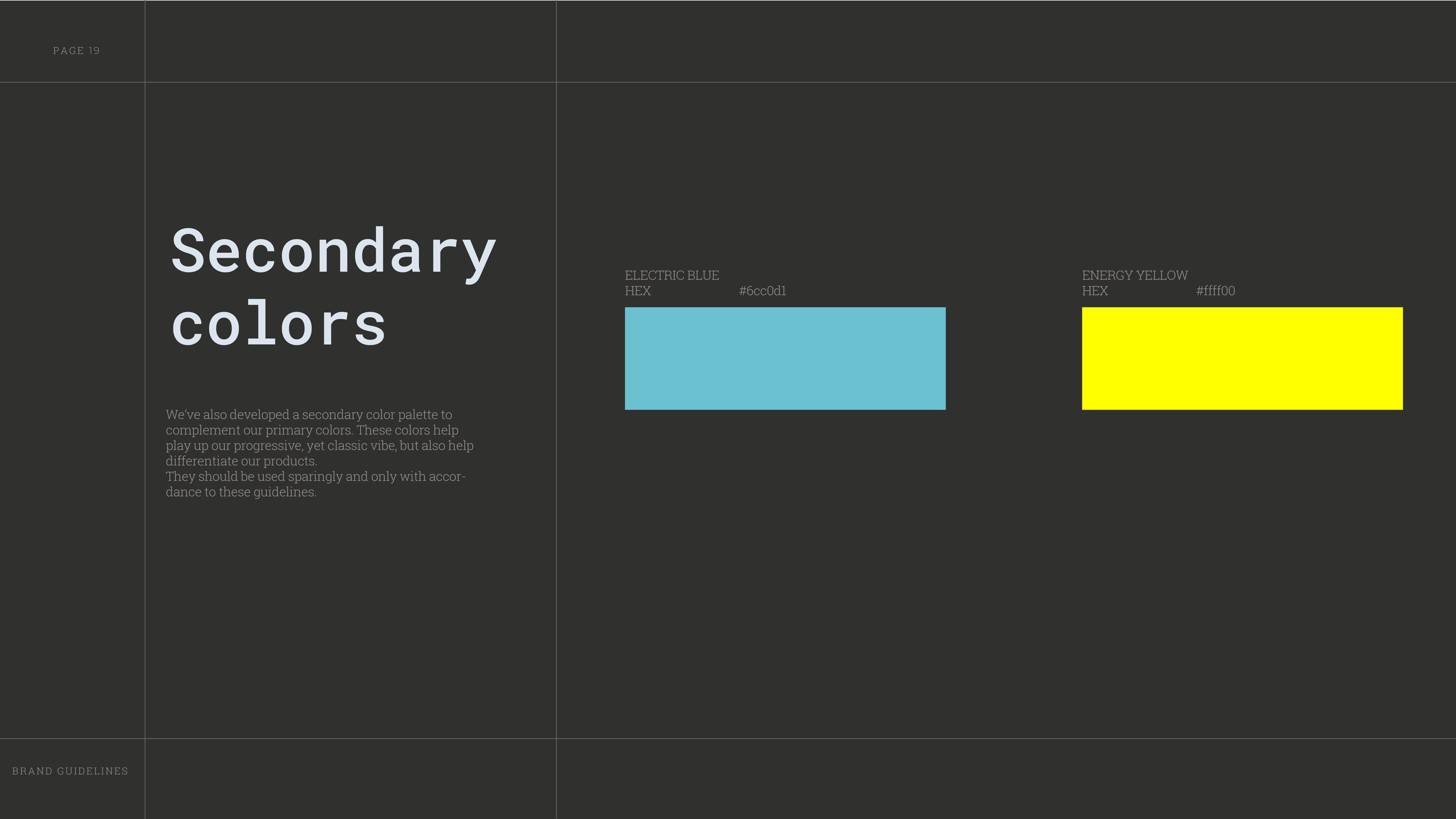
All those colours will likely be out of gamut when printed - so you’d want to nail down the Pantone and CMYK equivalents - HEX is for web only - not for print.
2 Likes
The iconic mark feels like ENVE’s and E13’s:
You should come up with a more distinctive design.
1 Like
It’s funny how both of those brands have similarly shaped logos and designs. Maybe they’re in their ‘design’ bracket here afterall. I do agree it’s very samey. Reminds of the time I was asked to design a book cover, and I checked out the competition in a book store, and all the books were very samey, dark cover, same type of font, sizes etc. So I went with a Lime Green, different font, and the client was bemused but talked him into it, and then when it was on the shelf in batches it popped out on the shelf, you couldn’t miss it. It worked. He was delighted. I never did hear from him again.
Anyway I digress.
Oh and another story on similar branding… it caught me out once, and nearly twice… buying bread!
I usually get this one.
But was fooled one day in a hurry
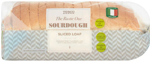
I know they look different, but I wasn’t quite paying attention and just lopping stuff into the trolley - side by side - you can tell - but in the shop they are on different shelves, away from each other, so I see the Green Sourdough label and just grabbed it - and what’s worse is I nearly did the exact same thing the next time I went shopping.
Gallaghers is more expensive - it has less ingredients (less UPF)
Tesco is cheaper - but it has more ingredients (more UPFs)
And I tend to stay away from UPFs.
I was so annoyed I didn’t spot it - but
But the point is - similar packaging and design is a strategy in marketing.
1 Like