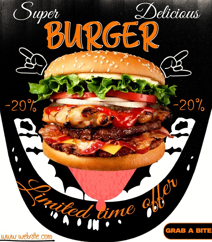
Hello everyone i am new to this forum and to the design world in general. But a year ago i saw an ad somewhere that kindled the creative fire in me(or a creative slow burn). What i struggle with the most is coming up with all the little elements that make up the design.
Like yes i have the image of a burger, and i know what the ad needs to say. But then what?. Do i just slap the burger on a white sheet and place the text under it?, above it?, inside it?. (I’m clueless)
That was when i learnt of visual metaphors, and they completely solved my problem. Even if the end result is not actually a metaphor, thinking like i am making a metaphor takes away all the pressure of coming up with a composition.
When making the image below, i wanted to make an open mouth receiving the burger, while the tastebuds jump for joy. In the end though, it came out like this. Please tell me what you think.
Things I like:
- You are thinking and trying to come up with a unique solution.
- The burger pops on the black background.
Things I don’t like:
- As I stated in number one above, you were thinking. Unfortunately, not all ideas are good ideas. For me, the tongue, teeth, and drool aren’t really working. Seeing someone else’s tongue is not particularly appetizing.
- There is a serious lack of identity in the ad. What is the name of the restaurant? Is this a national chain or a local place? If it is for a national place, you can get by with just a web address (I don’t need an address to tell me where I can find a McDonald’s). If it’s a local place, it would be good to have some clue as to where it is.
- Your typography needs work. The formal script and informal brush fonts are not working well together. Also, a formal script on a curve rarely works. You have at least three fonts going on. That’s too many for this ad.
- Spend more time on the copy. “Super Delicious Burger” isn’t a particularly strong headline.
1 Like
Speaking of typography, is it 20% or 29% off? A deal-breaker for cheapos like myself.
Thank you so much for the feedback. I will work on all you said. As for the identity…well there isn’t any. I just thought of making a burger ad and then jumped right into photoshop.
“-20%” is barely visible.
“Limited Time Offer” is barely legible.
