Would like to receive feedback on the text part of this logo, or the layout of the logo in general as I am not sure with the composition of the logo text and its pictorial mark.
As the text is using a font that has bold style, I tend to display it smaller to compose it with the pictorial mark. But the logo name is a bit long, so I also have idea to stack the separated words next to the pictorial mark. But when I use this kind of layout, I am not sure how big the size should I put for the text.
Thanks! ![]()
I can’t properly critique it without knowing, what is it, what is it for. I’m not even sure what the symbol is, or what it can represent or its relation to the type.
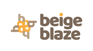
The layout is pretty typical. Beige Blaze isnt that long of a word for a title.
I had a logo at 26 characters, and my layouts were similar to yours. You might want to play with the kerning just a smidge. I like how the type is tracked in the 2nd example.
thanks for the feedback ![]()
Here’s the design brief:
Beige Blaze: A quirky name that suggests decor, design, and neutral palettes.
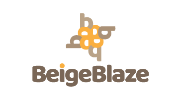
The pictorial mark is actually a play of lowercase b(s) I stacked them ![]() so it might resemble the burst or blaze
so it might resemble the burst or blaze
I think my issue is with the icon. I understand using the b shape as a pattern, but WHY? Is there supposed to be meaning to this circular shape you’ve made?
to create or to resemble the exploding b(s) as burst or blaze also to keep the geometric shape rather than just using flame shape with circular order ~ hope that makes sense ![]()
A burst has movement and your icon seems very static, almost like a shield or seal. I’d look into a way to capture more of the wild movement of a flame or burst to better convey this idea.
Hello, thank you for your feedback. I’ll try to add some more element details to make it look like a flame ![]()
I don’t think you need to add more. I’d suggest rationalising it down. Perhaps remove the outer bs, leaving the inner yellow shape and somehow giving that a bit of dynamic movement. The problem with that, is that because of its nature, ie, a repeat/rotate pattern, it is always going to imply geometric, circular movement, which is almost the opposite of a blaze.
My other problem is the name itself. Beige has some really negative associations – boring, bland, etc. So, to tie this with the word blaze, seems counter-intuitive, unless you were being intentionally ironic and the business was some sort of über-trendy 70s retro thing, in which case the feel of the logo is a bit off for that – though with a different font or lettering and some tweaking, you could give it a 70s feel.
When you say, decor in neutral colours, do you mean in a Farrow and Ball, Georgian sort of way, or a bit more burnt oranges, browns and vintage yellow vibe? Gentle and elegant, or retro and trendy? Or something completely different?
Your logo leans more to the latter, but it’s not retro or nostalgic enough. If the former, I am afraid it is pretty wide of the mark.
Who is your audience? What you have currently does not feel like it has much personality. It doesn’t feel like you are trying to appeal to a particular market. I am not trying to be destructive here, but i feel it just needs a voice that reflects more who your client is.
It is not a bad logo, per se. I’ve seen a lot, lot worse. In and of itself, it’s OK, but there’s not a lot guiding me as to the culture of the company. All a bit … dare I say it … beige, really. (Sorry I had to take that shot, the goal was left wide open.)
If you could let us have more of an ide ofvwhat your client does, we may.bevable to help steer you in the right direction.
Hope this helps.
2 Likes