I’ve been having a hard time making this info graphic for a client. They’re interested in “Wired” and “Fast Company” info-graphic styles, modern, vector based, etc. Feeling stuck, any help is appreciated. Thank you!
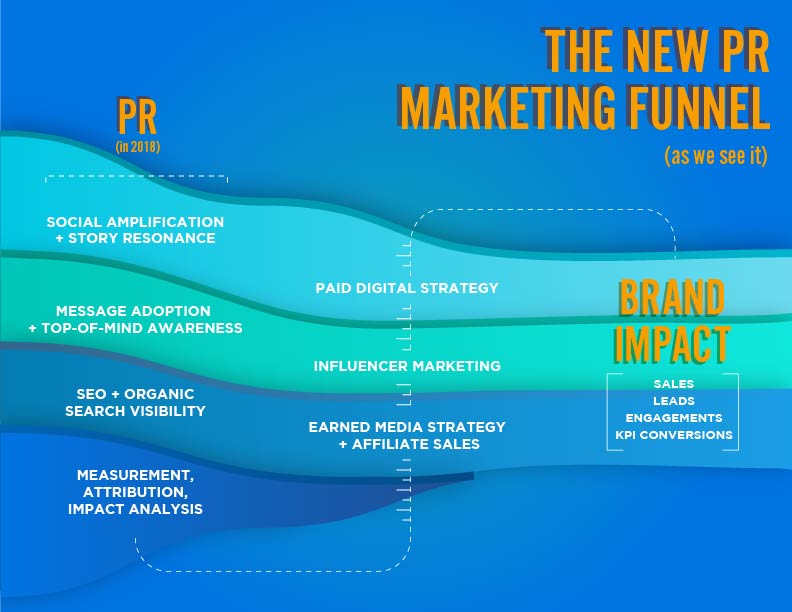
I feel like it’s okay, but it could be better.
A simple fix might be to put the brand impact headline and bullet points in a container so it’s sitting above the strata (for lack of a better word). Right now, that looks a little sloppy.
A more time consuming fix would be to move brand impact to the middle and show the other things directly influencing brand impact. You could also add icons for each area.
Either way, the type needs work.. Mixing two sans serif fonts can be challenging. The two you’re mixing here don’t work that well together.
1 Like
I’m sure this infographic means something to someone in your industry but not knowing what it is, I’m not seeing your intended flow.
Do the horizontal flow lines have anything to do with the direction you are supposed to read this?
Or are you supposed to follow the less visible dotted white lines?
ditto on the two sans serifs not mixing well here.
1 Like
Infographics (IMO) should be more visual. Right now, other than the oddly constructed waves, there’s not much here. Sure, there’s a dotted line to follow, but infographics usually are used to visually draw someone in, and to visually represent an idea in a quick and easily digestible way and/or to help communicate a fairly complex idea in a simpler fashion.
So far, with your example, the colors are clashing and there’s nothing here that couldn’t just be represented as some bullets.
If they mentioned Wired and Fast Company, do you have a “mood board” collected of various examples form those companies. I would analyze good examples found there and then sketch out some designs.
Here’s an early sketch of an infographic I worked on about 6 months ago as an example. Now obviously mine had a lot more content. And mine was web-only and meant to be scrolled.
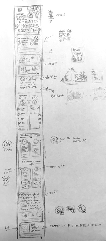
Do not, do not, do not just go right to the computer with this. Draw and figure out how to represent what it is you’re trying to communicate.
1 Like