It’s for a zany humorous thriller about Navy SEALs that takes place in the Everglades. Thanks.
I just thought it could be better if you put a larger image for us to see. Books have cover from the same piece of paper. Did you think of the backside and the spine of the book?
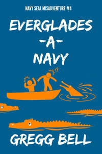
Since color is cheaper than before, i would use green for the alligators.
they dont look like navy seals and why would they look shocker or in peril knowing that the water was infested with crocs. they are navy seals, ya know. The crocs need some kind of eye improvement, they seem docile, not ferocious.
You’re forgetting it’s a humorous thriller, so the “shocked” look is actually appropriate I believe, so the reader doesn’t think the book has a serious tone. I do agree though that the alligators themselves could look a little more serious, but I’m totally okay with the “shocked” look.
Everyone replying should look at the original thread. This is a series of books. This thread shows the other covers from the series.
that background info helps.
the scene flows with the others books, so i say leave that.
maybe a stern look on the crocodiles might add suspense.
If your objective is to match the cover of your other books, you’re already there.
I you’re thinking the covers of your other books are lacking, and you’re wanting something a bit more professional for this book, well, that would involved a complete re-do.
You could add navy camo pattern to the soldiers. And maybe a horizon line to add more depth to the scene. with the swampy trees in the background.
Thanks likemetros. Here’s the bigger image. The back cover will be the same color and the blurb and an author photo. The spine will be the same color with the title and author name.

Thanks EB. I’m commited to the color scheme because of the previous books in the series. https://www.graphicdesignforum.com/t/feedback-on-book-cover/9916 (Thanks to Craig for posting this.) I’m going to work on the eye improvement.
@Sprainkles Thanks. Yeah, the book is a completely over-the-top farce, so I wouldn’t want anyone thinking it was serious. Believe it or not, despite the books’ silly covers and ridiculous blurbs, I get bad reviews claiming the book was silly.
@CraigB Thanks a lot for posting that, Craig. ![]() I certainly should have.
I certainly should have.
@EB_comix Thanks EB. Will see what I can do with the gators.
@Just-B Thanks Just-B. Yeah, if this fits with the others, I’ve accomplished my purpose.
@jasondezigner Thanks Jason. I will experiment with the horizon line, and I was thinking of some reeds instead of swampy trees, but I’ll try both.
Having seen the others in the series I think the more successful covers are the Oops and Dupes covers because the illustrations interact with the title better, they fill in the negative space formed by the -A- Navy. If you can get a gator to try and chomp on some of the letters that would be humorous and interactive (like the boat sinking on the “Y”.
Hello!
The drawing style of the alligators and the people don’t match. It would be good to give the people more definition and some water lines around the boat like the alligators have.
This is a weird thread. It keeps popping up even though it was originally posted 6 months ago… I think the cover’s done by now…(one would hope)