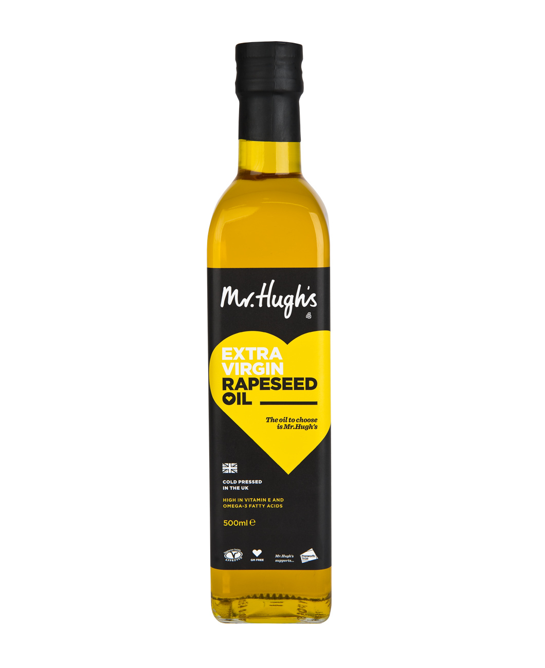
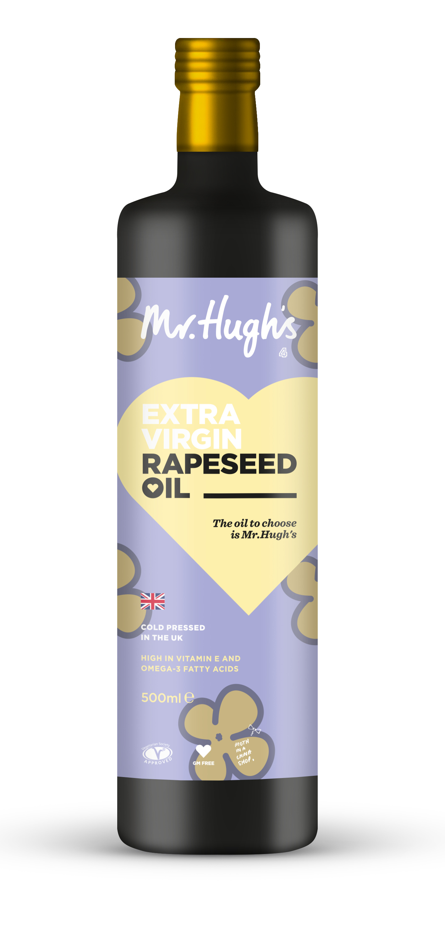
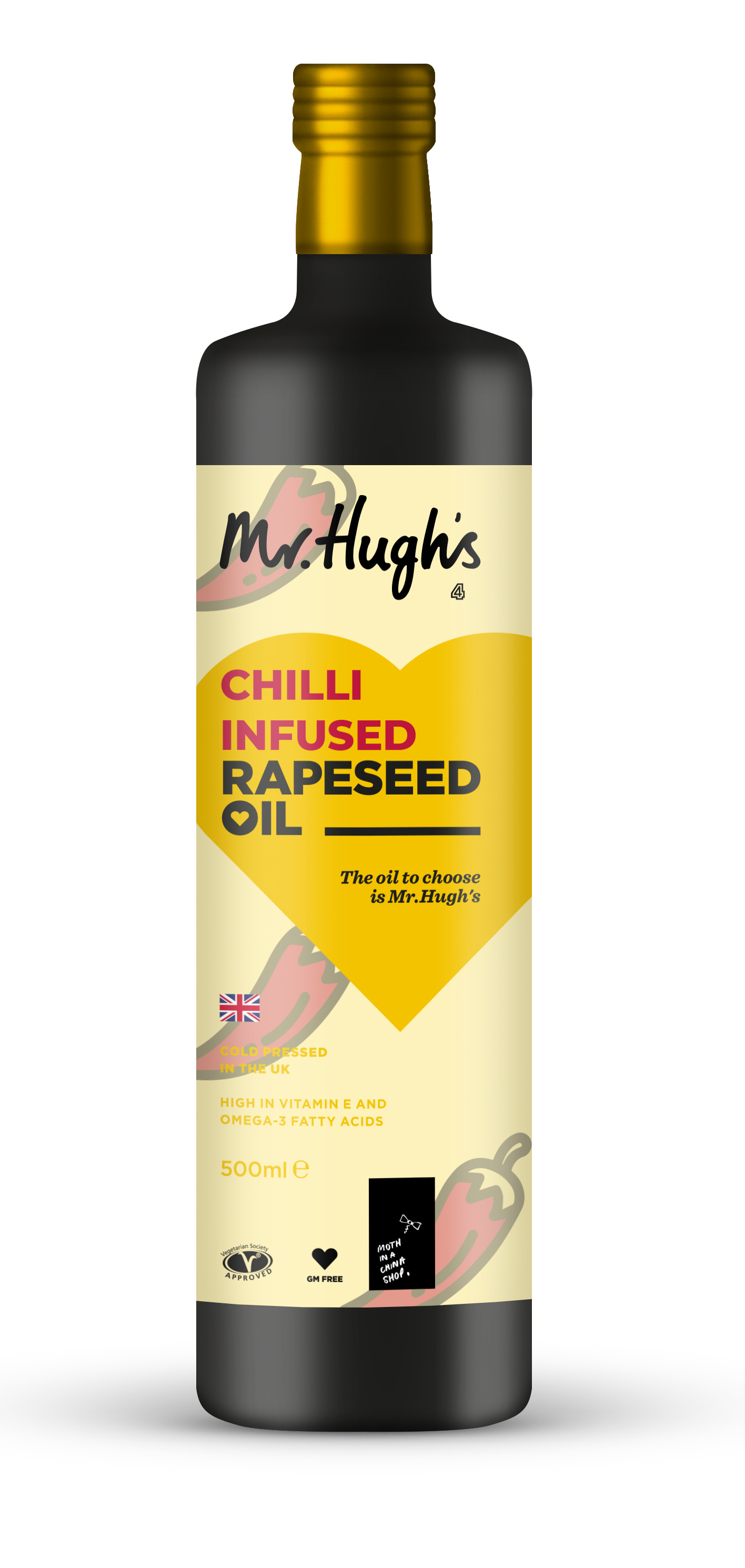
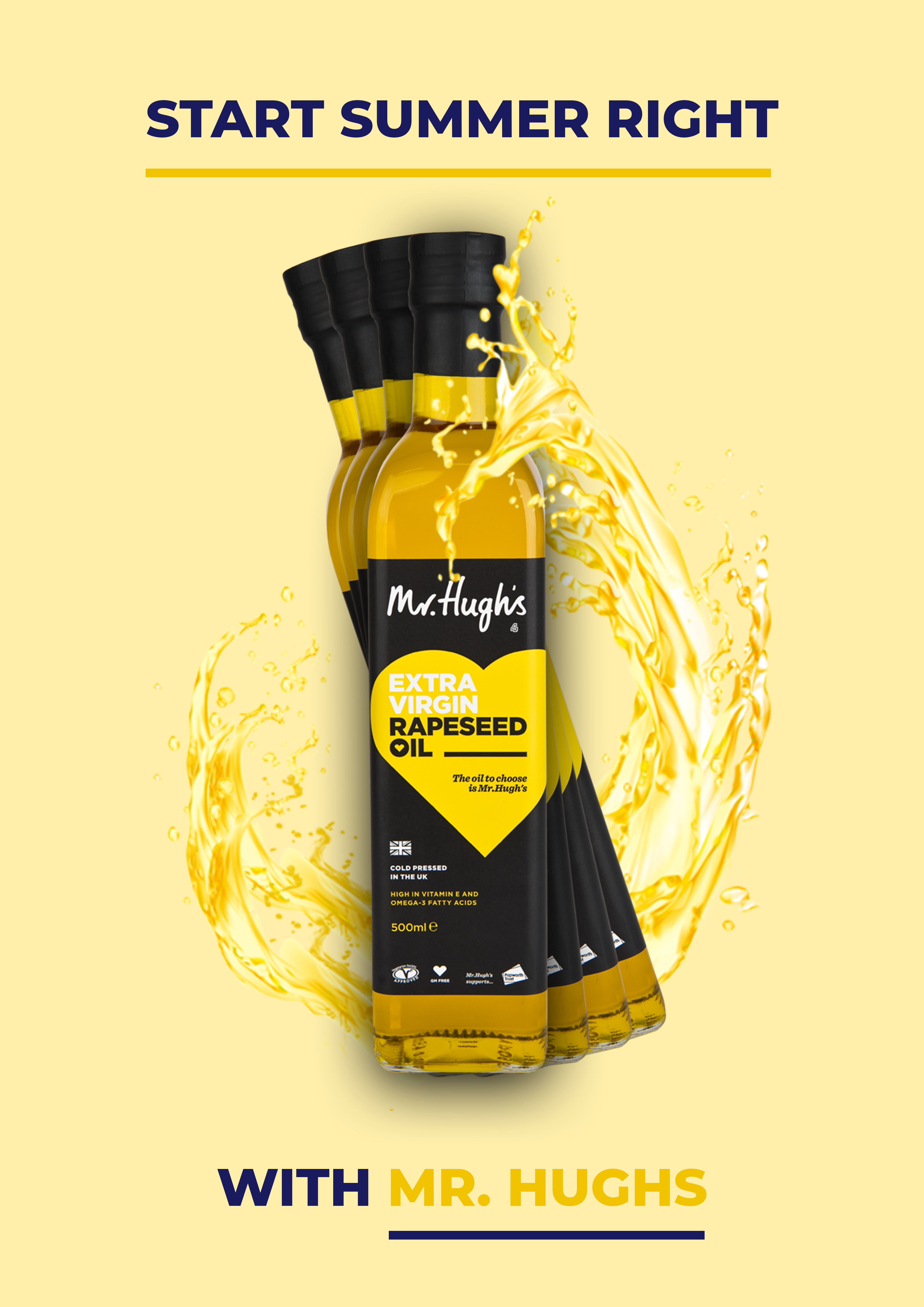
I was wondering if I could get any feedback on these designs that I have created for a competition. The client are after a limited edition redesign of the original bottle (the black one) to encapsulate summer. I have created two different variants of designs to represent the ingredient, along with an advertisement that would be seen either as a poster or a small notice board.
I’m totally against competitions and doing work on an I-might-get-paid basis.
Even so, you really have done a nice job with it. I like them very much. The oil itself is such a nice translucent amber color that it would be a shame to hid it inside a black bottle without a good reason.
Thank you, and I agree. However, I was unable to find a free PSD mock-up of an olive oil bottle that showed the oil inside, so I had to settle for the filled in one…
These are very nice.
Perhaps a contrasting background with the yellow heart for the chili infused one might be worth exploring.
And also reducing the overlap of Mr Hugh’s on the image of the chili, like it is in the flower option, might make the brand name less busy.