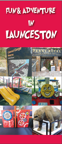
The headline is not really participating in the design. You just left a blank space at the top, then filled that blank space with words. Instead of the type being an integral part of the composition, it’s just a headline floating in a sea of left-over red space. The position of that headline is predictable, orderly and totally expected. There’s no tension, there’s no interest, no surprises, and there’s no interplay with the images below. Instead of the headline interacting with the layout, it sits there alone, isolated, bored and floating forlornly in the middle of a sea of redness.
You’ve tried to introduce some fun by using a playful typeface, but that playfulness looks awfully lonely just hanging there in a layout that isn’t especially lighthearted. The subject matter in the photos is of a few fun things, but the layout itself is rigid, geometric, orderly, stiff and calculated.
All the elements need to work together and play off each other. There needs to be an interesting interaction between the positive and negative spaces. The layout, as a whole, needs to have a personality that’s appropriate for evoking the right emotional responses from the target audience.
Also remember that hot colors, like red, advance, while cool colors, like blue or green, recede. In other words, the red background jumps out at the viewer and overpowers the cooler photos. And speaking of the photos, because they directly abut one another, the visual separation of where one ends and the next begins is awkward. It requires just a bit of mental work to separate and see each one as a separate photo.
It’s a brochure cover that’s supposed to be about fun and adventure, but the layout is neither fun nor adventurous. Playful typefaces and pictures of fun thing do not automatically add up to a playful and fun layout. It requires a bit of work for the reader to tease the fun and adventure from the cover, All this adds up to an unintended emotional disconnect with the subject matter and the layout.
To sum it up, if the subject matter is about fun and adventure, make the layout a whole lot less static and predictable — make it playful and have fun with it.