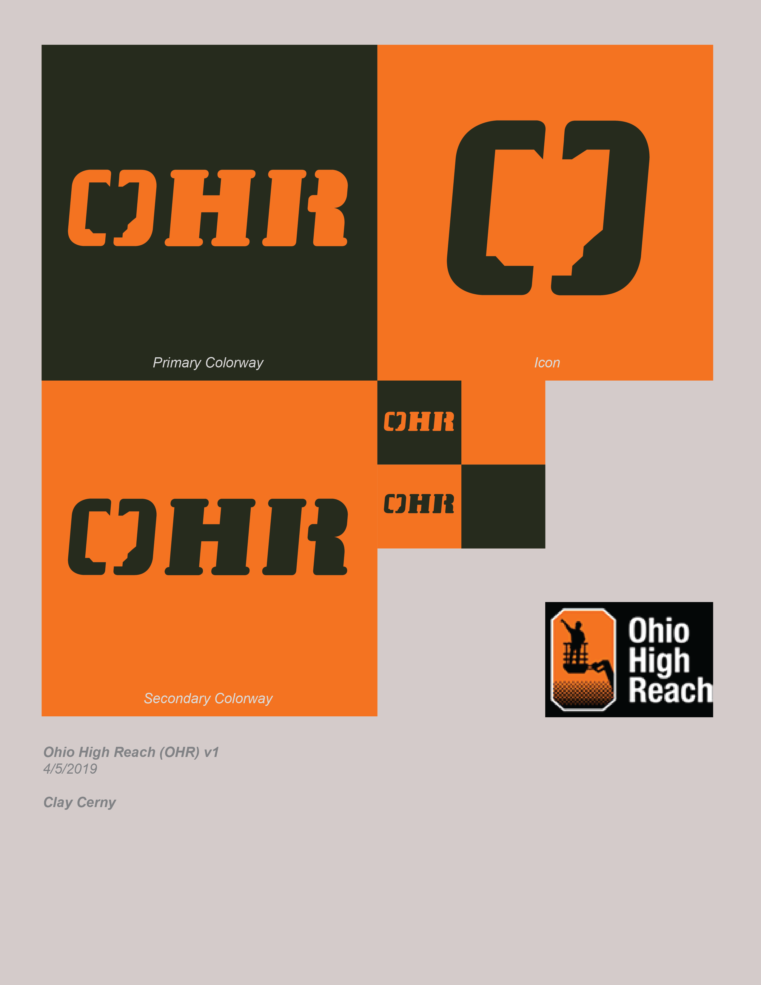
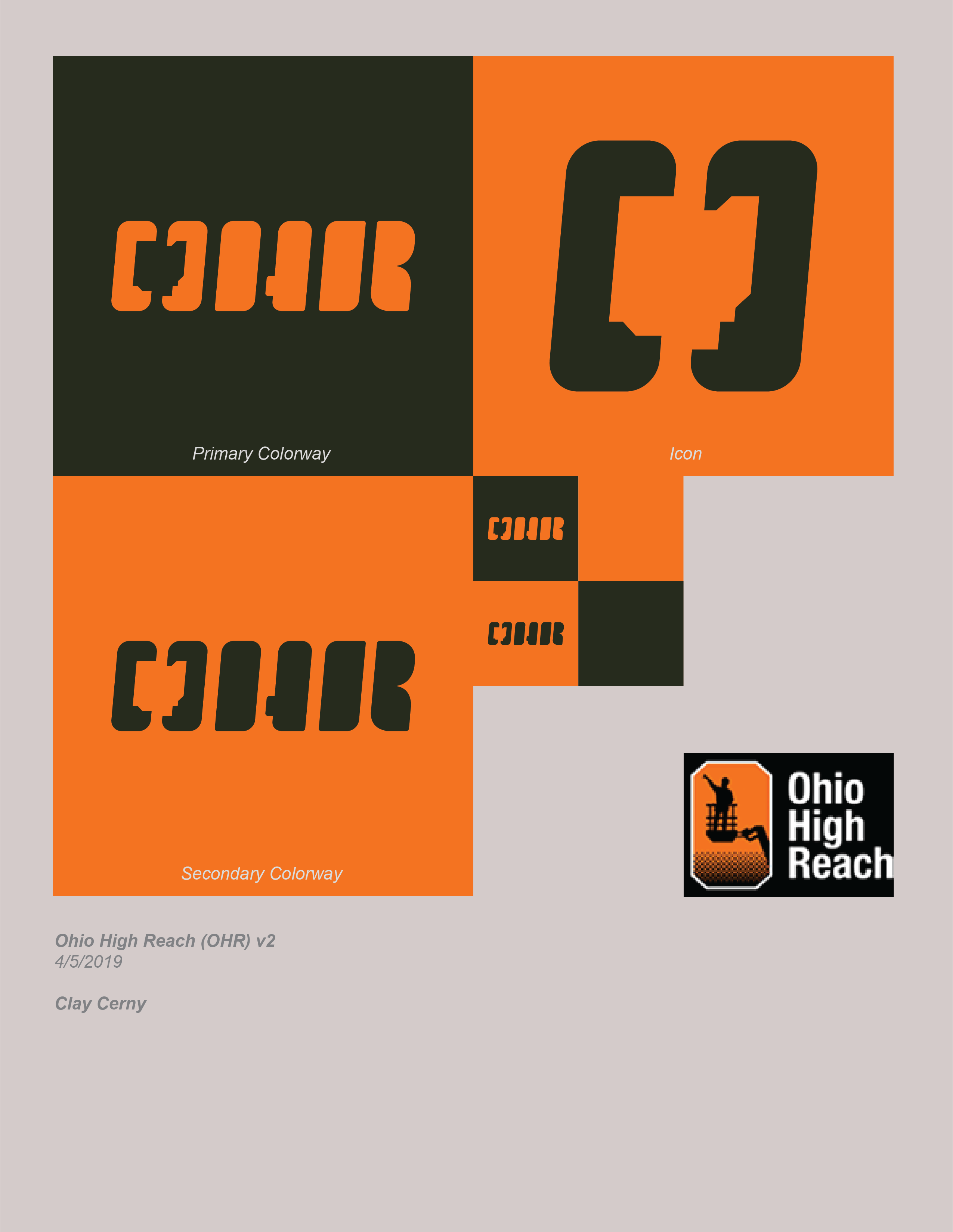
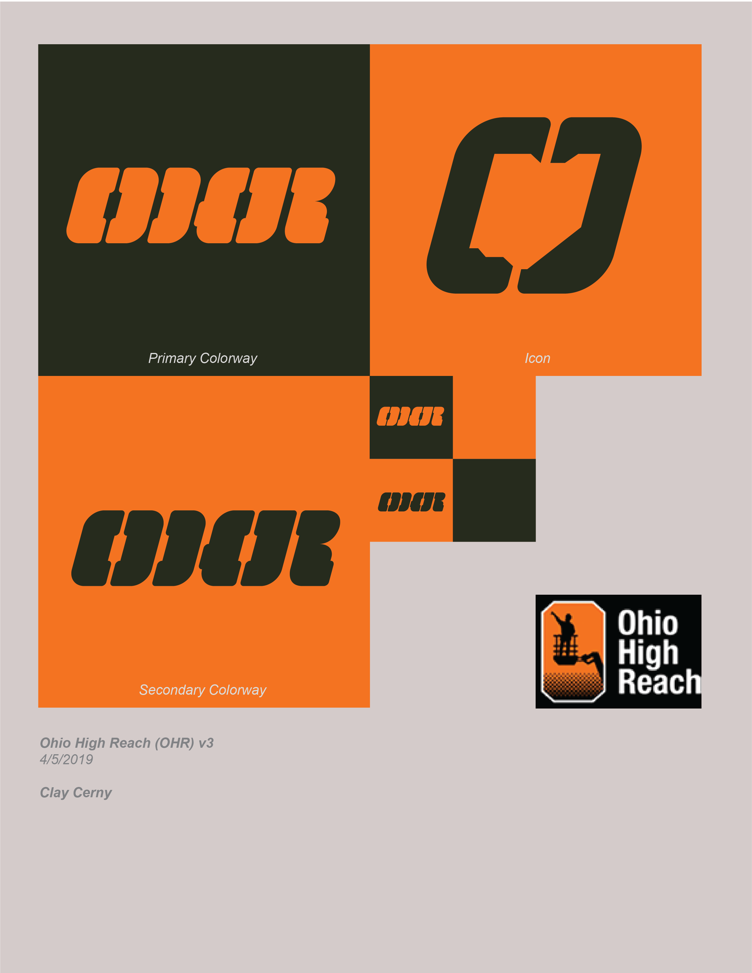
Hey Guys and gals, so this is for a construction equipment rental company (https://ohiohighreach.com/). They started as a strictly aerial equipment rental company, but now they are hoping to expand to other types of construction equipment. Because of this they wanted to change their logo to something that is more universal.
Their main store location is located right off the highway so readability is a big concern. These are still kinda rough, but let me know what yall think.
I might use a different orange that’s, maybe lighter or more yellow. I like orange, but it’s quite dark. If one of your main concerns is visibility and readability, a little more contrast between light and dark might be useful.
If you want to use an outline of Ohio as the counter in the O, that’s fine. However, if that’s the case, you might want to simplify all the letters. The Ohio outline plus the unusual letterforms, again, makes it less immediately readable than it could be. On the small versions, if I didn’t already know what the letters were, I’d be hard-pressed to decipher them.
The OHR on your bottom version — even minus the Ohio outline — is an interesting combination of shapes, but reading it as three separate letters is a bit of a struggle.
First of all, welcome, Clay. Way to jump right in and post work for critique!
What I like:
– Strong, black and orange color palette.
– Blocky, industrial feeling type.
– Geometric / angular outline of Ohio.
What I don’t like:
– I don’t these are particularly legible. At arms length, if you even begin to squint your eyes, everything runs together. Of the three, v1 is the most legible, but, even with that one, I see HR first and then pick up the O.
– What you are presenting is three iterations of one concept. I’d suggest working up a few additional concepts to present.
Also, I don’t know how active the client is with their website, but you might want to be careful linking to their website. They might follow the link back and see you’ve posted your concept work on a public forum for critique.
Sorry forgot to mention, the orange has to stay as per client request (I’m not a big fan either). I can try changing the secondary color to try to brighten the orange indirectly.
You’re definitely right about simplifying the letters.
The bottom OHR is my personal fav, but it definitely the hardest to read. I’m gonna try messing with the spacing between the letters maybe add an object in between. If that doesn’t it might be destined for the scrapper.
I’m not sure how using the shape of Ohio’s state line helps convey what the company does. Also, maybe its because I don’t live in Ohio, but it was not easy for me to recognize the shape of the state.
While I like the cleaner, more modern, look you are providing in your logo options, I don’t think any of them communicate what the company does as well as the previous logo.
I appreciate the feedback @silence04 and you might be right about how recognizable Ohio is. But as for what you said about conveying what the company does, well that’s where my little rant starts:
Now don’t get me wrong, including elements to convey what a company does is not bad and has lead to some great and clever logos. But, thinking that it is the only way to produce a successful logo is completely limiting. I would even argue that some of the best designed logos —Nike, Apple, and Pepsi to name a few— don’t include any representation of what their company does. Yet, they are successful because they still capture the feeling of the company. Capturing the feel combined with memorability the two most essential elements of any good logo.
Sorry for the spiel and thanks again for the feedback.
I’m not really familiar with constructions, so I really find it hard to understand the meaning of the Icon? can you enlighten me sir?
I like the v1 its very unique and clever. Aside from the Icon, I believed that if the icon can easily define/understand by people like me it will give more impression and value to the logo.