When I received the critique for my first attempt at this logo I knew instantly the person was right.
I’m working on a very tight budget so I downloaded a few images and a few free fonts and I am aiming to keep things very simple
I’m very much in the learning and studying stage so any advice would be helpful.
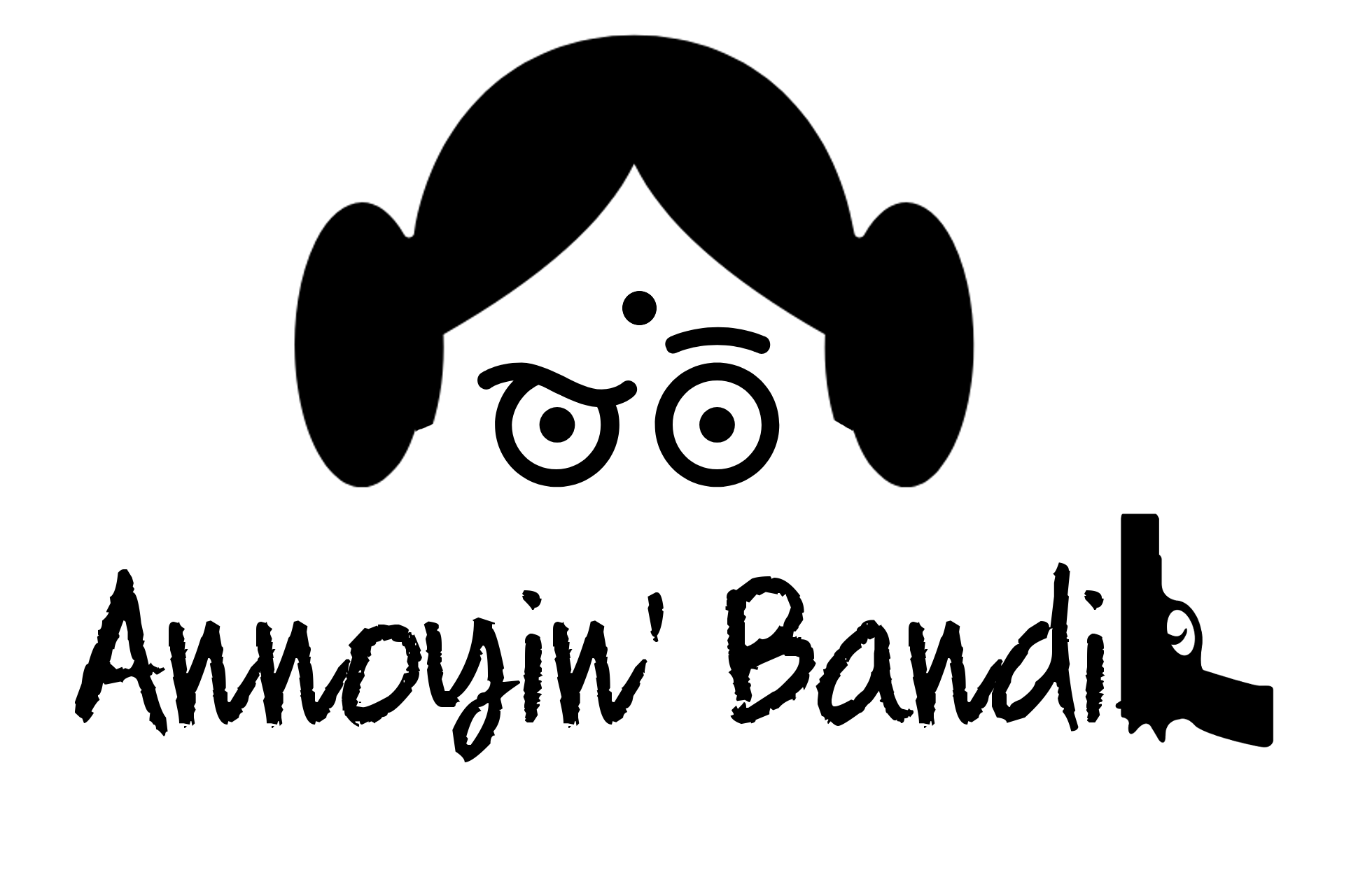
The logo is for an internet only store,selling modern art on bags with a strong ethnic and feminist slant. My heritage is from India so I have included the bindi (dot in the middle of the forehead) to signify the ethnic element. The target market is young female age 13-25.
Nothing here is working. It looks like Princess Leia from India with one eye shocked and one eye scowling. So maybe one thing is working: conveying India. You’re combining too many styles: a simple, clean illustration of Princess Leia, a hand written style font, and then a realistic gun shape. Is it supposed to read Annoyin’ Bandi or Annoyin’ Bandit? I have no idea. The gun doesn’t particularly look like a “t,” but, when you put it next to bandi, I want to read bandit. The upswing on the “n” combined with the apostrophe almost makes it look like a lower case “w.” The “n” and “d” combination aren’t working with this font. Why the gun? Sorry, this is just a mess. Nothing says modern art on bags with a strong ethnic and feminist slant.
I completely agree with Steve — this is not really working.
Hairstyles for women in India is something I’m not especially aware of, but I don’t recall seeing any photos of Indian women with large hair buns on the sides of their heads. Steve is right, it looks like Princess Leia from Star Wars.
Probably more important is that it’s confusing. A woman with hair buns, a handgun, a crazed facial expression and the words "Annoyin’ Bandi — maybe it’s a cultural thing that would make more sense in India, but I’m confused.
I understand about the bindi dot, and I suspect it wouldn’t be misinterpreted in India. Even so, my initial reaction to what you put together is that Princess Leia is an annoyed bandi (whatever that is) because she was shot in the middle of her forehead with the handgun.
First, I’m offering my advice as a student who is taking a class in print publishing, so I’m still learning the basics of design myself. But here are some of the things I noticed about your logo:
I like how you tried to incorporate your Indian heritage with the bindi on the forehead, and the use of a woman’s face is a great symbol for the intended concept you’re aiming for. However, the style seems too “cartoonish” with the eyes, and the hair that is associated with the character of Princess Leia from Star Wars. I would suggest using a more life-like silhouette of a woman’s face, so that the bindi is more obvious as an ethnic symbol, and the logo looks more professional (assuming that’s the direction you’re wanting to go).
As for the title, I like the use of a rougher, more artistic typography: it seems to fit well with the sort of roguish, feminist / ethnic concept you presented. But using the gun in place of the T (I’m assuming it’s called “Annoyin’ Bandit”?) doesn’t work well because it doesn’t match the shape: it looks like it’s trying to imitate a capital T because of its size in relation to the other letters, but it doesn’t look like one.
I’ll agree with everyone else for their reasons as to why its not working.
If the store sells modern bags online, what would your Indian culture have to specifically do with it other than some styles to be ethnic (which could mean more than india). Not only that, the internet is a wide place to sell on. So unless you’re specifically targeting the market of Indian women ages 13-25. I’m not so sure your specific culture is needed.