I am currently working on a personal project, where I am designing a logo for a local cafe.
The cuisine is Thai food, and the dining experience is casual and fast. I have tried to go for a more energetic look, however, I don’t know which direction to take the logo.
“Direction” might be the operative word here.
By putting the drop shadow to the right you are more promoting a laid back atmosphere rather than a moving-forward fast one, where the shadow would be to the left.
I’ve never been a fan of this type of shadow usage, the offset stack. If you are intending to illustrate that the letters are 3D rather than a drop shadow, then using the Extrude function may be an option. However, that algorithm is soooo bad that I’d do it in black with no light source, then expand and hand color the sides. The auto-color option is not good for logo development for a variety of technical gaffes that, as a sign guy, I hate seeing in a file. Plus, the color breaks stitch and those stitches do enlarge when scaled. Adobe should do that one over.
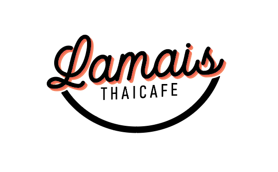
My initial response to the logo was the same – take away the “thaicafe” type, and it doesn’t say Thai to me. It looks more like a bakery or something French.
Then I started to wonder if the curve was supposed to represent a bowl (think bowl of noodles / pad thai). That’s why I asked about the line.
If the intent is to represent a bowl, that’s good thing, but it needs to be less abstract The way it is now, it’s more like Amazon than a bowl.
Is it supposed to be Lamai’s?
As in someone’s name?
I saw the bowl related to Thai food.
I don’t need logos to speak thai to me. Any logo missing a descriptive might be just as inscrutable.
Especially some place that may be known only locally.