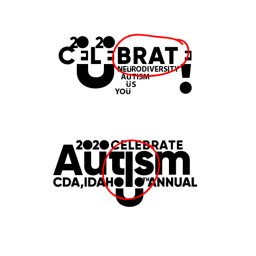
Hello, I am designing a logo for a t shirt.
The event is a walk that supports autism awareness.
Any feedback would be greatly appreciated.
I also added some of the goofs i made by accident. glad i caught them early.


Hello, I am designing a logo for a t shirt.
The event is a walk that supports autism awareness.
Any feedback would be greatly appreciated.
I also added some of the goofs i made by accident. glad i caught them early.


i know i am soulless, but why celebrate autism?
is awareness stronger?
promoting the word walk would help.
the logo seems lost with the U and o s maybe the circles should be another shape.
my bad, CELEBRATE is the theme. thanks alot 
If the theme is Celebrate, I don’t think it needs to be in the logo. As mentioned above, it’s confusing.
Your idea are interesting, but you’re trying to jam too much into the composition. Some things just need to be pulled out and typed separately as words.
what were the last 9 designs?
I would keep that theme if possible because people can relate to that image and know the jest of the event.
They vary, thanks for your help
I like #1 better, and will look nice on a grey or light brown t-shirt
I would possibly try to simplfy the design and do and icon with the smiley face, or if you really want to stick with the same design keep just one circle. I get what is on the design, but at a slight glance people might not read it straight away.