After a week of struggling with job hunting, here I am working on a new side project. To be frank, I found 2020 to be a rough year for job hunting, especially for someone who’s just about to graduate from a university. At the moment, applying for a job, for me, is more like trying to shoot in the dark, but I guess I’ll have to do whatever I can instead of chewing on my miseries as the situation applies to everyone and not just me alone.
That being said, I’m looking for everyone’s opinions and feedback on this logo I’ve designed. Despite having worked on a number of branding projects, I always find logo designing one of my weakest aspects and have been putting lots of effort into improving it. As such, I hope that everyone could be as harsh as possible.
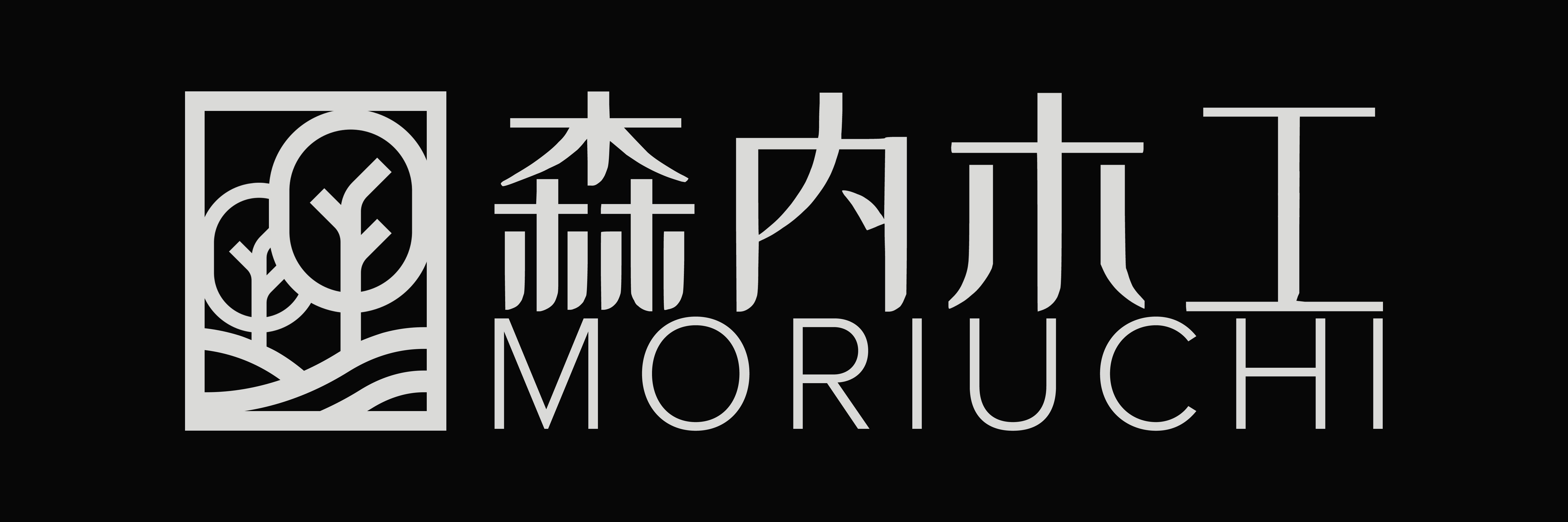
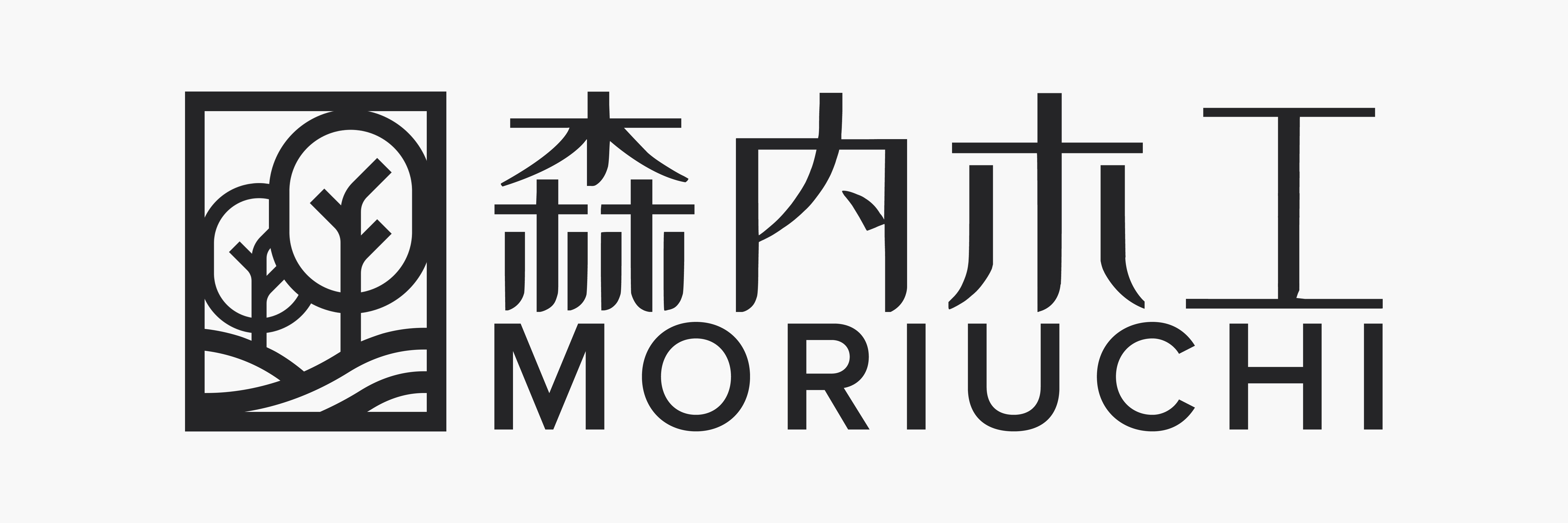
A little context on the brand this logo is designed for: Moriuchi Interior is an established furniture brand in Japan whose products employ only wood of the highest quality. The brand’s clients mostly consist of high-class families with high incomes. The name Moriuchi means “inside the woods” (Mori means “woods/forest” while Uchi means “inside”). As such, I’ve chosen the image of a forest illustrated within a box. The Japanese characters are stylized (designed based on Chinese’s Heiti letterform which is the equivalent of sans-serif. However, compared to the Japanese’s Gothic letterform, which is also the language’s equivalent of sans-serif, the Heiti letterform has a higher x-height, making the letters look more elegant) so as to make them more recognizable and to add a luxury feel to the letters. On the other hand, the Moriuchi name (in English) employs sans-serif with a slightly thinner stroke for the same purpose.
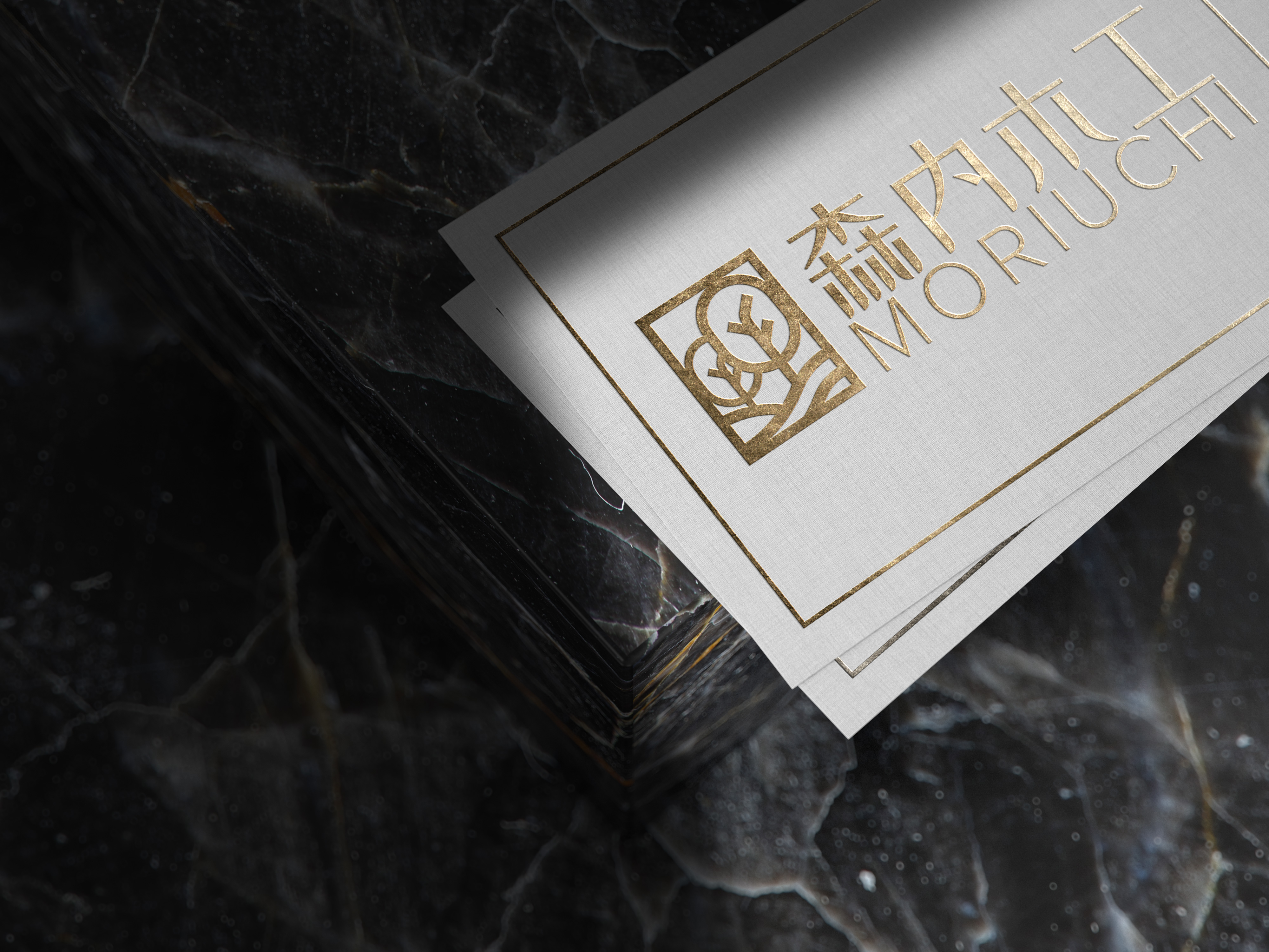
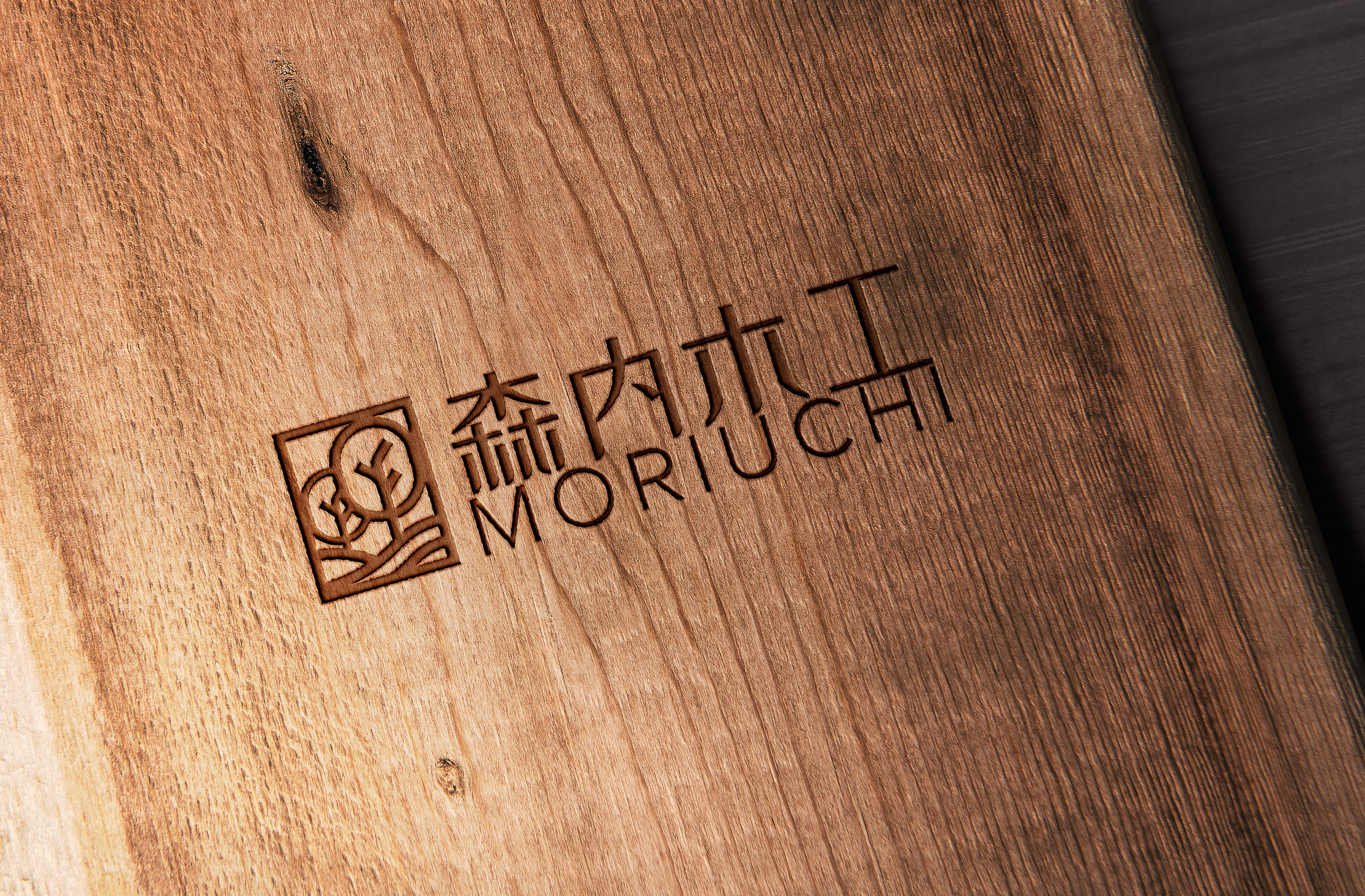
Below is the current design along with two mock-ups:
Are you looking for a job with a design firm or are you a small business looking for new clients?
As for the the critique:
I’m loving the rectangular line-art mark, it looks like to me like they’re trees and land which is relevant considering the business, it looks very elegant.
Although I don’t know whether the mark necessarily says “finely crafted wooden furniture” when I see it.
Have you explored other ideas around the wood: like maybe a woodgrain line-mark or a line-mark with the rings of a tree?
Also I think the thin-line weight of the english text doesn’t seem consistent with the line weight of your mark - maybe that’s not important given that it’s primiarly for a Japanese audience and the english text is secondary, but just saying from an english-speaking perspective…
By the way your mock-ups are awesome - where do you source them from?
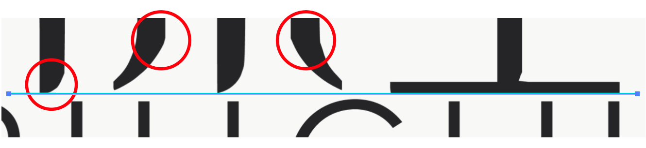
I’ll suggest that you take a little more care in constructing the characters, however. The curves at the bottom look rather hurriedly drawn with some awkward angles (red circles) and the bottoms of the strokes not ending along the same baseline (blue line).
I’d also be inclined to raise the bottom of the last character to offset the optical illusion of it being lower than the others pointed glyphs. This will also keep it from crowding the tops of the letters beneath it.
For that matter, I’d likely put a bit more space between the Heiti characters and the Roman ones beneath — they could use a little breathing room between each other.
Thank you for your feedback @Just-B@pluto
Actually I didn’t notice how bad the curves are since they appeared to be fine when previewed in Illustrator… I guess it’s because of the export setting or maybe because of some issues with directly moving from Illustrator to Photoshop…
Here’s the fixed version. I’ve also raised the leg of the 工 higher and also increased the weight of the Roman characters so that it matches better with the entire logo. There are also some more spaces between the Roman letters and the Japanese letters.
As for the mockup, I used to use free resources on the Internet to create my own mockup. However, lately, I’ve also been practicing using KeyShot and Adobe Lightroom to create a more realistic looking composition.
Currently, I’m still a student at the university and am looking for a job at a design agency as I want to gain more insight into design before setting out on my own. Also, I believe I could do much more if I actually join an agency as my focus is on Branding/Identity Design. However, I’ve been going through some hard time as agencies currently are looking for seasoned designers to add to their teams instead of inexperienced fresh graduates due to the damages caused by the ongoing pandemic.
Regarding your employment situation, hopefully some of the experienced guys here have some sound advice for how you can get your foot in the door with an agency. Would recomend checking out these videos though:
This looks amazing!
I’m a student too, not sure if my opinion is going to help but here it is. I don’t know if it’s just my personal preference, but having some more space between the Japanese and Roman characters might help. It still feels slightly stuffy. But overall, I love it. As a fellow design design, I’d also like to wish you all the best. Hang in there, things will definitely get better!