I would love any feedback on my magazine spread I created. I’m new to graphic design and appreciate any input!
The first page (top left) is part of the article? If not, it has no business on that page.
Folio is awkward. It should be clear of the copy area. Furthermore, customarily left-hand pages are even numbers and right-hand are odd numbers. Positioning is even more awkward: They should be on the outside of the page.
On (your) p.2, the byline should be more prominent, preferably centred. Not sure why a date is there. Does it serve any purpose? The copy crossing the width of the page is, you guess it, awkward.
I hope the cutlines are placeholders because they are just stating the obvious.
There are simple ways to make all columns line up without leaving gaping patch at the end.
1 Like
You mentioned being a beginner. Are you a student? Is this a class assignment? If it’s an assignment, is there a brief you can share? Background information helps to know where you’re at in your journey and what the parameters of the problem might be.
I’ll assume you’re a beginning student, and this is a class assignment.
Over the years, I’ve designed dozens of magazines and other publications. It’s sort of my specialty area and the field where I did my graduate work, so with that in mind…
First, your layouts are better than most student magazine layouts posted here. You’ve established a nice three-column grid, inserted a nice pull-out quote, used a nice illustration (Is it your illustration?), and, in general, created a nice, balanced composition using all the elements.
Getting down into the weeds, though, there are a few things I would have done differently, as well as a few things I think you’ve overlooked or assumed were unimportant.
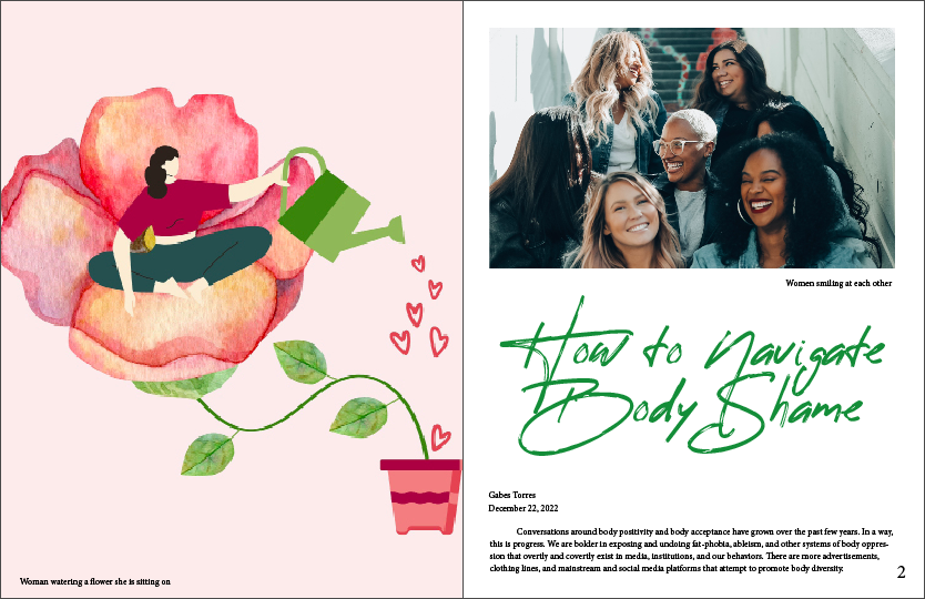
Starting with the first page, I love the Illustration. It quickly conveys the notion that people need nurturing to grow and bloom. However, it’s floating in an uninteresting ocean of pink and awkwardly squeezed into position on the page with big blank spaces above and below with margins on either side that are way too tight. In other words, the relation of the positive space to the negative isn’t working well, nor is the illustration working well within the area in which it resides. There’s also no credit line for the illustration, which is almost always needed. Finally, you’ve treated the cutline (caption) as a meaningless afterthought.
There’s a hierarchical order in which people read publication page layouts. Eye-tracking studies have demonstrated this many times. First, people quickly scan the layout before focusing on the photos. Next, they read the headlines. After that, assuming they’re still interested, they read pull-out quotes, cutlines, and subheads. Finally, if they’re still interested, they read the story’s first paragraph. In other words, those elements are essential; they’re what pull people into the story. Ignore them and you’ve probably lost the reader who turns the page and moves on to something else.
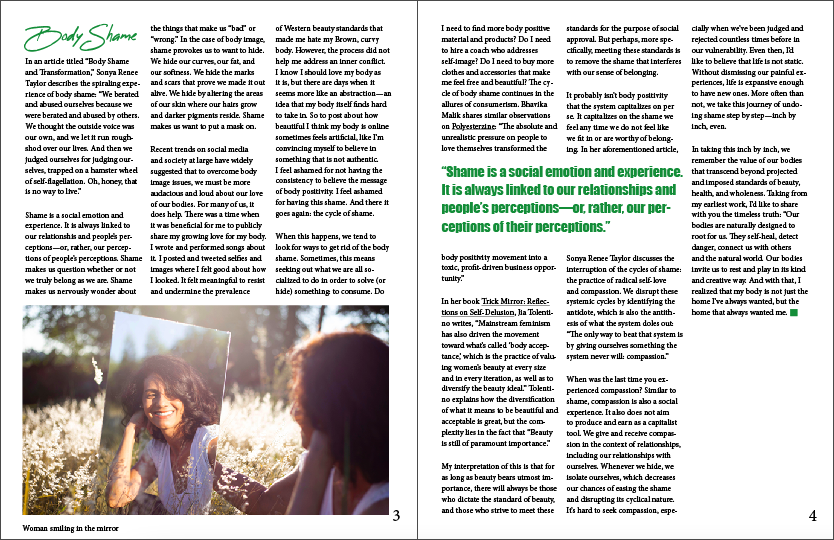
Moving on to the second page… You have the same problem with the photo cutline and credit line as on the first page. The photo is nice, but it doesn’t seem to tightly relate to the subject matter of body shaming. The headline typeface is interesting and grabs attention (which is good), but it is a little tricky to read at a glance (a possible negative). You set the byline in the same type as the body copy, which doesn’t create enough visual distinction between it and the story. The full-page-width column of body text is too wide and too shallow. You’ve missed the opportunity to lead people into the story with a larger point-sized intro paragraph or subheads. You’ve also missed the opportunity to insert an attractive drop cap to draw people’s eyes to the story’s beginning. These things aren’t required; they’re just options I suspect you didn’t consider
Page 3… I’m not especially fond of extra space between paragraphs, but it’s become increasingly common as people have gotten used to reading from website pages and emails that use them instead of paragraph indents. Even so, a magazine of the kind that would run a story about body shaming is likely one that would be more inclined to use paragraph indents. I don’t understand why you’ve added the words Body Shaming at the beginning of the text on this page. Once again, you’ve treated the cutline as an afterthought that doesn’t contribute anything to explaining the photo that isn’t already obvious. For that matter, you’ve treated all the elements at the bottom of the pages as an afterthought. Those elements are also too close to the bottom of the page and fall within the safety area. The page number is on the wrong side of the page. You’ve overlooked opportunities to place the name of the magazine at the bottom of the page and the specific issue of the magazine on the facing page (check other magazines to see how this is done).
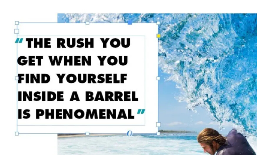
Page 4… As I already mentioned, I like the pull-out quote. It’s a little long and I’m not quite sold on the typeface, but it really does focus in on the heart of the story with a concise bit of wisdom, which is good and compelling. I also like the little green termination dot at the end of the story. However, what’s up with the big blank space at the end of the story? One absolute must in most publication designs is to not end the story and leave a big blank space because it wasn’t long enough to fill the space. You need to juggle everything around to take up the remaining space in a way that looks planned and not accidental.
Finally, you’ve missed other opportunities to liven up the layout and make it more interesting. For example, you haven’t used any drop caps. You haven’t used any subheadings or secondary section dividing heads within the story. You haven’t used any ruled lines at the bottom of the pages. For that matter, you haven’t taken advantage of most of the usual magazine touches that created a finished look that most magazines use.
As I said, as a beginning student, you’ve done good work. Don’t take my criticisms as anything more than me trying to help. I wouldn’t have written this much if I thought you weren’t ready for it. You might try checking out the Issuu website for examples of how other magazines have handled these and other problems. Some are good and some aren’t so good, but it’s a quick place to scan through lots of magazines for insights and ideas.
Not ‘bad’ but some fundemental errors
Why the caption under each image describing the picture? Bizarre. I can see what the picture is I don’t need a text description.
To connect the image of the flower to the story - you could move the pot over the right hand page and elongate the stem to the image - just for connection.
You can span images across pages! Don’t be afraid!
Top image - why is it squared into the page - let the image go to the sides and into the bleed area, or even cross over a little in to the left hand page.
Printers won’t thank you - but hey you’re paying them ![]()
I like the font for the header.
The author name and date is so bland. That typography needs work.
3 lines of text on spanning the page is hard to read - why didn’t you do that in 2 columns?
I’d bring the image up and bleed it off the page - whoosh up the header text
Visually fix the author name and date to something better
Set your body text to 2 columns for start of articles - and have at least 5-10 lines in each column for ease of reading.
Header on 2nd page - again I like the font
I like the 3 columns
I like that all the lines across the page line up - you used a baseline grid to good use here.
Body shame can span 2 columns if you wanted - maybe not necessary.
You don’t even have use the first column for body text.
That could be left blank it would give so much air to the page.
The image could use with being bigger and bleed off the page.
3rd page - that blank at the end could be filled with the text if yo leave the column on the left page blank - and shift the image slightly and bleed it off the page.
Pull quote - doesn’t look good - the font is at odds and the same colour as the heading, maybe a different colour - or a green background with white text.
Overall body text - I don’t like it - what is it, Times or something?
Page numbers are huge.
And techincally - you need more space on your inside margins - they margins look even all around.
Inside margins should be a little larger than outside margins, by about 3-5mm extra.
About the block quote again - you can do better.