Hey guys, I’m new here and I am looking for some honest feedback on my portfolio. I am still creating and adding stuff as I go along but would appreciate some feedback or critique on what I have so far. Do you think this is good enough to get a job, or is much more work needed? Please let me know where I can improve. Thanks.
P.S. Not sure why I’m unable to post the link to my Behance portfolio
behance /cpurkiss55
Here’s my opinion. My comments are designed to help you put your best foot forward.
Regarding the portfolio design itself, not the work in the portfolio, I think you need to do some work to modernize your own branding. I don’t care for the Craig Purkiss logo. It looks more like a figure or symbol for an exercise class or yoga studio to my eye, and I think the typeface is a bit feminine. This second point is more personal, but I’m not crazy about the shade of green you’re using. Your portrait in red and yellow with a bit of pink does not work with the green color. It looks like you were messing around with Photoshop filters and this is where you landed rather than it be deliberate design decision. Whether or not you change the green, you need a new portrait. Why did you go to a serif font for the numbers in the contents and for the page numbers? This looks out of place. The presentation of the work is okay, but I think it could be better.
Okay, I’ve been thinking about what kind of feedback to offer that will be honest and helpful. I think your work shows an understanding of the basic concepts of design, but I don’t think the creative execution is where it needs to be. With your portfolio, I’d say you could land a job doing junior-level regional work, but it’s not going to get you in the door at a more reputable branding agency. That’s not to say you can’t get there eventually, but you’re not there right now.
I’d say the two biggest things you can work on would be concept development (spend more time here, push your ideas, don’t settle for the first thing that comes to mind) and typography (which could use some improvement in terms of selecting appropriate fonts, font pairings, and setting type).
Ok this is the type of critique I was looking for. Truthfully I have had one foot in and one foot out of graphic design for years now and not really spending time to develop and improve. More recently I’ve started up and again and wanted to see where I was at. So this critique has been very helpful. Thanks.
Use a seperate page for each of your case studies and flesh them out with copy explaining your design decisions, at the moment sorry to say, but it kinda feels like powerpoint slides
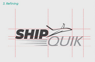
Please don’t draw out grids over your logos unless there’s a reason behind it:
Don’t use this background texture, use a solid colour instead:
Use your real photo with no quirky cartoon effects applied and you could use this as your profile image instead of the logo.
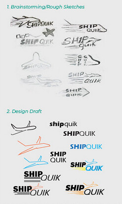
I get that you want to show your process, but I think these sketches and design exploration don’t really add any value and look kinda messy and ametuerish, I’d personally omit them:
My final piece of advise is about your logos themselves - try to be suggestive, not illustrative of what the company does i.e. the amazing FedEX logo shows an arrow, not a forklift or airplane or parcel.
Hopefully helpful mate, good luck with your job hunt
I largely agree with the comments made so far, so I’ll add some comments that haven’t been touched upon yet.
Why are you providing examples of logo colors when all one needs to do to see the colors is to look at the logos? Similarly, providing the name of the typeface you’ve used is irrelevant. In a style guide for Ship Quik, the formulations for the colors and the typeface names would be appropriate, but they serve to purpose in a portfolio.
I would not use the same canned stationery templates that everyone else uses. I’d much rather see designers shoot their own. It’s not hard to do, and it looks a whole lot more authentic.
I think it’s fine to mention that part of your process involves mood boards, even though many people would have no idea what they are. What I think doesn’t work particularly well is showing the mood board in your portfolio.
In summary, your portfolio is packed with lots of clutter. The most important items get lost in all the imagery. After sorting through everything, you only have a handful of pieces in your portfolio, and those pieces have been padded with lots of extras that don’t really tell me much.
If I were you, I’d try to simplify and establish a more obvious and dramatic visual hierarchy.