Hi, i am mona, a graphic designer. This is the first time to share my designs
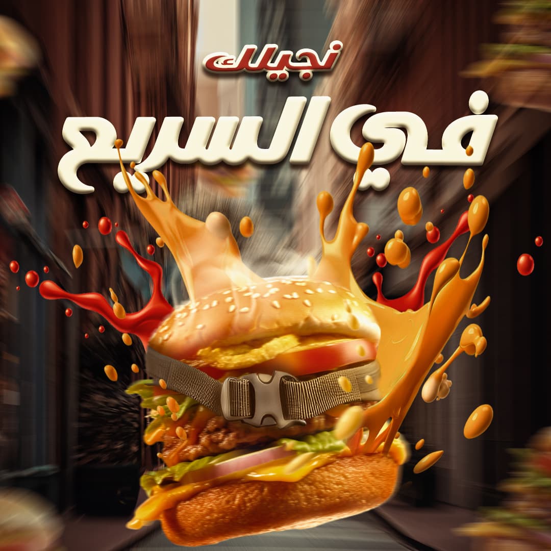
I really want your feedback on my design for social media post . I designed this post for a fast food restaurant in arabic country. This design said the fast delivery to the customer (this is the meaning of the arabic words in the post). I tried to make a simple design with a burger sandwich with a safety belt to tell how the fast of delivery is.
Please i wait your feedback on the design ,thanks
1 Like
Is that what a safety belt looks like in your location?
Looks more like a backpack strap, trying to hold the sandwich together.
There’s ‘fast food’ then there is food that’s been spattered all over the windshield. Not sure that’s a good look.
I want to like it more than I actually like it. First of all, your 3D modeling or rendering skills — assuming you created the image — are beyond what I could do, but the motion seems off. Is the burger coming at the viewer or is it traveling down the street away from the viewer? Is it bursting through a wall of condiments or are condiments trailing off of the burger? Also, I agree with @PrintDriver’s comments about the safety belt (or seat belt as we call them in the U.S.) looking more like a strap from a backpack.
Bottom line, I like the idea of showing a burger moving quickly, and I’d bet you are pleased with the illustration; but I don’t think the execution is working.
thanks
thanks for your feedback, I will consider all your points in my design.
I put the splashes behind the burger to indicate that the movement is going forward
I agree with those above me that the belt isn’t doing a good job holding the sandwich together and that the condiments are exploding from the sandwich in an unnatural way. However, I disagree that those problems matter very much. The advertisement is obviously fantastical and not meant to depict reality in any way, which is part of the chaotic visual enjoyment and appeal.
This ad would get my attention as a social media post. Since grabbing attention is exactly what it’s intended to do, I think it works well. I like it.
Is the red script at the top, the name of the fast food company?
thanks for your feedback
No, it is not the fast food company name
it means ‘’ we will come to you’’ and the white text means ‘’ fast’’
OK, if that’s the case, how will people know what company the ad is promoting? I assume the image is designed to go on the company’s social media accounts, so the company being promoted might seem obvious. However, not placing the name/logo on the ad makes it seem generic and not specifically designed for the company that the image is promoting.
Yes, i agree with you, but it is just a personal training to design ad .There is no company in the fact, but i make my own assignment to practice myself on create ad.