
Firstly, welcome.
Secondly, I am afraid, with no context and no idea of the problem you are trying to solve, what you have posted is pretty meaningless. Any critique can only ever be aesthetic. What was your brief?
Ah, my apologies! It seems there’s been a misunderstanding, and I appreciate you clarifying.
Firstly, thank you for the welcome!
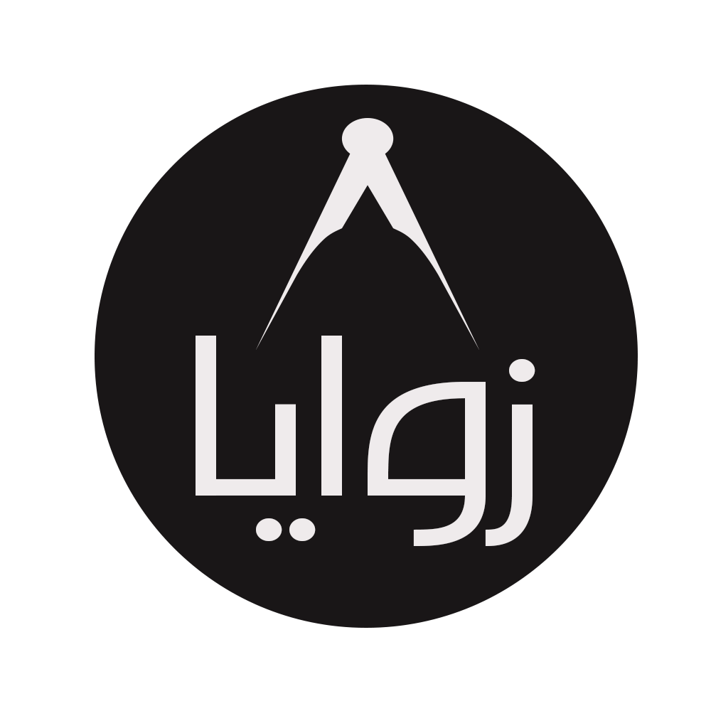
its logo for a documentary series in Arabic Lebanese I would like to know if the message is conveyed properly tell how you feel about the colors and the vectors then ill tell what they mean
Dude without knowing more we can’t possibly give feedback. Technically, it looks clean, good job. But does it answer the brief? We can’t possibly know.
It’s like if I decided to I rate it 4 pineapples. 4 out of what? What is the meaning of a pineapple? We’ll never know ![]()
2 Likes
Can someone give me feedback on this please thanks
I’ll let you know what it’s for once you tell me the message conveyed properly and what you think about the colours and the vectors and then once you tell me I’ll tell you what it’s for.
Thanks
2 Likes
“Lucy Is Getting Jiggly”
Well done!
2 Likes
Lol!.
Best answer to Touff’s original post!!!
The colors are black and white. There’s not much else to say other than every logo needs a black & white version. Will there be a more colorful version?
The symbol in the logo resembles a pair of navigation dividers, but I’m not certain. The letters are Latinized Arabic that translates to Angles in English, so I suppose there’s a conceptual relationship between the symbol (dividers?) and the word.
Aesthetically, it looks nice, but without more information, I’ve no idea whether it looks nice in the right way or whether I’ve correctly identified their conceptual relationship. Engineering? Phonecian navigation?
"I’m looking for feedback from a non-Arabic speaker regarding my logo. For context, ‘Zawaya’ (زوايا) is the plural of the Arabic word ‘Zawia’ (زاوية), meaning ‘angles.’ It can also refer to ‘corners,’ ‘recesses,’ or ‘perspectives.’ This logo is for a series of mini-documentary videos exploring interesting people from a Lebanese perspective. My key question is: Does the logo convey the idea of a documentary? your thoughts guys
My 2 cents, the logo does not convey documentary, but then again (at least here in the US) the logo for the TV station NBC does not convey TV directly. Coke does not convey soda. Nike does not convey shoes. Etc. I know that is a real high-level take.
Instead, with branding you want to ensure that any branding done conveys the brand image that you want to communicate.
The first thing I saw in the shape at the top of your mark was a drafting compass, which does at least have a tie to the notion of “angles”. But at the end of the day what about the branding, what about the overall approach, reaction, elements of the documentary does the brand need to communicate?
Similar to how the Nike mark conveys speed, energy, forward movement, simplicity, impact.
And even then, a logo is just part of the brand. What about the brand voice in the documentary itself, or perhaps how the documentary is filmed, or perhaps what is the focus of the documentaries. Slice of life, social impact, exposing the truth, empowering the viewer? Etc.
Your mark should not operate in a vacuum, it should be all tied together with larger branding.
But, if I were to just gut react to the mark itself, (assuming I knew the meaning of the text which you said is angles, recesses or perspectives) I would say at first glance my gut reaction is as I said earlier that I see a drafting compass, possibly a somewhat stylized pen nib and oddly, I somewhat see the shape as looking at something through a keyhole … a dome? a helmet?
Other than that it is precise and generally balanced. Not knowing the language, the font comes across os fairly formal.
But, the bigger question is in the scope of a larger branding framework, does it work? Does it communicate the brand? I have no idea.
2 Likes
Whether navigation dividers or a drafting compass, they both involve measuring, which is related to angles. However, both have more to do with circles than angles.
Protractors and adjustable triangles have more to do with angles, but will people recognize these mostly obsolete tools? They’re also not as symmetrical or as aesthetically pleasing as dividers.
You might also use an astrolabe or a sextant since they use angles to calculate travelers’ positions. Again, though, will people recognize these tools?
I also don’t know if the interesting people you referred to reside only in Lebanon or worldwide. This probably matters if you want the symbol to allude to travel and interesting cultures rather than focusing solely on personalities who do interesting things in and around Beirut and Tripoli.
I also want to say that I agree with @Craig. If the logo needs to stand alone to instantly communicate the subject matter, a visually recognizable and relevant symbol is probably more important than if the logo is just one part of a broader visual branding.
Another thing to consider is how well the logo lends itself to animation and motion since you’re designing something for video.
1 Like
Mountain hardware or a clothing logo. I’m a native English speaker born in England, raised in Canada. My two cents.
Seventeen Pineapples! Well done. Or is it? ![]()
Personally I’m getting a microscope view of blood cells. Is this for a blood donation campaign? Or perhaps a butcher’s shop who also offers tutoring in microbiology on the side?
Either way… don’t tell me. Ever. I give the best feedback that way.
1 Like
If you don’t understand it, then I can’t explain it. And if I explain it, then you clearly didn’t get it, which means explaining it would ruin it. So please understand it so I don’t have to explain it, which would mean you already understand it. Thanks for your feedback, which proves nothing, except that there’s nothing to prove, unless you didn’t get it… in which case, see above.
1 Like