Hi guys,
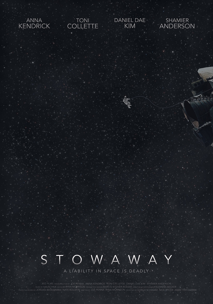
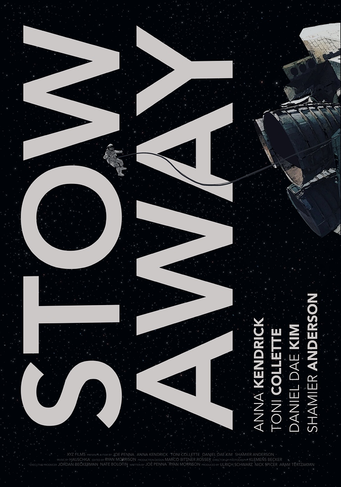
I tried developing my film poster design from the first image to the second. I feel like this makes it more effective/attention-grabbing but I’d love to know if others would agree. Does it work? If not, how can I improve from here, or should I go back to my initial idea? I feel like the composition of it is fine but I’m not sure if the copy is more annoying/inconvenient to read than it is appealing (because of the vertical placement). Is the title too distracting or is it good that it’s so bold and bright?
Any advice would be very helpful and greatly appreciated 
Thanks and have a great day!

