Just sharing my most recent practice renders:)
Feed would be appreciated
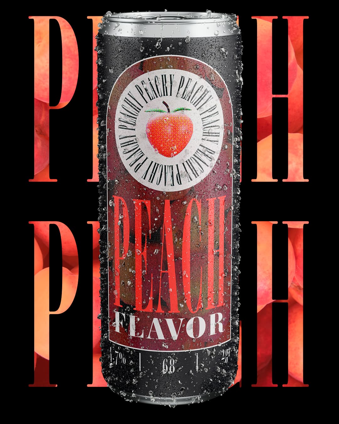
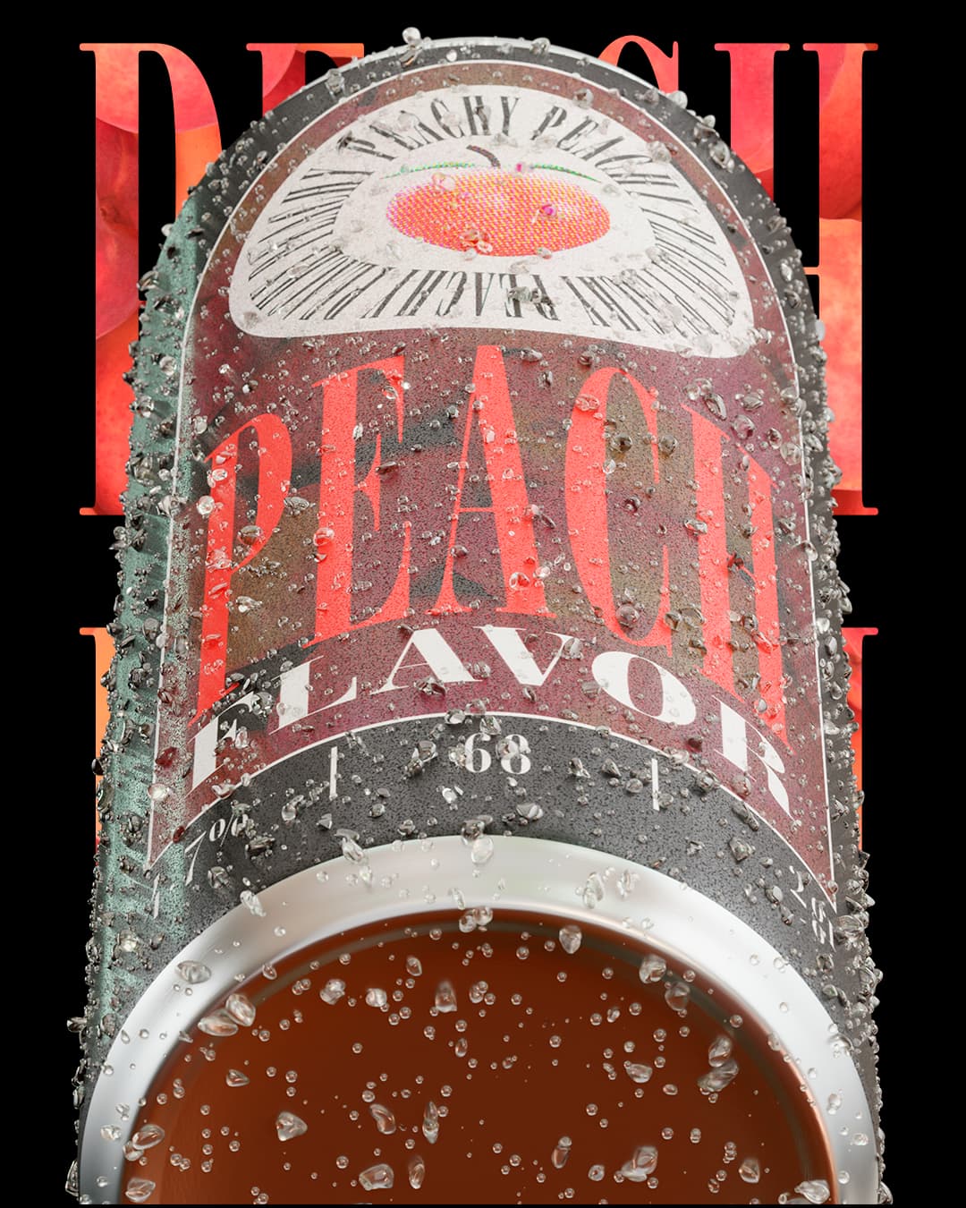
I’m guessing you rendered the can and that is supposed to be either ice or water droplets on it signifying it is cold.
Missed the mark. It looks like it’s encrusted with salt. Take another look at a can with chill condensation on it, or one that has just come out of a crushed ice bath - and really SEE what it’s doing. The droplets or ice don’t just cling, they slide and leave water streaks and do all kinds of things other than staying all still and crystalline.
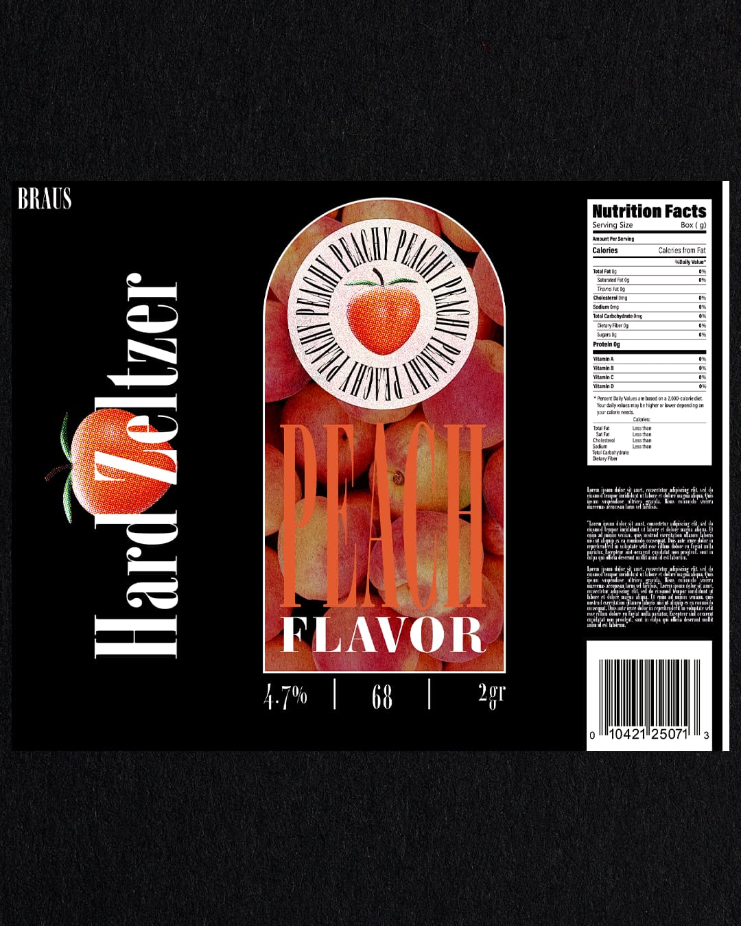
The peach in the circle needs to look more like a peach. Kinda looking persimmon like.
Zeltzer on purpose? Or is it hard Seltzer? There used to be a Zeltzer as a brand name a long time ago.
Yeah, I agree, the “water” looks kinda hard lol. It’s really hard to represent droplets or water in general on blender so I went for a more “Icy” look some frosting would’ve helped.
This was mostly about learning how to 3D model and texture the can
For a beginner I would say that it looks pretty good
Since this is just for fun and I don’t really care too much about the label making too much sense. I just wanted it to look good. The peach looks like that because it’s really an ass twerking that looks like a peach. I animated it for my actual job (I design for nightclubs) just repurposed it for this.
Anyways thanks for the feedback
Were you looking for critiques when you posted this? If so, let me know, and I’ll move it to the Crit Pit section of the forum, which is specifically for getting critique-type feedback
In addition, if you are looking for critical comments, do you want them on just the 3d rendering of the can and the ice, or do you want them on the design of the can graphics as well?
Well, I just wanted to share something I was proud of since I’m just beginning to feel like I’m improving on my journey. But you know what? I could use some feedback, let’s move ti!
I don’t know if anyone could give me feedback on the render, I’d be interesting to hear a graphic designer opinion since the 3D render communities I frequent don’t care about design at all. I guess what I want is to know is how a good graphic designer would use 3D and what’s valuable for the client.
I feel like the lighting and overall presentation of the can looks pretty good. I like the texture on the label a lot, the subtle reflection noise on the material makes it look premium IMO but I understand that’s hard to print, not to mention expensive. You be the judge.
As for the graphics on the can, fell free to critique! Honestly I just experimented a bit, I feel like it’s not bad but it has room for improvement. Like how the word peach it’s hard to read on the label but looks fine on the can, that’s just the settings I used for the material in blender. (by the way the post processing and color correction on blender is amazing, check it out sometime). I’m more worried about the composition of the (images?posters?) overall, they’re supposed to be shared on social media.
Finally, and maybe this is a bit off topic but how’s my English? I want to freelance abroad and feel like my writing it’s not professional enough yet to effectively communicate with the client, or to give them a good impression.
I know this post is all over the place but I guess that’s what first post are for!
1 Like
Firstly, your written English is considerably better than many mother-tongue English speakers.
3D rendering aside –/I’m not the best qualified to comment on this – the typography needs a lot of improvement. The big taboo is mechanically condensing fonts. If you want a heavily condensed font, use a font that was designed that way, rather than squashing a more extended one. Doing so, makes for some quite unharmonious glyphs.
Also, legibility needs looking at. There is not enough contrast between the type and the background. In fact, what you read is FLAVOR far more prominently than what you are wanting people to read first.
Hope this helps.
1 Like
Can Rendering – This looks pretty good to me. Not exactly what a company like AB would have in their ads, but impressive for a practice job.
Condensation / Ice – Needs a lot of work.
Label – Nothing is working on the label. You need to start over.
1 Like
Appreciate the response.
I know next to nothing about typography, kerning and stuff like that since I’m not classically trained. I’m an industrial designer but I could benefit immensely from learning about graphic design. Next time I’ll put more thought into my graphic design. I made the label thinking more about it looking cool and I wasn’t trying to communicate anything or solve a problem.
With that in mind, here’s my feedback.
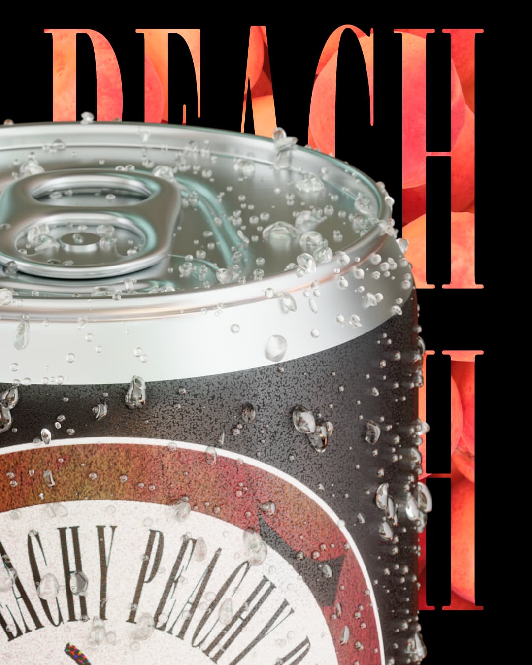
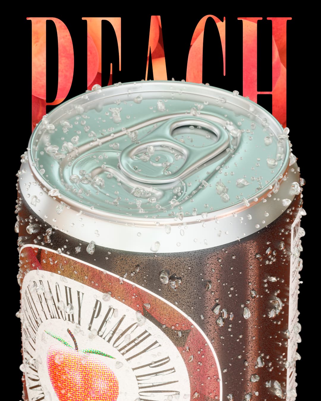
The can is great. The top of the can with the pull tab is especially impressive. Did you do it all from scratch in Blender? For that matter, it’s excellent.
The icy water droplets are realistic, but they’re evenly applied over the entire can in a way that doesn’t consider the differences in distribution, condensation, and perspective that would occur on different parts of the can. For example, the droplets on the bottom of the can appear as though they’re on a flat plane due to them not conforming to the curved surface. However, on either edge of the can, where there’s a foreshortened perspective, the droplets become more crowded, as they should. In other words, you’ve considered things such as perspective in some areas but not others.
You’ve placed such fine condensation on the surface that the can appears fuzzed-out and clouded. This might happen in real life but wouldn’t make for good advertising imagery.
I know type isn’t your specialty, but as already mentioned, don’t squish type — doing so hardly ever looks good. Equally important is that squishing type makes it difficult to read. Contributing to the legibility problem is the red-on-red type on the label — it needs more contrast. Similarly, the big PEACH words behind the can are completely unreadable since the can obscures them.
You mentioned being an industrial designer, which is similar to graphic design in many ways. For example, form should almost always take a back seat to function in both disciplines. This is also true of typography; your compositions look good at first glance, but if the words are difficult to read, they’re not functional.
For a beginner, it’s terrific, as is your English. ![]()
1 Like
Man, I’m framing this response.
Really appreciate the feedback, It was very encouraging to hear!
From what I’ve heard, having a niche it’s really good and my forte it’s 100% 3D so I’m just going to keep polishing until I’m a master at it! I modelled everything on blender, when I say beginner I mean using photoshop, I’ve been using blender for like a year and a half. I think Blender is the future since it’s so accesible, especially when the integration of web 3 and all this nonsense starts to pay off.
10/10 forum! high quality feedback is kinda rare this days, I´ll post some higher level stuff for a product I want to launch sometime soon.
AB? if you don’t mind, can you share the full name? just so I can set a goal!
Thanks
They are fundamentally what graphic design is about. All the rest is just how to achieve this.
Anheuser-Busch
1 Like
Graphic design is about communicating to your clients’ demographics and solving your clients’ communication challenges in order to increase their bottom line. If that is not what you set out to do, even in “for fun,” it’s just pretty pictures.
Now that you’ve pointed out the Twerk, as it were, cannot unsee… ![]()
Lemme tell you man, trying to look for tutorials for “jiggly/bouncy physics” in blender while modeling a literal arse during work hours was, to put it lightly, more embarrassing than looking at porn. Although that might be a good back up plan if everything else fails lol.
But yeah, where I’m from graphic design is really undervalued, so the mindset it’s different and I might’ve fallen into that trap, I guess GD it’s kind of like ergonomics in the sense that it might aimed at a percentile of people with specific characteristics in mind.
@sprout
Guess I gotta go back to basics then, I suppose that’ll come with practice
This topic was automatically closed 365 days after the last reply. New replies are no longer allowed.