I think there is room for improvement but I’m unsure where exactly.
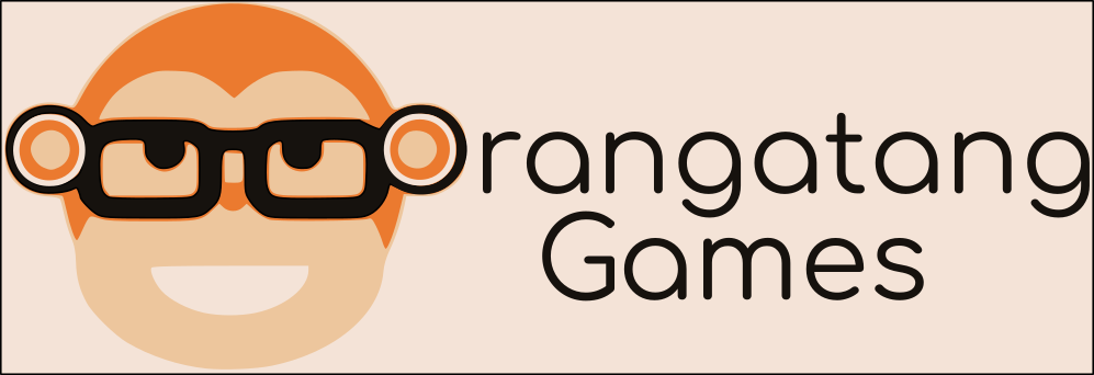
The monkey image contains strokes that go beyond the term ‘hairline’. Printing will be difficult, and I can guarantee a registration issue that will make the logo appear pixelated.
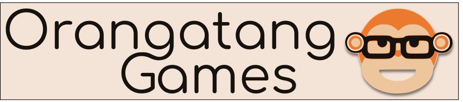
The graphic dominates the typography. I would love to the see the type have the spotlight and the monkey in the same position, but equidistant in height to the text.
‘Games’ is capitalized and has an odd justification to the top line. It’s too close to center justification for it to seem intentional. It may appear like you aimed for center, and something went wrong. Perhaps a left justification with ‘games’ being in a heavier version font. maybe all caps? play with it a bit. Do two or three more variations. I guarantee they’ll get better with each attempt, even without you attempting to do so.
I changed a few things will later try out a different font for the Games word like you said. Also I will look into fixing the hairline strokes. For now which seems best:
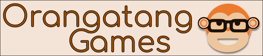
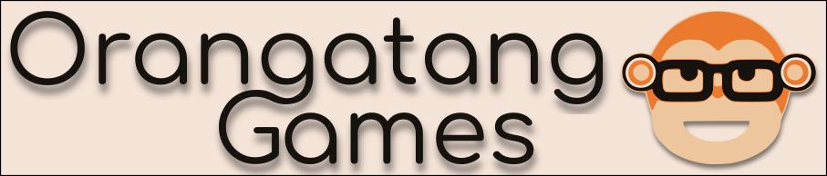
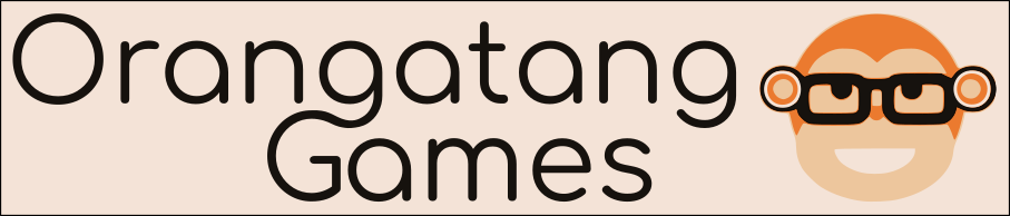
Among in these the 1st is looking good, but If you are going to change some more , hope you will make great.
The first one has stroke widths that are untenable. Picture trying to cut those skinny black outlines with an exacto knife. (the same goes for the orange stroke around the eyeglasses.)
Drop shadows are always problematic because they involve transparency effects. Try cutting out a drop shadow with an exacto knife. Also, if you offset a drop shadow too much, like you’ve done here, it becomes a second set of overlay letters and muddies your message.
Have you done any sketches? When doing logos you should do 100. Then do 100 more. Only then take the best ideas to the computer. You are just flailing here.
1 Like
Spelling orangutan correctly might be a first step. ![]()
Haha yea forgot to mention this was on purpose, I’ve been using Orangatang as a username for years now.
That caricature does not look like an orangatang either. Oh wait. Orangatang is a bird isn’t it?
So your “first real logo” design is for your own online persona’s brand of games? Is that a self-portrait of sorts?
Maybe you can get some advice about mechanical or aesthetic improvements, but a logo isn’t just a graphic; it’s a commercial identity. The reasons for the existence of a brand logo is to induce particular effects on the target market, relative to the product(s) or company it represents. In order to make or suggest improvements to the graphic in this context, one would have to know everything about the product(s), the market, the business model, and the business objectives behind all of those things.
This being your “first,” suggests there will be more, so as Orangatang, are you a graphic designer or a purveyor of games?
It’s just for a small indie gaming company, I’m a programmer not a graphic designer but I’m interested in learning about graphic design as well. Appreciate the insight about there being a commercial aspect to it as well.
Isn’t the brand … orangatang … locked down under copyright?
As in orangatang skateboard wheels!?!
1 Like
Ugh your right! I totally missed that thanks for the catch! Guess I’ll work on a new brand name.
Thanks for the feedback I’ll go buy an exacto knife and try to cut shadows now. I think your right I do feel like I’m just flailing I will be doing a bunch of sketches for my next logo probably not 200 though ![]()
Before you up and leave all your efforts on this branding why not give them a shout and get their take on your concept?
Might work out well for both.
1 Like
That’s a good idea, I’m just unsure if I should even dabble with that out of fear of some kind of legal trouble. Are you sure it’s OK with their consent?
Can’t see why it wouldn’t be. Their consent would have to come from a decision maker on the matter and it should be in writing and to double check … as I would do … have a lawyer take a good look at their (Orangatang’s) consent.
Just recently I went down this same exact road. I created a forum which has the same name as an existing brand. Realizing my mistake I reached out to them and after a brief phone call and some follow emails they graciously gave me their consent.
What won their approval was that I agreed to promote their products along with the agreement that I wouldn’t allow any other competing business to advertise …and I wouldn’t promote a competing business even as a suggestion to anyone on the forum.
I also made sure to keep them well informed every step of way during development.
Be honest … straight up honest … and you’ll have nothing to lose.
Ok, yea I’m pretty honest that sounds reasonable I hope it works out.
Hey just doing a little research, according to this Quora answer a trademark is a name and also the goods/service, so since the Orangatang brand is associated with skateboard wheels I should be fine in using Orangatang for an indie game company. I found the trademarked info of “Orangatang” on this trademark search website http://tmsearch.uspto.gov/bin/showfield?f=doc&state=4805:nik2oo.2.4
1 Like
I’m not an attorney, but If a product is fundamentally different and unlikely to be confused with a different company or different product using the same or a similar name, my understanding is that it’s likely not a trademark violation.
Then again, despite the likelihood of winning a court case, it might just be best to avoid the possibility of a legal issue arising.
1 Like
A nice little read on trademark - and copyright - regarding logos: