As a part of my graphic design study, I need to seek some feedback on a double-sided flier design. This was created for the agideas Design Event in Melbourne, with a focus on a contemporary look. There’s a small brief, rationale, and some rough work here. Otherwise, the flier is below. I look forward to the feedback.
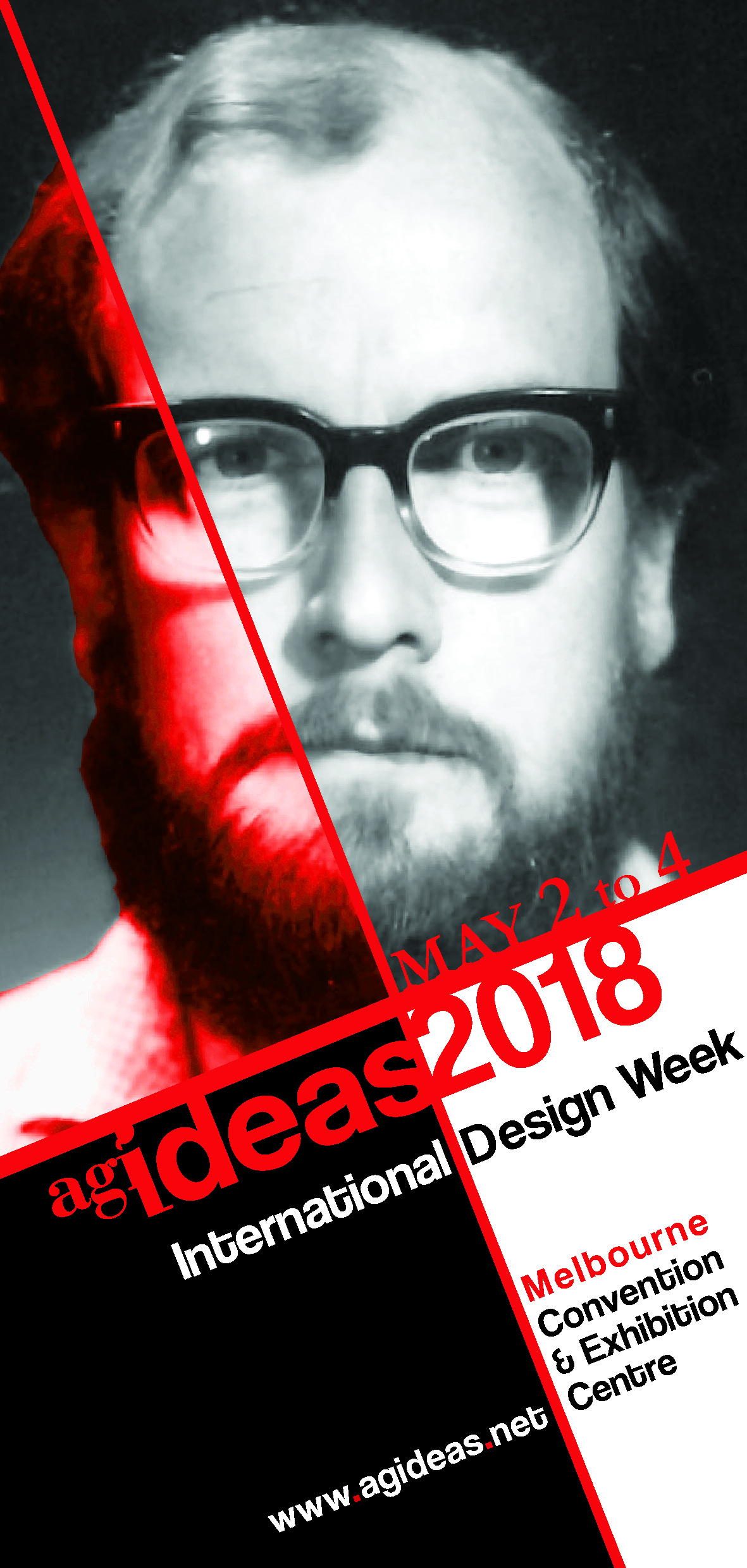
Red is the color of anger, especially when applied to a face (or even part of a face.)
There is nothing engaging about the man’s expression either.
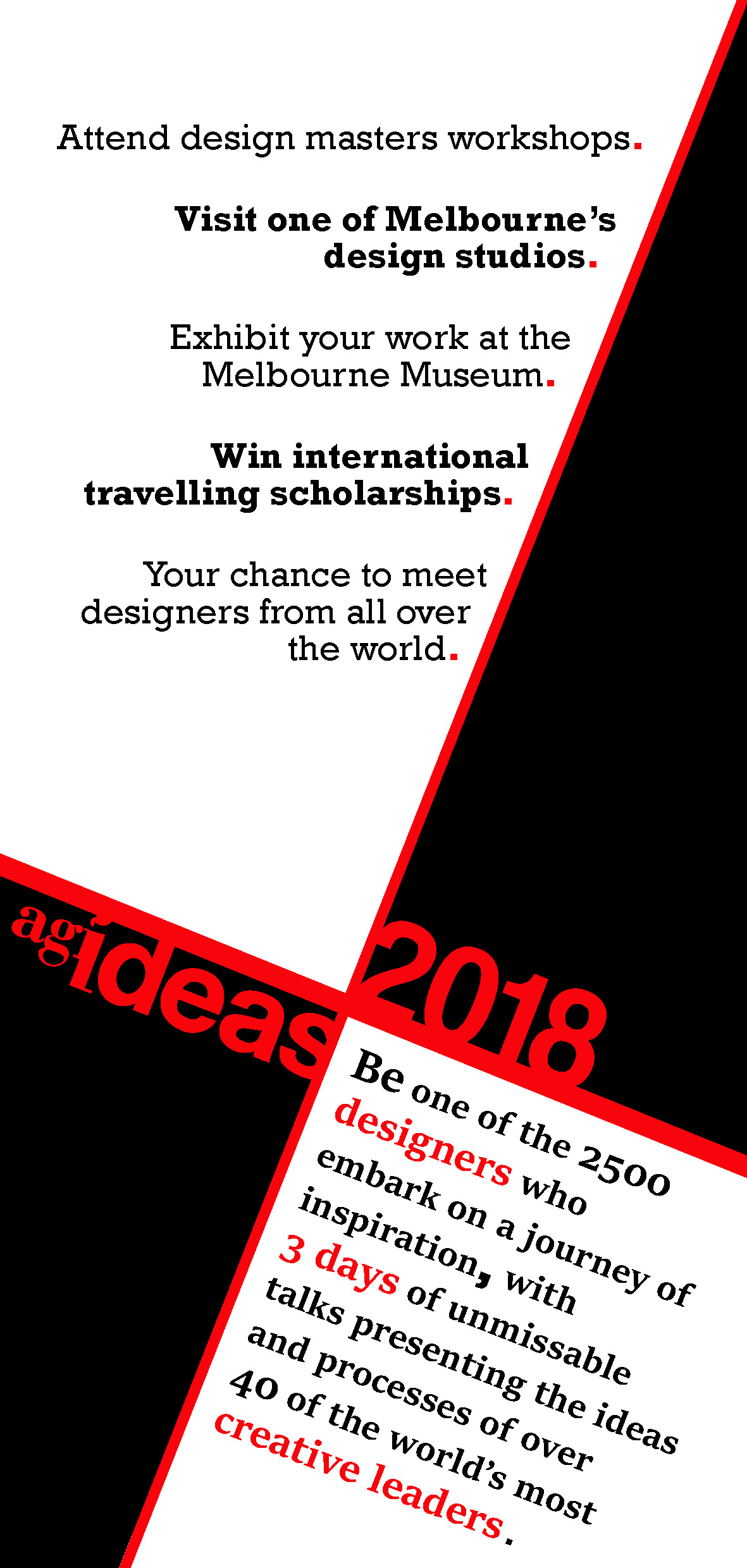
The way your text is broken up in the right lower box is a little weird and it’s one big run on sentence. I might have done it thus:
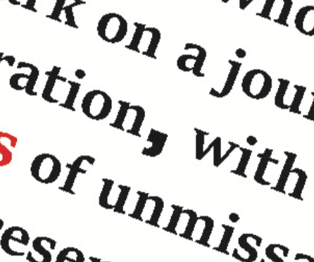
Be one of the 2500 designers who
embark on a journey of inspiration. Three days of unmissable (spellcheck says that’s a word???) talks
presenting the ideas
and processes of over
40 of the world’s most creative leaders.
Love the layout, but the picture… makes me smile, also is out of context.
the lower left can be summarised. if you need to pitch the idea, then reverse the incline -
continue the left to right center line for more space distribution for the text. Maybe.
Again, love the composition, it talks to me.
PS >> if this is some historical figure… try to combine more heritage with other images..<<
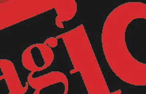
i don’t like that. the left half of the i is way to small. at first i thought that something went wrong there.. after zooming in i realized you did it on purpose, but still..
I’m with PrintDriver here. There are few things I like about this.
Why is this person’s face even being used? Is he a speaker at the convention?
The whole color scheme just instills anger when viewed. It gives the feel of pre-war propaganda poster.
Very wordy, with not enough type breaks for easy reading.
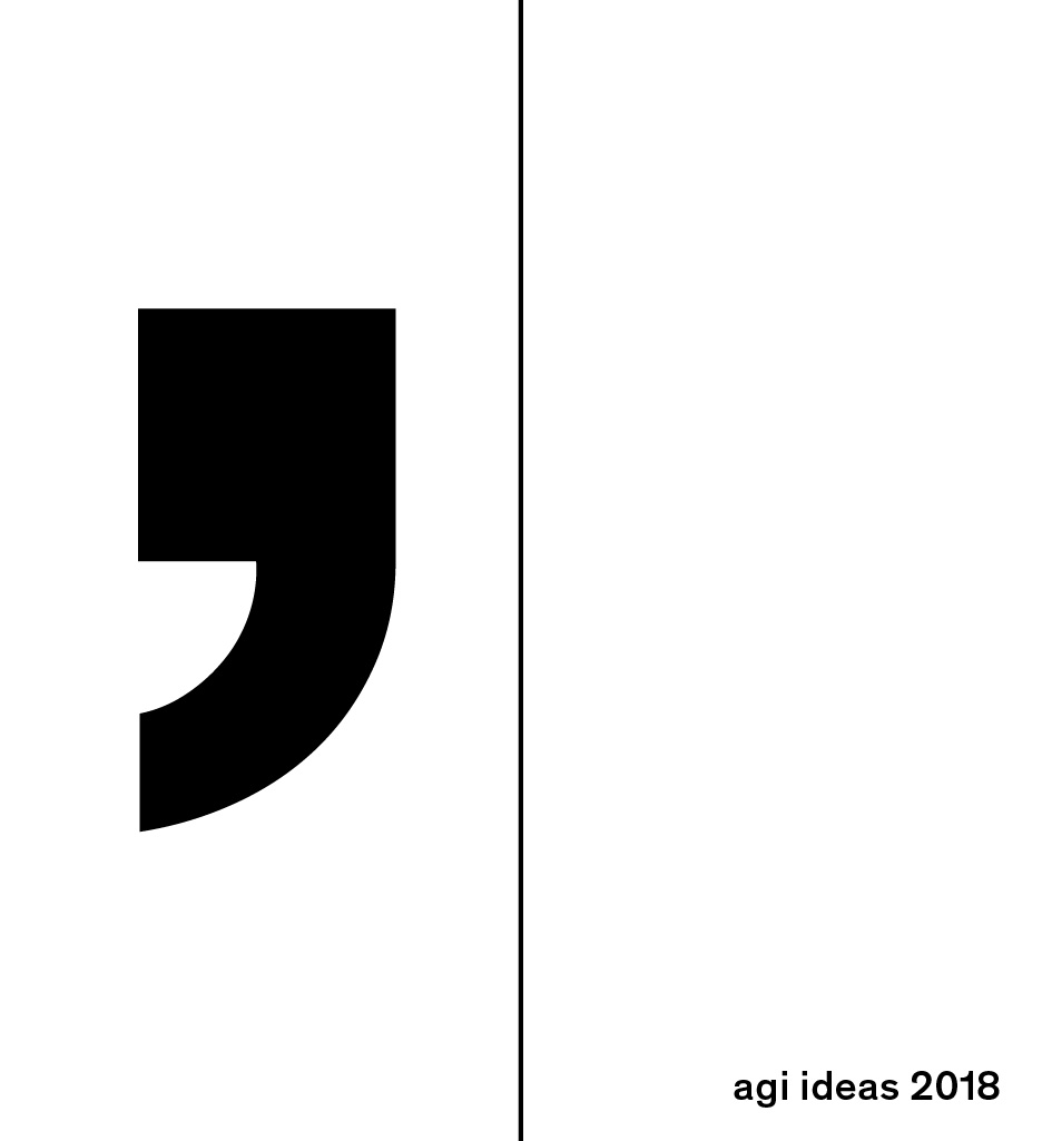
Except the “mega comma” I love the mega comma.
It’s authoritative punctuality just yells “TAKE A PAUSE. RIGHT HERE”
I like its assertiveness.
The linked document seems to suggest you were to use a provided image. Was that frightened head shot from 40 years ago the provided image? If so, that’s a bloody tough assignment, and I’d suggest trying something more radical with it than the relatively lazy, technically-meets-the-requirement treatment you’ve done. Otherwise, that guy deserves a sizable paycheck.
Was the copy provided too? The writing needs work.
The list of action-commands at the top of the backside (that’s the back, right?) is at least succinct, but the last one is out of place. It’s wordier than the rest, yet less direct, and not a sentence like the rest.
The final call to action is a roundabout, mixed message that would leave me considering staying home. 3 days of “talks”? Bleah. Even the megacomma can’t make that read like excitement.
Be one of the 2500 who embark = Join thousands of fellow designers on a 3-day adventure
ideas and processes = leave these words out; might as well be “crops and dirt”
unmissable talks = can’t-miss appearances by the world’s most creative leaders (don’t say how many)
Like I said; gotta get more radical with it . . . crank up the size so it’s only partially visible, add some dramatic shadows or superimpose some illustrative stuff over an eye . . . something.
Thanks for the feedback, everybody. I’ll be sure to utilise it. In response to a couple of posts:
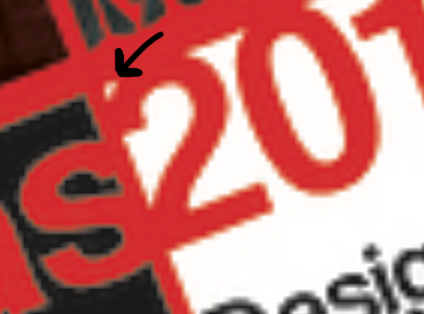
@chrsgrbr That space on the 2 was annoying to me as well - glad to know I wasn’t just being picky. And agreed on weird split ‘i’ agideas logo. Unfortunately it was supplied for the project and has to be used as is. Also, I love my big comma.
@Biggs That’s totally fair, and I see what you mean. It does have an overly-aggressive feel, like the start of a true crime show or something with the still of the murderer’s face turning to red. As for the photo itself, that was one of the required included documents. And I’m glad to see appreciation for the comma.
@HotButton yep, all the copy was included, as was the image. And I think I agree with you - the original plan was to include some illustration, and in retrospect I probably should have kept with that. Thank you for the feedback!
Thanks again, everybody. Very much appreciate y’all taking the time.