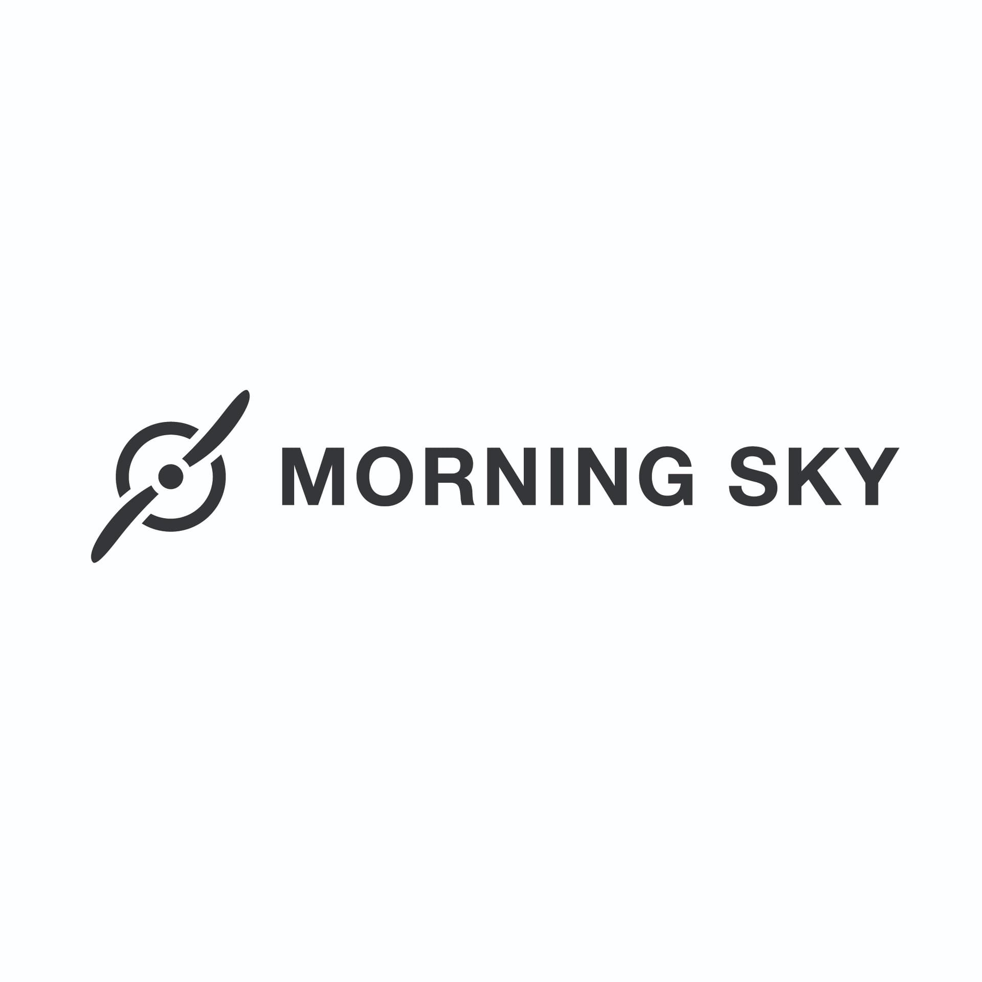
Concept: A logo featuring a Cessna 172 propellor, a common flight training plane.
Purpose: Serve as a logo for a fledgeling fictional flight school with the mission to make flying accessible for all through affordability, inclusive branding, and dedicated staff to help students discover how flying can fit into their life, no matter their circumstances. The brand values are: Timeless, Welcoming, Trustworthy, Professional, Inclusivity, Warmth, and Accessibility.
Format: For use in digital and print formats - staff uniforms, website, pens, business cards, signage outside and inside the office building, on airport street signage, and on aircraft, stationary, and flight sims.
Audience: Women and men ages 18-30, but especially underrepresented groups in aviation such as women, POC, and LGBT that may be from all over the world, but especially local. Most of them likely work in tech, engineering, finance, and business.
Experience Level: I am a Junior Designer, looking for my first full time design gig.
Nature of Job: A self-directed project for a fictitious client.
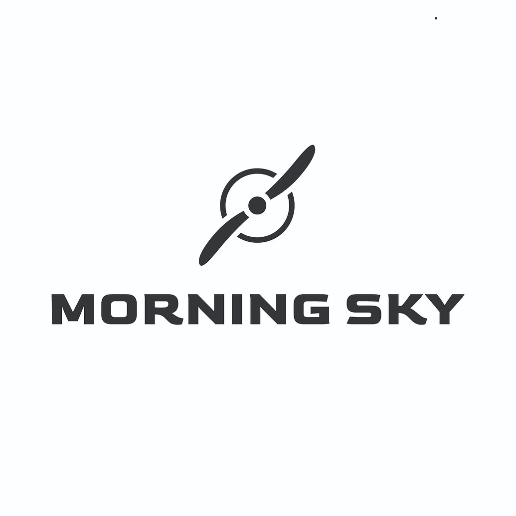
The second one looks more appropriate based on the brief and brand you described in my opinion
That’s because the font looks a lot more authroritative and “solid” for a flight school. I do think that perhaps the slight corners on the end of some letters (like the bottom right of the “G”) may not scale well when used on print mediums and the other mediums you mentioned like staff uniforms
So, the bottom looks better, but the font needs to be a bit updated - keeping the general elements the same (like thickness, that looks really nice etc.)
This brief kinda cracks me up.
Beyond training, it costs +/- $200 per hour to rent a cessna. It’s not exactly an affordable hobby.
But your solution to the brief is a nice one.
I also thought the brief was pretty amusing for that reason.
I went through flight school back in 2001-2005 and it was expensive back then for a new-ish, less than 5yr old old 172 + instructor was $120/hr.
Granted, a local FBO had a Piper somethingorother - Cherokee, Warrior or Archer, I forget which - for $85/hr and an much older 172 for $75/hr.
General aviation flying has been a rich person’s game for decades, especially if you fly enough to keep current and practiced.
That said, the goal of the brief is a noble one that I applaud. I like the design too, overall. Maybe not the shape of the propeller quite so much, but overall it’s nice.
The propellor mark feels a bit generic to me, have you tried expanding on the idea a bit more to create something more unique given unique brief?
Alternatively have you considered ommiting the propellor mark altogether?
Neither typefaces really feels warm, welcoming, inclusive or affordable to me, have you tried using a humanist or even a script typeface as maybe that might convey these feelings?
I understand that if you used the “O” in the same size as the rest of the word, But I was thinking that the “O” within the word Morning, could be larger than the other letters in the word.
Choosing a logo for your flight school is a fun endeavour and I’m happy to assist you in developing some concepts. Based on your brief and brand the second one appears more relevant. It is due to how authoritative and solid the font seems for a flight school. These endeavours such as designing signs and logos always attract my attention.