I made this for a client of mine. Looking for some advice to make the design better
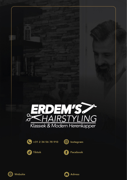
If I am being honest, I don’t think there’s much right with it. It is neither one thing nor the other. You are going for a minimal approach, yet the logo uses all the cliché elements you might find lin local classified ads for local barbers. You’ve obviously thought; barber – scissors and razor (poorly arranged too, it has to be said), then stopped there. Why? You are not doing your client any favours. They could probably do similar with a template logo.
Who is their market? What you have is contradictory in terms of demographic. Neither blue-collar local factory worker, or young, cocktail bar hipster.
The typography needs a lot of work.
Fonts with high/low ascenders and descenders don’t work well with such tight spacing (without even getting into legibility issues,), especially in italics. Tight letter spacing is purposeful, perhaps even aggressive, yet the typeface is not a particularly aggressive one. In fact, looking at it, the font itself is contradictory. Some open, geometric features of a Futura and some other parts with elements of grotesques. Not a choice I’d have made for this sort of creative service company, which needs to be seen as having some finesse — unless they only do short back and sides and buzz cuts, in which case the minimal, hipster background image is off the mark. If you want to show class, elegance, luxury, etc, usually more open spacing works better. Look at luxury brands.
Overall though, I think you need to pin down who the business is trying to talk to, establish a tone of voice and go from there. That requires asking the right questions of your client and doing a lot more research.
For me, this is one of those back to the drawing board and think a lot deeper solutions. You are not being paid to come up with template solutions. Your job, as a designer, is to talk to their customers in the right tone of voice. Otherwise, AI and the Canva-kids will have your job in a heartbeat.
Not what you want to hear, I’m sure, but there’s little point in issuing sugar-coated flattery. Drop the clichés. Think deeper than; Hairdresser-scissors-job done.
Hope this helps.
1 Like
Appreciate the detailed feedback, Sprout, lots to take in there. I’m not the original poster, but I agree that understanding the target audience should come before jumping into visuals. Using common barber symbols like scissors and razors without context can make the design feel generic. The font critique also makes sense, clashing styles and tight spacing can hurt readability and confuse the tone. It’s a good reminder that design choices should support a clear message, not just fill space.
What I like
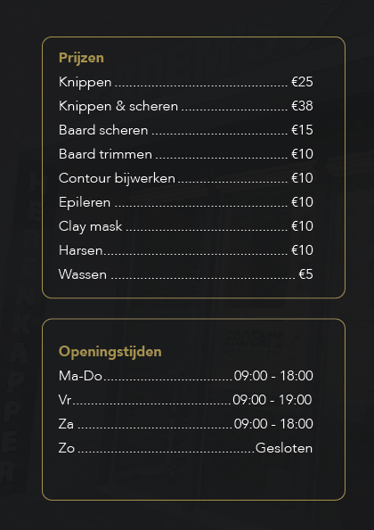
- I like the black white orange color scheme
What I would change
- Image is not clear at all. It’s too dark. I can’t even see it properly.
- The thin white fonts on the black background is hard to read.
- I don’t like how the text is in boxes. It’s clear that Prijzen and Openingstijden are two different sections. There’s no need to box them in.
• The logo is rather busy. Having two tools in it is unnecessary.
Thank you for your detailed feedback.
Just to clarify the logo was provided to me, so I wasn’t responsible for the design itself. That said, I completely understand your points and really appreciate your insights.
Your comments about the typography were especially helpful thank you for that! Do you happen to have a font recommendation that might better suit a barbershop aiming for a more refined and contemporary look?
Thanks again for taking the time to share your thoughts it definitely helps me move in the right direction.
As I mentioned, that depends entirely on the market demographic. Once you’ve determined that – and only your client and you can determine that – font choice comes next to speak in the right tone of voice, so I am not going to offer generic options.
Once you are at that point and you have determined the target market, then perhaps you could have a conversation with the client about tweaking and revising the logo. How far you go with that depends on current brand recognition. Even if there is some level of recognition, it would not be unreasonable to update and modernise it to bring it line with whatever brand identity you build.
It’s all about building trust and a relationship with the client.
Good luck. Have fun.