Flyer ideas for upcoming event

Hello, I wanted to get some feedback. Today I got the theme for the flyer for our festival coming up at the end of July. The Festival is named Dominion Word. The theme is called Glory and Grace. I looked up a few pictures to get ideas and created a flyer. Below is the draft of what I came up with tonight and attached are some pictures I looked at that I liked. I really liked the church’s online flyer pic with the border frame, but I didn’t want to copy that exactly because I don’t think you can legally do that.

I will say after looking at this, one change i will make to the flyer is to move the visit us to line up w/the When. I did mess w/the circle outline, as reflected in one of the examples, for a bit w/the grace and glory. Originally I had it as a circle around grace and glory w/the black background and white as the rest of the background color but didn’t like it. I wasn’t a fan of the circle at all w/all the other text around the flyer, so i didn’t stick w/it.


images (1)
images
Please note, above the first name and last name, is a blacked-out picture but I didn’t realize it was black on black for the example till now. I know its pretty awful but i did use grid lines this time and a color palette.

I’m a little confused (sorry). Can you clarify what is yours and what isn’t? Is yours the bottom image?

  1. What feedback have you received from your church? Are they using your designs?
  2. Have you looked into taking a graphic design course yet? If I recall that was among the recommendations to your posts awhile back.

@Just-B sorry for the confusion. Yes my draft is the bottom one w/the ‘name of building’ txt on it. I know its not great but it took like an hr or so to come up w/it, but there was stuff that i sat there messed with and didnt like so i would remove it (like the example i mentioned above in the original post, about the circle encompassing the words grace and glory inside). I also feel bad that it took me like 2 hrs to get that draft.

@Mojo The feedback that I have gotten from my church they want things styled like this more so I do the best I can but

  1. those are way out of my beginner novice, volunteer graphic design flyer/poster creator realm.

2.i have 2 other posts i believe that shared some of my content we have used. Though its all aweful its what we have because im the only one doing them. I dont mind creating them as i do want to get better but i just feel bad because i know they are aweful but you have to start somewhere and will get better eventually.

  1. I feel like the examples, personally are super busy, so i try to create what they want without making it so busy as well but w/all the info we need on it.

  2. the last flyer i created here (post titled: [New Flyer - Please Critique), they said that was the best flyer i had done yet and really liked it compared to others because it was simple and i guess looked good. It made me happy that they really liked it/said it was the best one i had done so far.

They are using my designs but I will try to give them 1 draft that is 2-3 different versions and have them pick or say remove this, adjust this etc. and then we’ll make the changes and see if they are good w/that for the final version.

I have looked at taking graphic design courses but I was trying to find free ones or youtube channel i could watch and learn from when i have time. There was one that was recommended in a prior post that i went and watched a few of his videos and learned from them and saved the sites he recommended. I just try to get ahead of the game so i created a draft and provided examples of what i like then figured i’d post on here and as i progress for this poster hopefully put out something that doesnt look as aweful and basic as prior ones. I greatly appreciate this community and the feedback.


IMG-20230311-WA0000

Ok.

On the positive side, yes, you do have some things properly aligned and that’s a step in the right direction.

The most glaring error is you have the url running off the page. It’s sloppy design. Think about what that tells your audience about the event. You have to catch stuff like that on your own.

Design is about more than being able to use software. A good education in design will also include instruction on history, criticism, and aesthetics. Those are things that will shape your work, and you would really benefit from that. Because what I see is someone who is struggling to figure out how to put things on a page in a compelling way, so you’re just tossing it on there, then hoping you’ll get enough advice on how to make it into an acceptable design.

Online courses, especially free ones, aren’t going to give you the comprehensive education you need. They are good for showing you how to use some of the tools, but they don’t get into… history, criticism, aesthetics. Your work would really benefit from that.

If education isn’t possible, have you considered using templates designed by other people?

1 Like

If you’re going to keep at this, you’ll have to learn to question yourself about every single decision.

image

  • Why did I put that ampersand exactly where it is? Why did I make it that small?
  • Did I really intend to put the word “When” right up against that black/white border?
  • Why did I use ‘@’ instead of the word “at”? Does it look cumbersome with ‘@’ repeated on all of 4 lines like that?
  • Is that a comma at the end of the url? How did that get there?
  • Do I have a call to action? Is it positioned prominently enough?
  • What’s the draw? The guest speakers? Why did I make them so small and drop them in a bottom corner like an afterthought?
1 Like

@Mojo The url running off the page, was my mistake as I didn’t adjust that because when I used the actual site name, it doesn’t run off the page and the font is smaller and matched w/the rest of the font elsewhere on the poster. I quickly added that fake url, to finish the template look w/fake info so I could upload it. I noticed it but thought I’m not gonna go back and fix it and export it again as a jpg, just for an upload but now I know going forward I should.

I will look again at some design classes, last i looked the community college was already in session and it was too late to jump into a class. I forgot about using free templates, which was mentioned in the last post, thank you for the reminder. Since you reminded me, I just reached out to Canva to see about signing up for an account for non-profits.

Thank you for your honesty, what you see as you said " someone who is struggling to figure out how to put things on a page in a compelling way, so you’re just tossing it on there, then hoping you’ll get enough advice on how to make it into an acceptable design." is true. I look up ideas or think of different things and put it up and then ask for feedback on here because I figure at least w/each attempt I’m learning and can try to get better. I do agree that design classes would be good.

I think part of the draw of this volunteer opportunity/position, is wanting to create something cool and have it used, not having to borrow someone elses design from a template. I haven’t used a template but i will look into it, it sounds silly but i feel like im cheating or something by using a template vs making something up on my own.

In graphic design, looking cool is not cool. Being effective is cool.

@HotButton Thank you for your reply. When you said “learning to question yourself about every single decision”, is that something you do (still) or did at one point then grew enough to not have to question every single decision in your designs?

(that was a serious question, not sarcastic. I am under the impression you do or are a graphic designer).

I know you probably meant the questions rhetorically but I did want to answer them below.

I put the ampersand there because the grid lines placement-wise it seemed okay, I was going to go to the left but figured it looked better centered. I made it small because i did have it bigger and it just looked too big and since its an and I didn’t want to draw that much attention to it.

The “When” along the border, again, it was lining it up w/the grid line placement, figured it’d look better there then over but I guess i could have put it in line w/the Visit Us txt.

I used @ to save some space, though it is probably around the same amount of space either way.
Does it look cumbersome w/the @ on all four lines…i never thought it looked cumbersome, I’ve seen the @ sign used on other flyers so I figured it would be alright.

no comma at the end of the url, it was my mistake on making it too big txt wise (should have made it smaller but didnt) and rushing to upload. its a /.

In a sense, I guess I am perplexed on the call to action. From what I know the call to action is what you want the user to do or participate it or click. The call to action I would think would be the theme of the festival, not the festival itself because you want to draw people to the theme to come to the festival, if that makes sense. I was hoping the theme was positioned prominently enough as it’s in the center and has two bright colors that stand out on the flyer.

the draw is the theme or i guess the festival itself but they want emphasis on the theme of the festival. The speaker is always the same speaker. I made them small and put them in the bottom corner because the focus isn’t on them its on the theme. I feel like if I made them bigger or put them in the center it looks weird because the focus is what they are talking about (the theme) during the festival, not on themselves.

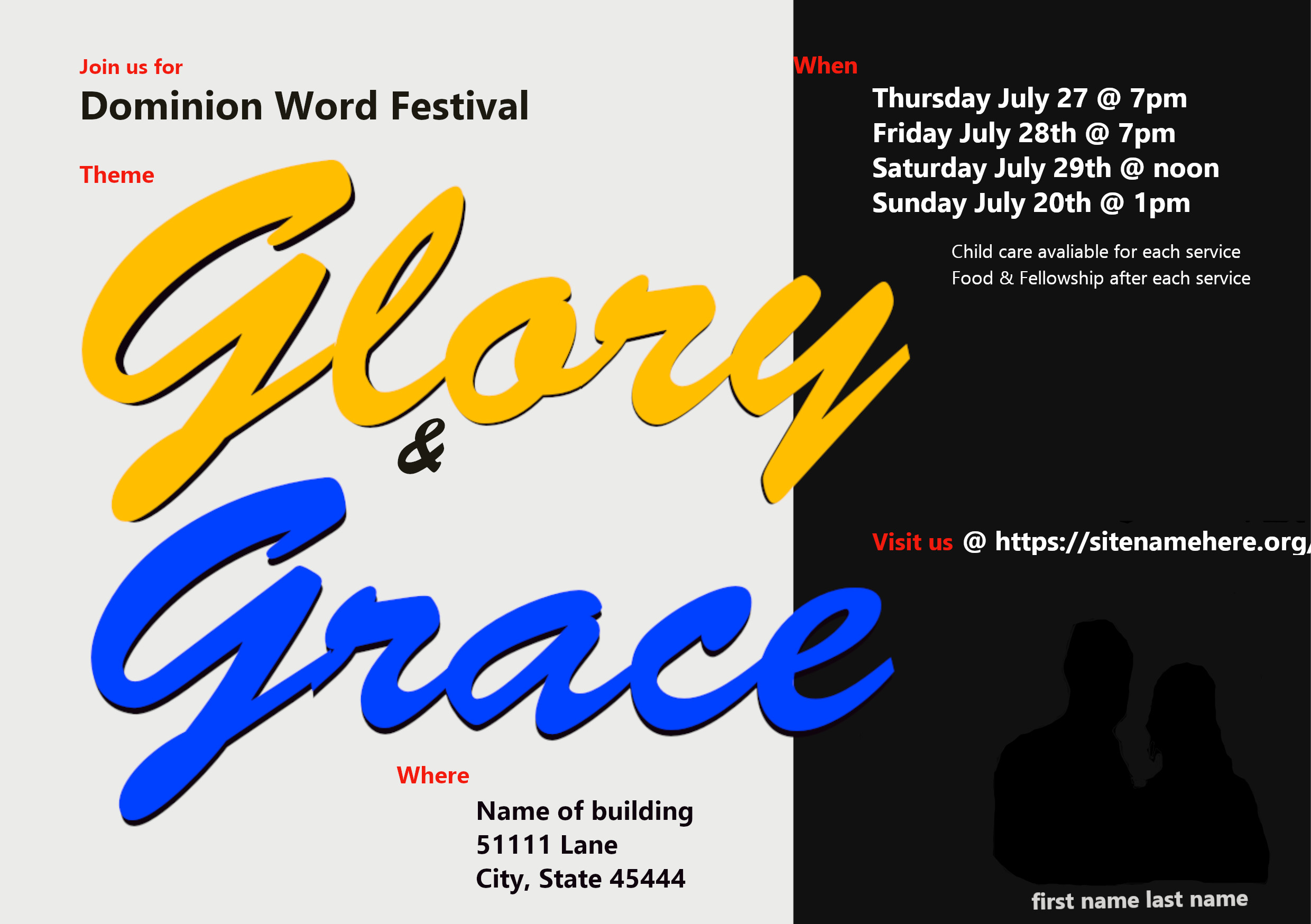
The top image below is what you posted last March. Beneath that is what you posted this week. You’ve definitely improved. I don’t want that to go unsaid, so congratulations on how far you’ve come. :smiley:

You’ve been paying attention and looking for examples of things that work and then trying to figure out why they work or don’t. This is a good approach. You’re also questioning your work and critically comparing your work to theirs.

@HotButton suggested that you question all your decisions, which is excellent advice. Sometimes you’ll realize it could be better, then figure out what’s wrong and how it can be improved. Sometimes, everything clicks, and you can sit back and honestly say it’s pretty good. Even then, you’ll always find flaws — even when others don’t see them.

You asked if this self-criticism ever stops. No, it doesn’t, or at least it shouldn’t. As soon as one becomes complacent, the learning stops, and mediocrity sets in.

All that said, here are a few specific comments.

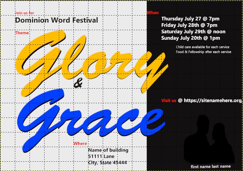
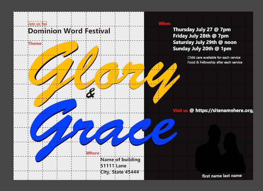
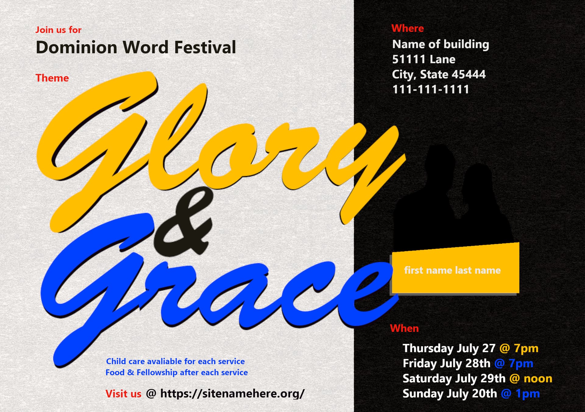
I’m not quite sure you understand grids. An underlying grid helps you make logical decisions, taking some guesswork out of placing elements on the page. Their whole point is to produce orderly, harmonious, and logical relationships between all the page elements and spacial subdivisions.

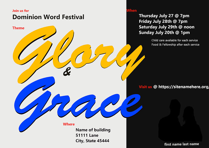
For example, you used this background in your work. Why? It’s almost divided into thirds but not quite. Thirds, halves, and quarters subconsciously register with people as being orderly. More complex spacial divisions aren’t as readily perceived.

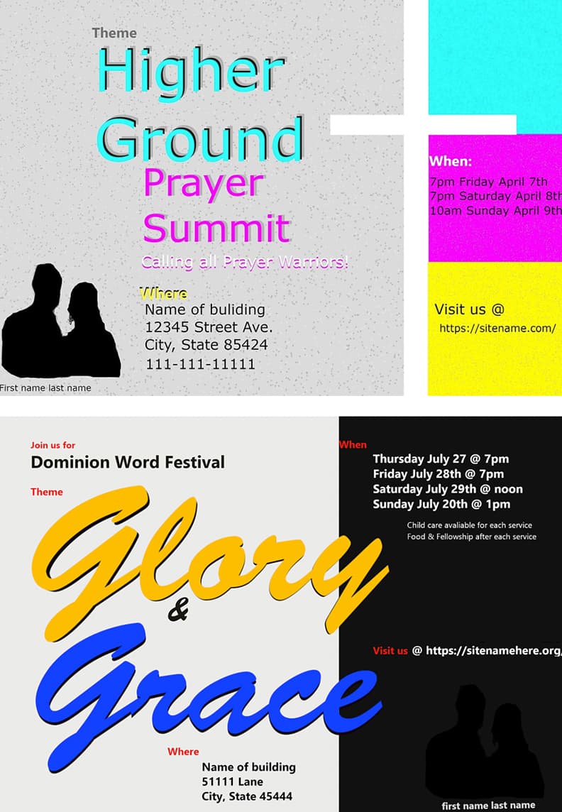
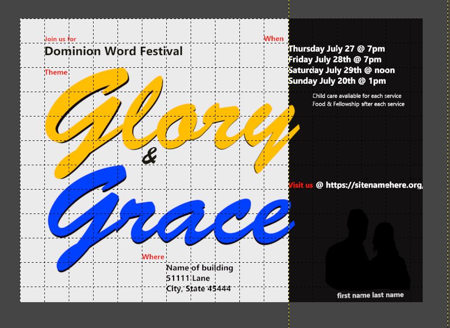
Below, I’ve recreated the same thing divided into thirds, which might have created a more logical division of the space.

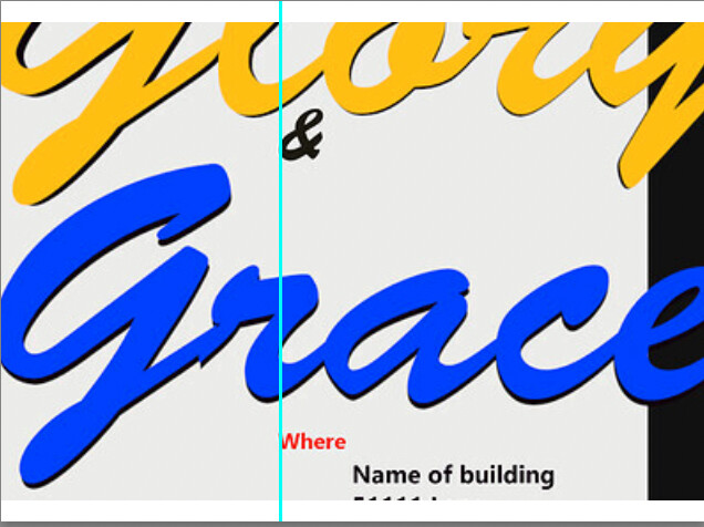
As far as the ampersand lining up with the grid, okay. It lines up with the word Where, but it’s far from obvious. The structural relationships to the underlying grid need to register with a viewer subconsciously, or the geometric relationship serves little purpose. That’s not to say that you shouldn’t have lined them up, but I am saying that this is a good example of letting the grid determine your decision in a way that didn’t accomplish anything.

image

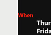
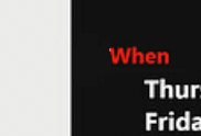
Below is another area where you’ve relied on the grid to make an unfortunate decision that draws attention to itself because one thing is awkwardly bumping into another.

image

A better placement would be to position the word When halfway between the black/gray dividing line and the block of words below it. That would create a little subgrid (of sorts) that uses the obvious geometric division of a half.

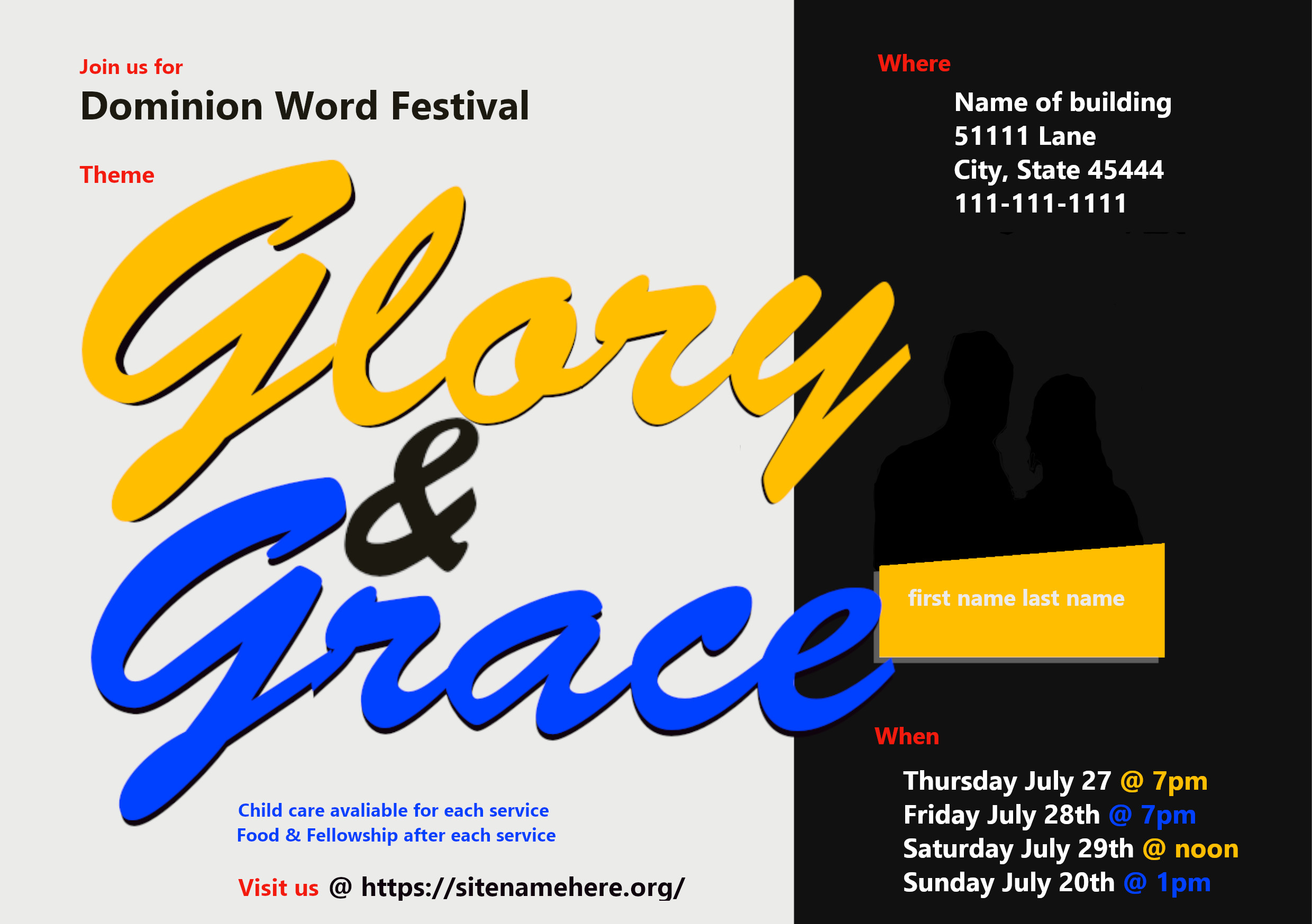
As an aside, I’m not sure all those little red labels serve a purpose that couldn’t have been better handled another way, but I do see why you used red to provide some interesting detail. That’s another subject, though, for another time.

image

I’ll make one more suggestion and leave it at that since this is getting a bit lengthy.

You’ve used other similar church-related designs as inspiration, which is fine. However, new and interesting inspiration can also be found by looking outside that particular genre. For example, things you see in magazines, on billboards, or labels in the supermarket might provide some new insights for you to use to make your church flyers more visually compelling and different from what other people have done.

Still do. Always will. Must.

No, I provided just a few examples of maybe 3 or 4 dozen questions you should be asking yourself about the decisions you executed here. Every detail of your design is the result of one or more decisions, even when you don’t think of it that way. Make it a personal policy to acknowledge those decisions and insist that each one is defensible. And by defensible I mean something stronger than “seemed okay,” and “thought it would be alright”. Design does more than make something “alright;” design accomplishes a goal; produces an effect; strikes a chord. To sound a clean and effective chord, you must handle the instrument with authority and execute all the notes of the chord (and the silence surrounding each of them), in harmony, in rhythm, with purpose.

The rest of your post has too many instances of “I guess” to result in impactful design. If the designer is guessing, the audience isn’t even positioned to guess, let alone engage.

Although there is plenty I’d have done differently with the other designers’ examples you posted, you should take time to look at them again, and contemplate how much more emotion they convey and evoke than what you’ve done. And, again ask yourself questions: Why did they do that? Why does it work? I know you were already trying to emulate them in theory, but you’re only parroting the mechanical aspects without putting in the mental and emotional work, and it shows. A designer’s job is not to present, it is to manipulate.

@Just-B Thank you. Your info, made me want to sit down and re-do some things, like made me motivated, so thank you. I really appreciate you taking the time to look back and the previous post, see, and notice that I’ve improved. It means a lot because I was honestly wondering if I had improved.
So, thank you very much. That really helps me. I also appreciate the time you took to reply and give advice. Below is a picture of the grid lines, so you can see why I did the placement I did. Maybe, I should have included that with my original post, i’ll know for next time to include both, one w/grid line and one w/out. Below is a pic of the flyer w/the grid.

The background black and white, I did it specifically based on how the lettering was overlapping onto the black. I wanted it to bleed on a little but not a lot and not enough to wear it looked like I should do more then one letter. It had a lot to do w/the grid and how it looked overall. Below are diagrams of how it looks w/the grid so you can see if i would have moved it one way or the other in either direction.


The ampersand, thank you for that information. I have now adjusted the ampersand to be bigger and in this post at the end i’ll include the updated version of this flyer…that being said, is it okay to update the flyer in this thread vs creating another thread for the same flyer w/updates?

I figured it would be okay and easier to just update here. Honestly, I plan on continuously updating this a few times, at least this week and possibly next and then send in 3 drafts or so that I plan to have them review and pick 1 of the 3. Originally I did 3 separate designs and then last year I was like its too much and too hard, doing 3 separate so i decided 3 drafts of the same style/color and they can choose. At least until I get better then later maybe do 2 different designs and a few drafts of each.

When, yes I though the same thing originally like its too close but i figured oh well…welp, I was wrong and should have gone with my gut thinking move it over more. Thank you for mentioning the better placment!

The red labels, I am glad you brought that up because I was originally only going to go w/the blue and gold but then I thought well if I recall from my 1 graphic design glass in college over 8 yrs ago, black and white don’t ‘count’ as colors when designing. Maybe it was just white didn’t count as a color. Either way, I wanted to add a 3rd color and I was trying to see what 3rd color would go with those two that weren’t close to either. With that in mind, I looked at a color wheel and did this. I used the color wheel to pick the gold and blue together. I purposely picked that gold color because since the theme is glory and grace, I wanted to see if there was a biblical color representation of glory or grace. When I googled it, I saw that the color Amber symbolizes Glory, then i looked up amber colors. That is one thing I try to add to my flyer design, is if there is any symbolism. Even if other people don’t know it purposely, its just something unique I like to add.

What would have been a better way to handle the red labels?
I did it as mentioned to add a 3rd color but I also figured, it would draw the eye to important information, kind of like bullet points short and to the point.

The inspiration outside of the church-related designs. I do appreciate that, my only concern is if they like a certain style (all the examples i gave in my reply to Mojo), I don’t want to put so much time/energy/effort into creating something that doesn’t line up with there style. I like more contemporary and abstract art so I try to put that into my designs but it is literally polar opposite from the style they like. The flyer in march i did they liked it and said it was simple, they have said before have the flyer be simple, which when looking at the style they like, i think its far from simple and busier.

Random, but I feel it should be noted, its not different speakers its always the 1 same speaker all the time. This is another reason why I don’t understand why a picture is always needed for every flyer but thats more what they want.

Here is the updated version of my flyer, whether its the same, better, or worse idk.

@HotButton Thank you for providing the questions you did. It helps. You are right, when you say every detail of your design is the result of one or more decisions which I never thought of it like that until you mentioned it. I very much like the idea of making each decision defensible. Very good information from your post all of it makes sense and makes me look at design differently. Thank you for the thoughtful and constructive reply you shared. It really does help me learn as im doing this. The last part, where you said it isn’t to present, it is to manipulate. I think that makes me wonder okay, generally, manipulation is looked at in a negative or malicious way. I look back at the examples i shared in this thread and i think okay, how were these manipulative…and I guess you mean it in the sense of how do they catch your attention, what did they do that is intriguing or interesting on the flyer in regard to design and placement of content. In some, how did they manipulate the flyer to barely see the city landscape (praise unlimited flyer) in design but still have it fit in with the whole design of the flyer. Or the let the fire fall where they have the dove on fire but it fits with the flyer and colors but its still off on its own, or the purple one where they have 2 different purple backgrounds merged to make 1 background, etc. Because I think, hmm there is nothing manipulative about glory and grace, and i looked up pictures of glory and grace and just found bland types that didn’t have any oomph or punch to the design whereas the examples here for the most part do, even if its a different kind of punch.

I’m glad you could take my advice to heart, but you’re reading “manipulate” the wrong way, unnecessarily inferring a negative slant. I meant it in the same way you manipulate a knife and fork to cut food on a plate and deliver it to your mouth; not being manipulative in a way that is dishonest or untoward.

Rephrased, the job of a graphic designer is not only to present information in digestible form, but to simultaneously invoke a response—typically on an emotional level—to manipulate the audience; make them feel a particular way about the information given, to present a call to action, provide all the information they need to act on it, and make them want to act on it.

2 Likes

@Just-B I adjusted the flyer more from the reply I did yesterday. Instead of what it is at the bottom of my last reply I just made a small background adjustment that I think helps overall. Below is the newest one.

You might want to watch these two videos on grids. The production values on the first one isn’t that great, but the information is good if you watch it all the way through. The second video is pretty good and dynamically demonstrates the usefulness of grids.

I don’t want you to get hung up only on grids, though. They’re just one of many helpful techniques and ways of working in design.

Here’s another that isn’t really about grids, but I think you’re ready for it.

1 Like

@Just-B Thank you for your help and the videos. I think they have helped me for sure (just recently posted 2 more drafts for this event). Sorry if you got a few notifications for previous tags. I posted then removed it and figured I’d just do a new post instead of continuing to add to this thread. I wanted to repost and just say I appreciate the help and advice you always provide. Thank you! It means a lot.

1 Like