@Just-B Thank you. Your info, made me want to sit down and re-do some things, like made me motivated, so thank you. I really appreciate you taking the time to look back and the previous post, see, and notice that I’ve improved. It means a lot because I was honestly wondering if I had improved.
So, thank you very much. That really helps me. I also appreciate the time you took to reply and give advice. Below is a picture of the grid lines, so you can see why I did the placement I did. Maybe, I should have included that with my original post, i’ll know for next time to include both, one w/grid line and one w/out. Below is a pic of the flyer w/the grid.
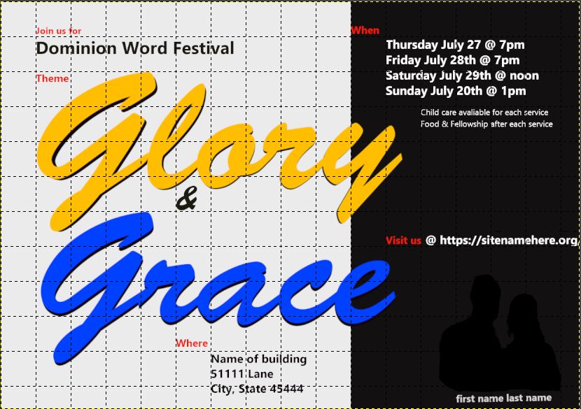
The background black and white, I did it specifically based on how the lettering was overlapping onto the black. I wanted it to bleed on a little but not a lot and not enough to wear it looked like I should do more then one letter. It had a lot to do w/the grid and how it looked overall. Below are diagrams of how it looks w/the grid so you can see if i would have moved it one way or the other in either direction.
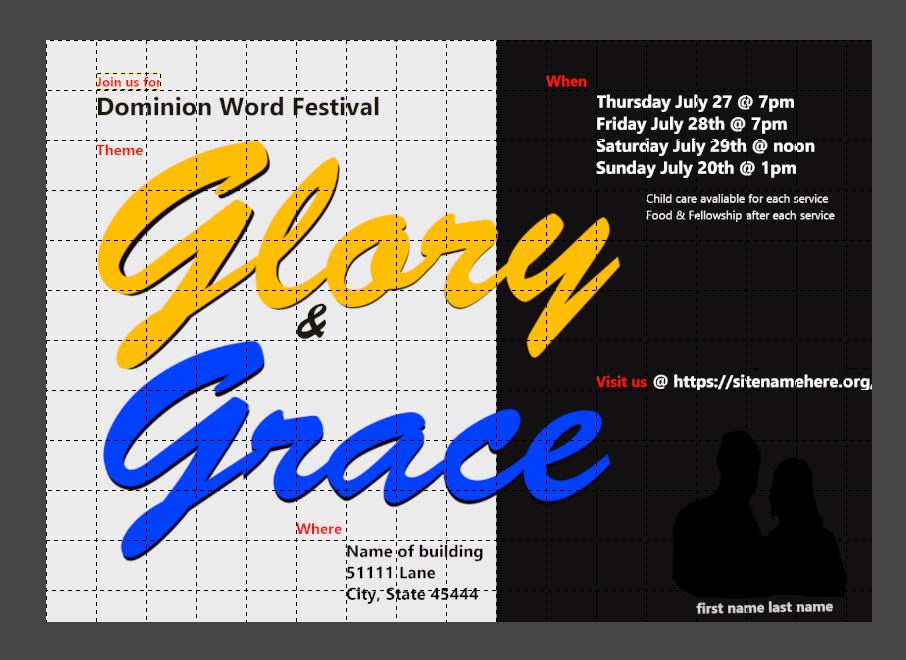
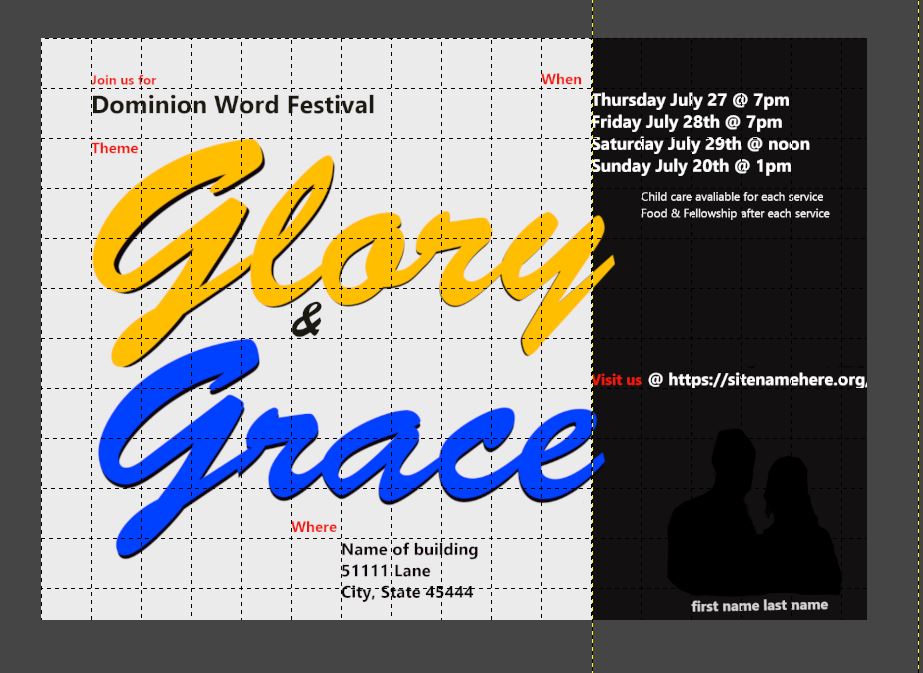
The ampersand, thank you for that information. I have now adjusted the ampersand to be bigger and in this post at the end i’ll include the updated version of this flyer..that being said, is it okay to update the flyer in this thread vs creating another thread for the same flyer w/updates?
I figured it would be okay and easier to just update here. Honestly, I plan on continuously updating this a few times, at least this week and possibly next and then send in 3 drafts or so that I plan to have them review and pick 1 of the 3. Originally I did 3 separate designs and then last year I was like its too much and too hard, doing 3 separate so i decided 3 drafts of the same style/color and they can choose. At least until I get better then later maybe do 2 different designs and a few drafts of each.
When, yes I though the same thing originally like its too close but i figured oh well..welp, I was wrong and should have gone with my gut thinking move it over more. Thank you for mentioning the better placment!
The red labels, I am glad you brought that up because I was originally only going to go w/the blue and gold but then I thought well if I recall from my 1 graphic design glass in college over 8 yrs ago, black and white don’t ‘count’ as colors when designing. Maybe it was just white didn’t count as a color. Either way, I wanted to add a 3rd color and I was trying to see what 3rd color would go with those two that weren’t close to either. With that in mind, I looked at a color wheel and did this. I used the color wheel to pick the gold and blue together. I purposely picked that gold color because since the theme is glory and grace, I wanted to see if there was a biblical color representation of glory or grace. When I googled it, I saw that the color Amber symbolizes Glory, then i looked up amber colors. That is one thing I try to add to my flyer design, is if there is any symbolism. Even if other people don’t know it purposely, its just something unique I like to add.
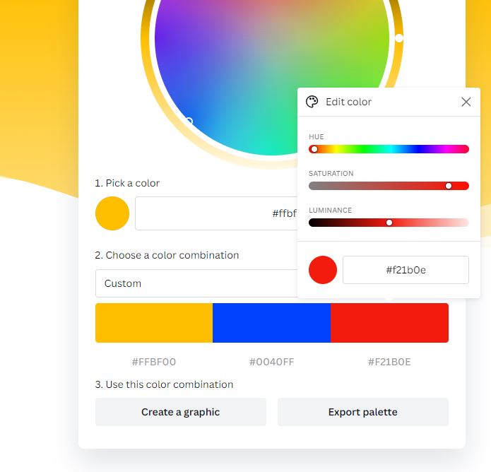
What would have been a better way to handle the red labels?
I did it as mentioned to add a 3rd color but I also figured, it would draw the eye to important information, kind of like bullet points short and to the point.
The inspiration outside of the church-related designs. I do appreciate that, my only concern is if they like a certain style (all the examples i gave in my reply to Mojo), I don’t want to put so much time/energy/effort into creating something that doesn’t line up with there style. I like more contemporary and abstract art so I try to put that into my designs but it is literally polar opposite from the style they like. The flyer in march i did they liked it and said it was simple, they have said before have the flyer be simple, which when looking at the style they like, i think its far from simple and busier.
Random, but I feel it should be noted, its not different speakers its always the 1 same speaker all the time. This is another reason why I don’t understand why a picture is always needed for every flyer but thats more what they want.
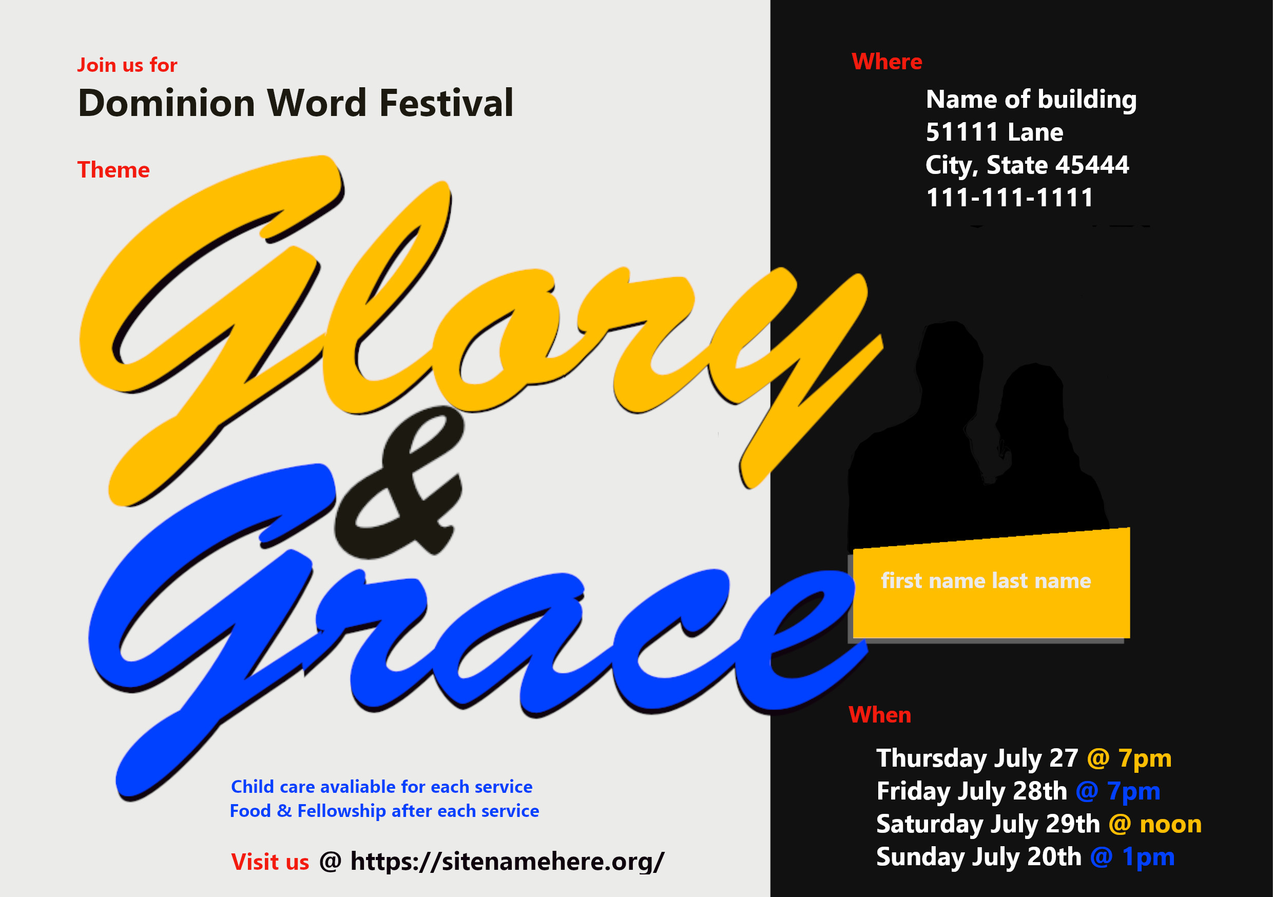
Here is the updated version of my flyer, whether its the same, better, or worse idk.