How can I improve on this flyer?
Is that the text you were provided?
Flyer? As in mailer?
Is there a front side?
Is there contact info on how,where,when to sign up?
Website maybe? A phone number maybe?
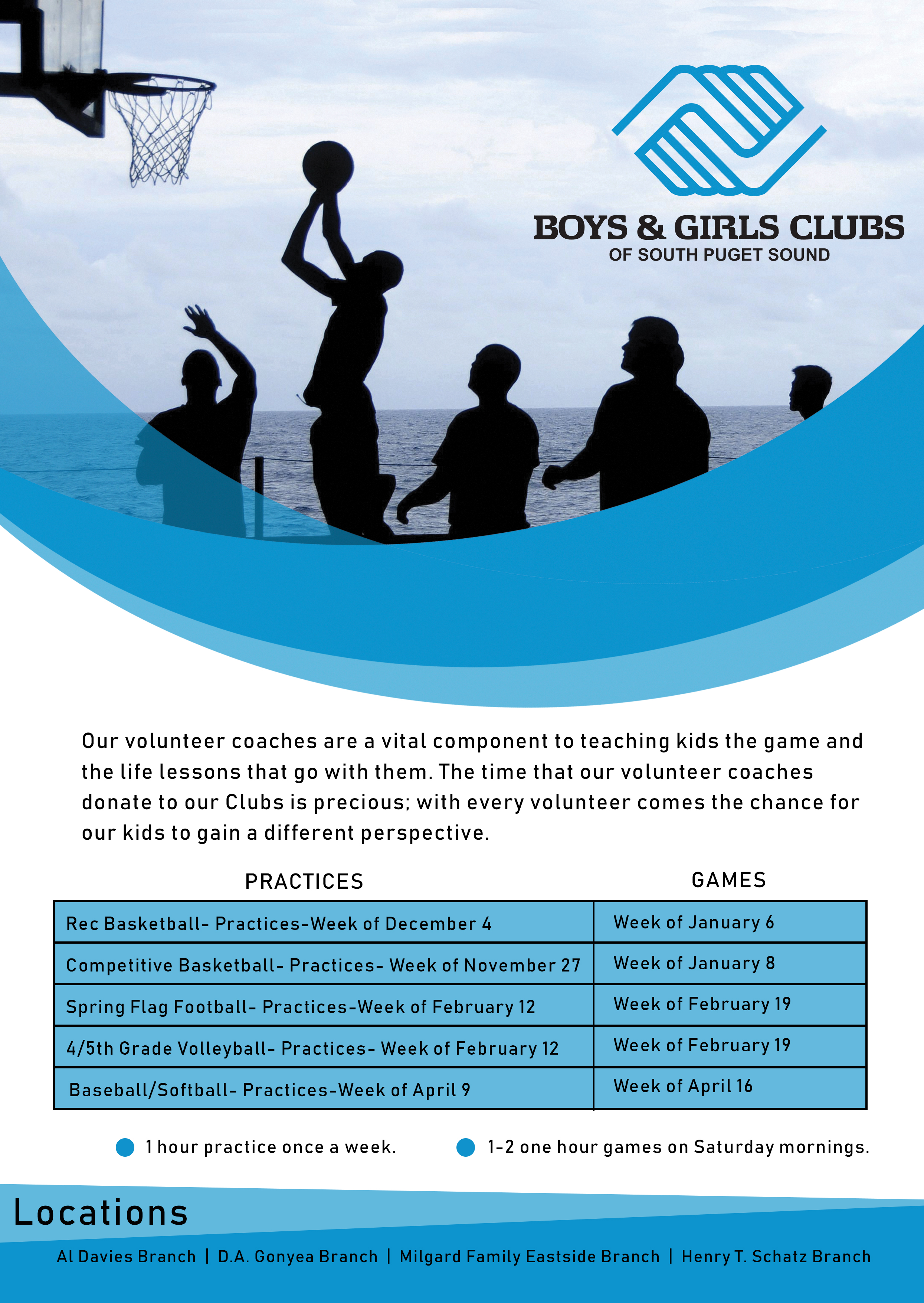
What is the age demographic for the games and is the photo showing the appropriate age group?
Are they having fun?
You need more white space (not literally white). The straight lines of the text and the waves of the design are fighting.
1 Like
I would reword the paragraph. Make it much briefer and easier to read, more scannable and to the point.
And Instead of the logo being so prominent, maybe emphasize the benefits of the program as a header. “Learn Life Lessons from Volunteer Coaches” etc.
I agree with the other feedback, too.
You’re balancing the design, but it isn’t integrated. The top half could be covered up and it will have no effect on the information.
Few suggestions:
- Give this flyer a title in the blue swoop. Perhaps Coaching Volunteer Opportunities?
- Instead of using that blue for the dates of practices and games, make it a little lighter.
- Can you make it have three columns instead of two? They could be Activity, Practice, Game. For example the first one would be Activity: Red Basketball; Practice: Week of Dec. 6; Game: Week of Jan. 6
- The word “Locations” on the bottom and your top paragraph should be the same distance away from the left side.
1 Like
@SurfPark thank you, that’s very helpful. I will play around with your advice on this.
The first thing I noticed is that the image looks like adult men while the flyer is about boys and girls. I would find or draw something more age appropriate.