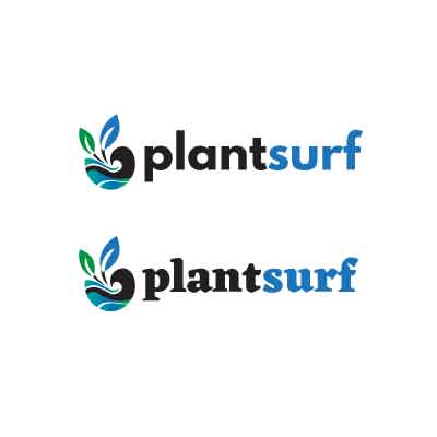
I like the second one. It has more character. I’m getting tired of plain old sans serif.
But it still depends on what the business does. Maybe boring is more appropriate.
@Smurf2 I think sans serif font makes the text to be easier to read.
@pluto Yes I agree with different mood that takes place for each font.
The target audience is 25-65 years old males and females who look for information related to plant or botanical resources and forum.
@PrintDriver I also like the second one. The font makes the logo totally looks unique, but I wish it’s not too bulky or too bold.
I agree the second one has more “personality,” but I’d also say it looks “squat,” perhaps solely due to that horribly ugly lower-case a. If it was my design, and I really wanted that font, the a would get some refinement.
@Smurf2 idea sounds fair enough (and a playful concept), as each font gets the chance to be there. But I’ve never seen a logo that combines two different fonts in the name text to disregard its design consistency. Perhaps a tagline can use different font?
I’m actually in this demographic.
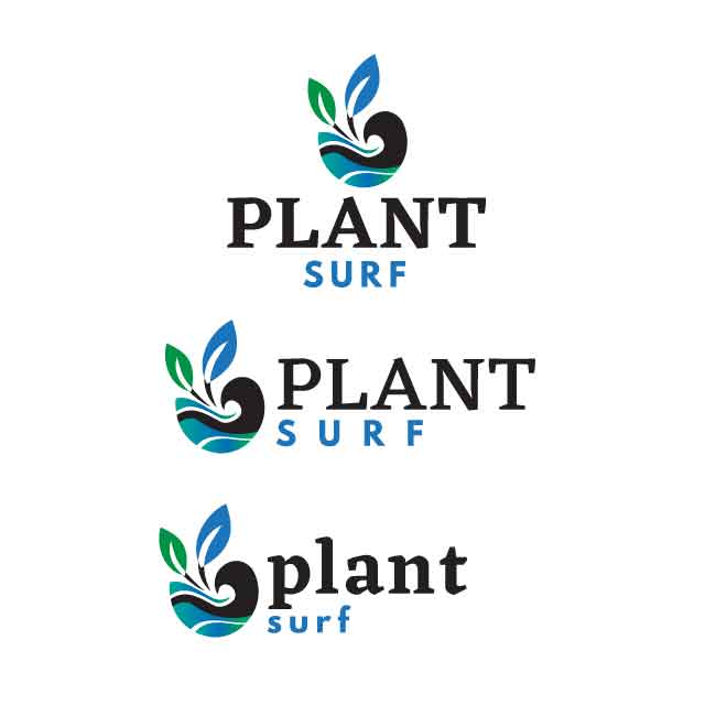
If I’m looking for information on plants, I’m not looking for a clean trendy, modern, hipster logo website. For me, growing plants is all about dirt and green and environmentally pleasing. Maybe not black oil slicks on waves. I want something that looks like it knows what it’s talking about. And quite honestly, this kind of website, the logo isn’t going to sway me as much as the first couple of posts I read. But it would help if the logo were sincere.
I guess now that I know your focus a little better, I have to ask why the focus on wave and surf rather than green and plants? The color black also has a weird connotation in gardening relating to “black thumb” so either it’s about killing plants, or maybe where someone would look to get information to avoid killing them, but the second is a stretch.
Or maybe this is a hydroponics website? Then you might have hit your target with the top one.
You can go all trendy and modern and maybe appeal to the people who mist their gift orchid til it dies, or you can appeal to people who actually grow things. If this is not aimed at the trade, but more toward hobbyists, you might want to rethink. Take a look at sites like Dave’s Garden or GrowVeg.
(Those are just two sites I use and DG has grown beyond the capability of their webmaster and is quite a mess now. But usable.)
This kind of style would be more suitable for a community or an exclusive club I suppose, or more classy lifestyle?
I think sans serif will look much better, as it’s simple, generic, non-specific, common, precise and straight forward
thank you!
The focus is the plant, because it’s with colors while the wave appears in black. I think it will make easier for the eyes to recognize the shape as a wave with solid darker color.
I’d like to have the pictorial mark that is not part of the text, so it can also work as icon for the business.
@Smurf2 , @PopsD
However, I’d still want to see how the Eczar font could represent the company business, so here’s my try
I agree you should be concerned about that, but I disagree with your color solution. Your color use is confusing what you’re attempting to communicate.
For example, you have a green leaf and a blue leaf — both with black stems, yet plants aren’t blue and stems aren’t black. Your water is composed of a blue-green gradient, yet the wave part of that same water is black.
Plants aren’t blue or black and waves aren’t black. I’m not saying you shouldn’t take artistic liberties with colors, but I am saying that if you’re choosing color to help clarify what the objects are, you’ve done the opposite.
thank you.
It’s a logo, not a painting
I just need to find good balance with the color combos. If the pictorial mark just using black color, hope it would still be noticed as how it’s expected.
Found an inspiration of a logo that uses uncommon color schemes: